The International Trucks logo synthesizes experience and modern innovations. The emblem conveys strength, durability, and the ability to keep pace with the times. The logo emphasizes the company’s unity and integrity after its restructuring.
International Trucks: Brand overview
Emerging in 1902 from the merger of the McCormick Harvesting Machine Company and several other companies specializing in agricultural machinery, the International Harvester Company initially focused on farms’ needs. It was not until 1907 that the company entered the commercial trucking arena by introducing the Auto Wagon brand. These vehicles were originally designed for rural areas, meeting the specific needs of farmers and local businesses.
During World War I, the company made a significant leap forward by expanding truck production to meet military needs. Over the next two decades, International Harvester produced revolutionary heavy-duty trucks, particularly the D and S Series. These models set new standards in the industry and fueled the company’s growth.
In 1986, in a strategic move, the truck and engine divisions were spun off into a separate company, Navistar International. The company continued to produce medium and heavy trucks, but now under the International brand. Further diversifying its portfolio, in 2001, the company merged with Harley-Davidson’s truck division, acquiring the rights to produce the PayStar and TranStar models.
Over the years, the company broke new ground with the revolutionary ProStar, LoneStar, and LT models, which have become a hallmark of advanced engineering and cutting-edge technology. Despite financial instability during the economic downturn 2008, Navistar International managed to regroup through a comprehensive restructuring. As a result, it increased its market share, thanks to strong industry demand.
In 2020, a turning point occurred when TRATON SE, a German automotive corporation, acquired Navistar International, gaining control of International Trucks. International Trucks now dominate the production of Class 4-8 commercial vehicles in North America and worldwide. Under the TRATON umbrella, these trucks are sold in more than 60 countries.
Meaning and History
1902 – 1915
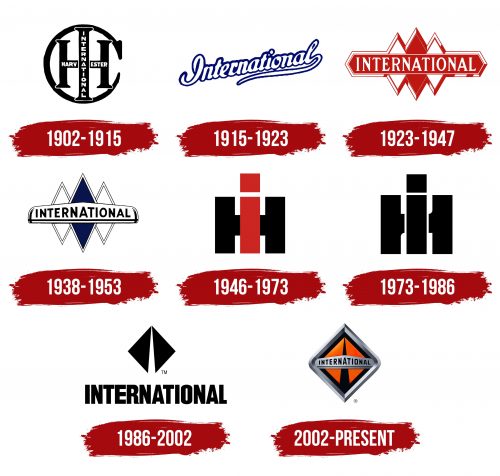
The first logo of International Trucks was compact and unique, reflecting the brand’s essence. The logo featured the initials of the company name, International Harvester Company, interwoven with each other. This design showcased the emergence of a new brand formed by merging three separate manufacturers, a significant milestone in the company’s history.
The letter “C” in the logo was stylized as a sickle, highlighting the primary focus on agricultural machinery. This was crucial as many customers associated the company with agricultural equipment. The full company name was inscribed directly on the letter forms to avoid customer confusion. “International” was placed on the “I,” and “Harvester” was on the “H.”
1915 – 1923
When the company expanded to include plows and tractors, the word “Harvester” became less relevant. The new logo reflected this shift in focus. The word “International” took center stage in the logo, rendered in white letters with a blue outline, emphasizing innovation and technical achievements.
This change carried several important meanings. First, the white letters symbolize purity and reliability, which are crucial for agricultural equipment buyers. The blue outline added a touch of technology and modernity, highlighting the high standards and advanced technologies used in production.
The continuous writing of “International” indicated the company’s commitment to a unified style and direction. Despite the expanded product range, the company remained dedicated to its core mission—producing high-quality agricultural machinery for farmers and agricultural enterprises.
1923 – 1947
Three sharp triangles on the crossbar represent the teeth of a harvester, highlighting the company’s focus on harvesting equipment. These elements are surrounded by a broad white outline, indicating safety and improved mechanisms. The red shades of the triangles signify the speed of processing and sharp edges, promising farmers ease in their work.
The logo’s center features “International” in bold white capital letters, emphasizing the company’s growth, expansion, and ambition to lead agricultural machinery production.
The company is developing and constructing a new plant, symbolizing its commitment to innovation and expanding production capabilities.
1938 – 1953
The teeth on the logo remain, but the crossbar is now shaped like a thresher, highlighting the mechanical precision and functionality of the company’s products. The color scheme has changed to white and blue, emphasizing the reliability and durability of the company’s products.
The white emblem represents purity and innovation, reflecting the brand’s drive for new developments and technological improvements. Blue signifies stability and professionalism associated with high-quality work and product performance.
The emblem showcases the company’s various products, from agricultural machinery to more complex mechanical systems.
1946 – 1973
By the end of World War II, the famous brand logo emerged, becoming a symbol of International Harvester for many years. The manufacturer returned to the original idea of overlapping letters. In the new version, the letter C was excluded. The letter H was in black, and I was in red to differentiate the symbols. This design element resembles a top view of the company’s most famous products – tractors. This approach highlights the compactness and innovative design of the products.
International Harvester stood out in the market by producing versatile, compact machinery. Their equipment was designed for easy use in confined spaces, making it popular among farmers and small landowners. The equipment’s compact size and multifunctionality allowed it to perform various tasks, significantly increasing its value and demand.
1973 – 1986
Upon reaching the milestone of producing 5 million tractors, the brand updated its identity to reflect its achievements and future growth. The new logo features the letter “H” split into two halves with “i” in the center, symbolizing the correct direction and commitment to innovation.
The company began producing harvesters and made a significant move into tractor manufacturing. This decision proved successful and allowed the company to grow into a major force in agricultural machinery.
Today, the recognizable “H” and “i” letters have made the brand a symbol of quality and reliability for consumers.
1986 – 2002
The main figure of the logo is a diamond divided into two triangles. A white stripe appears between them, resembling an obelisk—a monument to the company’s numerous projects.
The sharp triangular shapes resembled the cutting parts of a reaper or elements of a plow. Together, they formed a modern sign, highlighting the company’s progressiveness. The two blades indicated the manufacturer’s division, with part transitioning to Tenneco and part continuing under the Navistar International Corporation brand.
At the bottom, the name was written in large black letters. The size testified to the company’s equipment’s popularity in the market and the transition to producing trucks and buses.
2002 – today
The International Trucks logo features a rhomboid pattern, a design element used since 1923 and updated in 2002. The rhombus is framed with a metallic border, giving it a three-dimensional look through different shades of silver. The inside is black, accented with triangles in a red-orange gradient. In the center, a plaque displays the company’s name, with the letters growing larger towards the middle, filling the space effectively.
The metallic trim modernizes the classic diamond pattern, connecting the company’s history with its current image. The red-orange gradient in the triangles adds energy and movement. The typography, with letters increasing in size, highlights the brand name and uses the space well.
The metallic border adds depth and a modern touch, linking the past and present. The varied silver shades enhance the three-dimensional effect, making the logo stand out. The black background contrasts with the vibrant triangles, adding a dynamic and energetic feel.
The central plaque with the company name, designed with progressively larger letters, naturally draws the viewer’s eye. This clever use of typography ensures the brand name is prominent and memorable.
