The Ioniq logo embodies the image of environmental purity and fresh air. The symbols convey a sense of lightness, maximum safety, and quietness—the main characteristics of the company’s cars. The emblem gives the impression of future technology already available for purchase today.
Ioniq: Brand overview
Launched by Hyundai Motor Group in 2015, Ioniq has become a standalone brand that produces environmentally friendly electric vehicles. The brand’s name, a fusion of the terms “ionic” and “unique,” emphasizes its commitment to innovation in battery technology and sustainable transportation solutions.
A year after Ioniq was founded, the first model, the Ioniq Hybrid, debuted. In 2017, this model was joined by two more variants – the Ioniq Electric and the Ioniq Plug-in Hybrid. The brand continues to expand the range of vehicles on offer, with the Ioniq 5 crossover being introduced in 2021.
Looking to the future, Ioniq is committed to expanding its lineup of eco-friendly vehicles. By the middle of this decade, the brand plans to offer more than 23 eco-friendly models, including hybrids, plug-in hybrids, and all-electric vehicles.
The Ioniq has carved a niche in the electric vehicle market due to its affordability, operational efficiency, and advanced technology. As of 2023, the brand has gained global distribution and sells its vehicles in more than 60 countries, with key markets ranging from its native South Korea to North America, Europe, and China.
The Ioniq could become a significant force in the emerging electric mobility landscape with its commitment to green transportation solutions.
Meaning and History
2016 – 2020
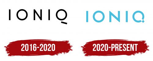
The first emblem of Ioniq was designed in black, which may not seem to align with an eco-friendly theme but emphasizes the company’s strong principles. The first model was a hybrid with an internal combustion engine, explaining the black choice. This represents the initial stage of transitioning to more sustainable technologies.
The next Ioniq model was a plug-in hybrid, followed by a fully electric model, demonstrating the progressive development of the lineup and the commitment to reducing emissions.
All letters in the name “Ioniq” are uppercase and written in a thin, airy font, symbolizing the brand’s goal of minimizing environmental impact. The last letter, “Q,” has a unique feature with a missing crossbar. It hints at the absence of an exhaust pipe in the company’s cars, emphasizing their eco-friendliness and shift to electric technology.
The name Ioniq combines the words “ion” and “unique,” highlighting the company’s unique approach to car manufacturing and its innovative nature.
2020 – today
With the release of the hybrid Ioniq Blue model, the company’s logo was updated to emphasize the brand’s eco-friendly focus. This step aimed to minimize environmental impact. The hybrid Ioniq Blue was highly fuel-efficient, consuming only 4 liters per 100 kilometers, significantly reducing harmful emissions.
This move established the company as a brand using advanced future technologies. The Ioniq Blue emblem was redesigned to symbolize ecological purity and innovation. The name “Ioniq” is in capital-light blue letters, representing fresh ideas, reliability, and progress. All letters are standard except for “Q,” which looks like a ring with a hole and a small square protruding from it. The light blue color reinforces the car’s eco-friendliness and modern appeal. It reflects the brand’s commitment to sustainability and forward-thinking technology. The distinctive feature of the “Q” in the logo, with its white and blue squares, evokes the image of a special plug covering the exhaust pipe, symbolizing the shift to clean electric energy.
The emblem visually represents the storage and use of clean energy, similar to how batteries store electricity. This design choice highlights the company’s commitment to developing environmentally friendly vehicles and pursuing a sustainable future.


