


![]() IRCTC Logo PNG
IRCTC Logo PNG
The logo’s elements showcase the company’s three business lines, built around travel and the road. The IRCTC logo is modern and stylish. This shows that services are delivered at the highest level, leveraging advanced technologies.
On September 27, 1999, the Indian government created the Indian Railway Catering and Tourism Corporation under the Ministry of Railways. The goal was to address long queues, opaque booking, and intermediaries charging high commissions. M. N. Chopra became the first chairman. Initially, the company focused on catering, while ticket digitization came later.
On August 3, 2002, IRCTC launched India’s first online railway booking portal. Internet access was limited, and trust in e-commerce remained low. Yet, the system expanded from a small set of trains to nationwide coverage within a few years.
In 2003, services expanded to include Tatkal booking, mobile ticketing, and onboard catering. In 2007, IRCTC introduced an e-wallet in partnership with the State Bank of India. In 2008, it received “Miniratna” status, granting it greater operational autonomy.
In 2011, the Shubh Yatra loyalty program was introduced, followed by the Rolling Deposit Scheme in 2012. By 2013, IRCTC added flights and hotels, entering competition with MakeMyTrip and Yatra while retaining a monopoly on rail tickets.
Tourism projects included pilgrimage routes and the Maharajas’ Express. In 2016, a lightweight website was launched, and in 2017, the Rail Connect app appeared, alongside Tejas Express train operations.
After the removal of service fees in 2016, losses rose, prompting the introduction of new revenue streams through agency commissions. In 2019, IRCTC held an IPO on the National Stock Exchange that was heavily oversubscribed. By December 2023, the platform had 66 million users and about 730,000 daily bookings. In March 2025, it received Navratna status.
Meaning and History
IRCTC currently operates four Tejas Express high-speed trains under the state-owned company Miniratna. Before that, passengers had huge nutritional problems during long train journeys. They had to leave the trains and quickly buy whatever they needed at stations with only minutes to stop. Poor-quality, unsanitary food led to even more serious problems in the country. And short exits from the carriages ended with panic and storming of the station’s food stalls.
After the launch of the catering and tourism project, pantries and kitchens appeared on medium- and long-distance trains, serving passengers with freshly prepared high-quality dishes. This was a real revolution in Indian railroads.
What is Irctc?
IRCTC is an abbreviation for the Indian Railway Catering and Tourism Corporation, which specializes in tourism, catering, and ticketing in the rail industry. The organization was formed in 1999 and is subordinate to the ministry.
Also, the company has gradually expanded its services into related areas. She was the first to offer to book train tickets through her website. Over time, other sources of orders were added: using phones via SMS, GPRS, and Wi-Fi. Now the population can book not only electronic tickets but also real ones, with delivery by mail. And for suburban routes, special passes are sold. The firm has also implemented a Shubh Yatra program for frequent train travelers.
Against the background of the measures taken, which became innovative for India, the Indian Railway Catering and Tourism Corporation logo is perceived as no less revolutionary. It has more than one color, is structurally complex, reflects the company’s key direction, and includes its main symbols. Since this is a young organization, it has only one brand name.
Font and Colors
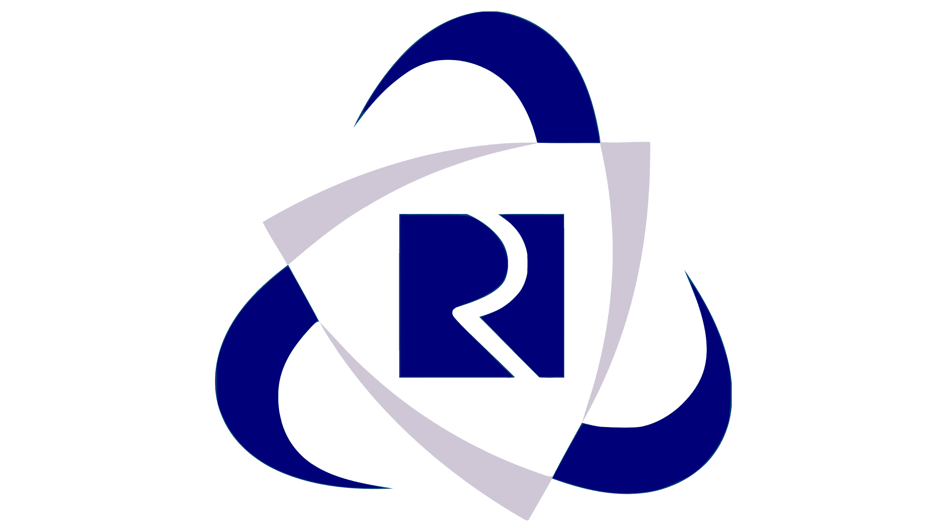
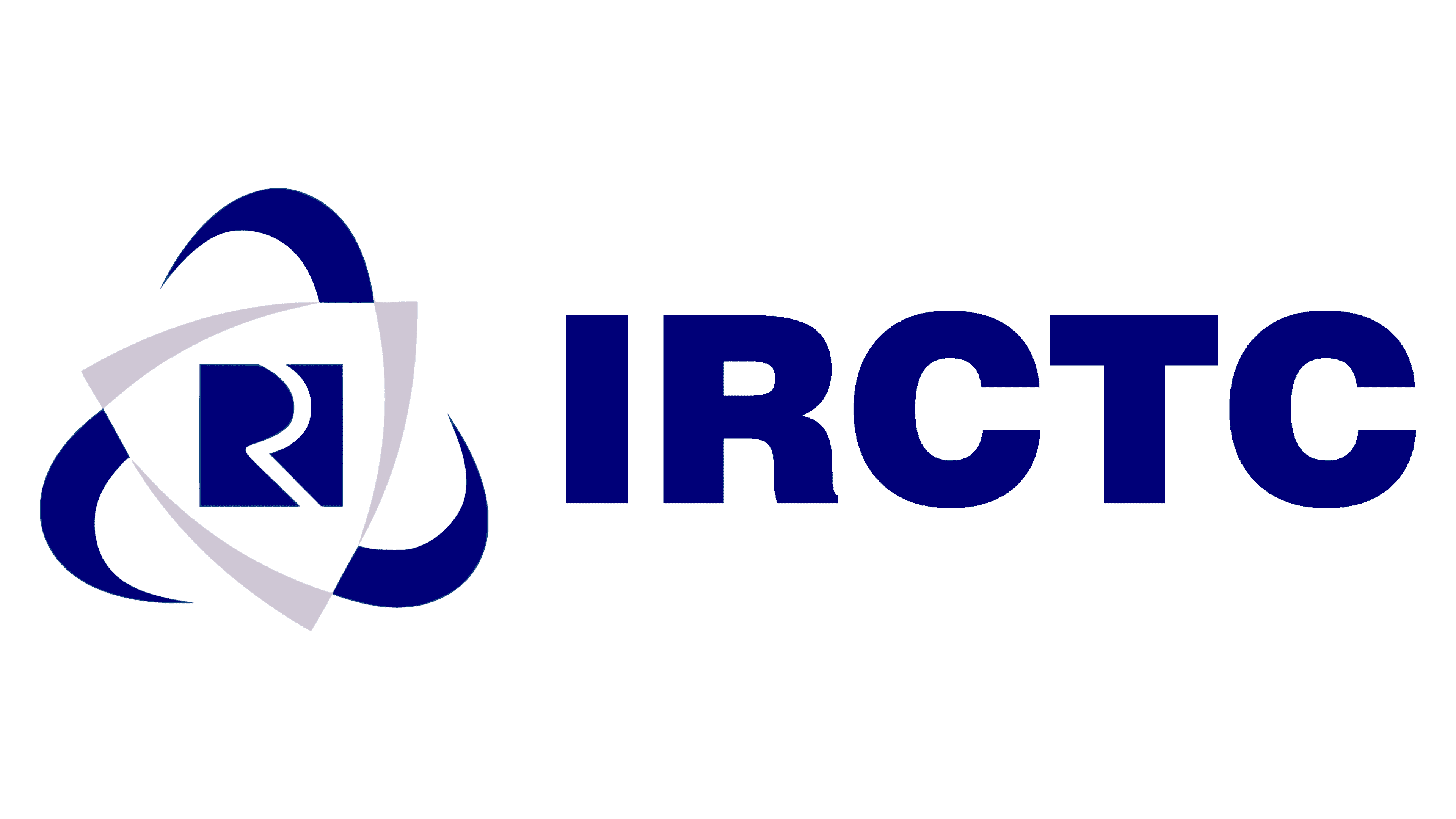
The centerpiece is the “R,” an abbreviation for “Railway.” The letter is half-hatched and lacks a left half, so it appears as a thin railroad symbol on the map. It is located on a dark blue square and connects to its background at the entry and exit points.
Then, two triangles with convex sides are shown. Geometric shapes differ in size. Therefore, they are harmoniously inscribed into each other. The small triangle is white; the large one is gray. They are located on an impromptu fan propeller, which is extremely important to the company because it was the first to provide trains with improved comfort and air-conditioning systems. The three blades look like hooks because of the color contrast.
Under the graphic symbol is the company’s abbreviated name, IRCTC. It is an acronym for Indian Railway Catering and Tourism Corporation. The letters are straight, thin, large, and centered, which does not upset the balance of the emblem’s elements.
The inscription in the logo is set in a smooth, grotesque typeface with an even balance of rounded and sharp lines. All characters are in upper case and have a mid-character breakdown. Although there are three colors in the emblem, white is not considered corporate and only acts as a background for the other two – Navy Blue (# 000075) and Chinese Silver gray (# CCC7D2).
FAQ
What is the symbol in IRCTC?
The symbol on IRCTC train tickets is a mix of numbers and letters that detail the train and travel arrangements. A typical symbol looks like “12345/S1/42.”
In this example, “12345” is the train number. Each train has a unique number, which helps with booking, scheduling, and tracking.
The part “S1” shows the coach type and number. “S” means sleeper class, and “1” is the specific coach. Other classes use different letters, like “A” for AC (air-conditioned) and “G” for general.
The “42” is the seat or berth number. This helps passengers find their assigned places.
This system makes train travel organized and efficient. It helps passengers easily find their trains, coaches, and seats.
What are IRCTC’s logo and tagline?
The logo and tagline reflect its mission and extensive reach. The current tagline is “Lifeline of the Nation,” emphasizing the brand’s vital role in connecting people across India. This phrase underscores the importance of the railway network in the daily lives of millions, facilitating travel and transportation across vast distances.
The logo visually represents this extensive connectivity. It depicts a network of railways spanning the entire country, symbolizing the comprehensiveness and reach of the Indian railway system. This logo-and-tagline combination communicates the essence of the brand.
What is the Irctc logo?
The IRCTC logo is modern and represents the organization’s network. It features the name in bold, wide letters, making it clear and easy to read.
Alongside the name is an emblem within a triangular shield. In the center, a white “R” fragment appears on a blue square background, surrounded by three blade-like shapes. These elements give the logo a dynamic and forward-moving feel.
The design reflects the brand’s commitment to connectivity and movement, showing its role in linking different parts of the nation. The triangular shield and blade-like shapes convey strength and reliability.
Is IRCTC an Indian company?
Yes, it is an Indian company operating under state control. Since 2019, its shares have been traded on the stock exchange. Despite being publicly traded, the brand remains a government-owned entity serving the nation and its people.
The company manages catering, tourism, and online ticketing for Indian Railways, an essential part of India’s transportation system. Its state-controlled status ensures it meets government objectives and public service commitments, providing reliable services to millions of passengers.
Becoming a publicly traded company in 2019 allowed IRCTC to raise capital and expand operations.
Which is the official site of Irctc?
The official IRCTC site is www.irctc.co.in. This state-owned enterprise under the Ministry of Railways uses this site to book train tickets, manage travel plans, and access various services.
Another site, www.irctc.com, exists, but the primary and most used site is www.irctc.co.in. On this site, users can book tickets, check train schedules, explore tourism packages, and access catering services. It serves millions of passengers daily and has a user-friendly interface for easy travel planning.
The .co.in domain signifies the site’s official status, ensuring users get reliable information and services directly from the brand. The website’s design and functionality show the commitment to providing accessible services to travelers across India.