![]() Iron Maiden Logo PNG
Iron Maiden Logo PNG
The aggressive logo of Iron Maiden is well-justified, as the band’s main musical direction is heavy metal. The emblem has a tough style, not tolerating alternatives, but is extraordinarily similar to the design of an ancient Greek ornament. Its bright color makes it energetically saturated.
Meaning and History
![]()
The Iron Maiden logo did not appear immediately upon the band’s formation, but five years later, when its debut studio compilation was released. This happened in 1980. The emblem’s appearance has hardly changed, and it has been adorned on several music albums: besides the 80th year, it also appeared in 1995, 1998, 2010, and 2015. Although the design was slightly different each time, the overall style was consistent.
Therefore, the modernization undertaken hardly affected the personal style of the British musicians, as the adjustments concerned only the length of the letter legs and the transition from a subdued palette to a bright one. That is, even though the group’s composition was often updated, the emblem remained faithful to the basic form.
What is Iron Maiden?
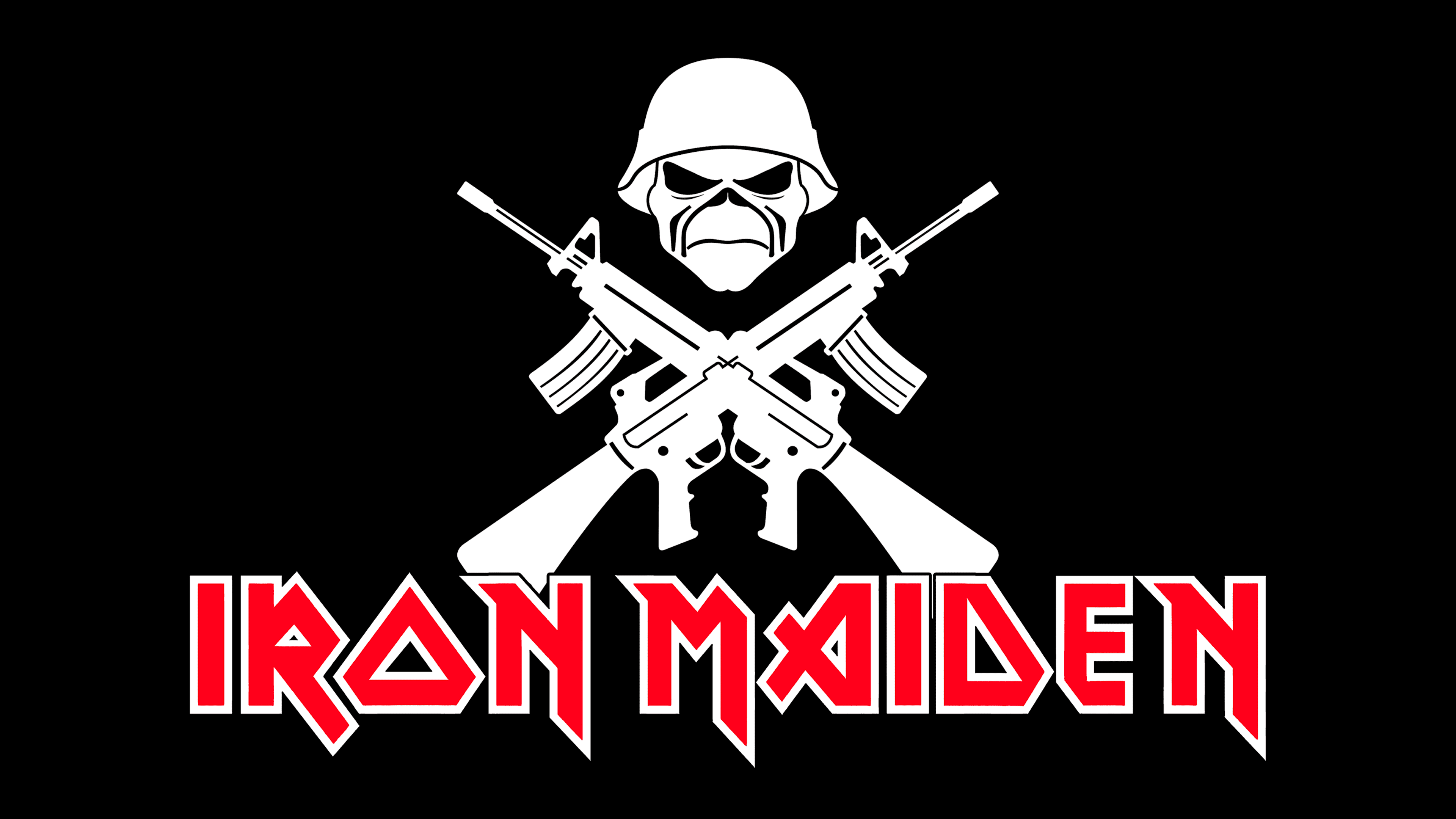
Iron Maiden is a cult British heavy metal band, helping revive the country’s modern heavy metal scene. It emerged in London in 1975 and still resides there. Its creativity strongly influenced global music trends, as the group’s tracks often accompany video games. Its founder, ideologist, and linking element is Steve Harris.
1980 – 1998
![]()
The Iron Maiden logo features only one element: the music group’s name. It fully corresponds to the heavy metal style because:
- consists of geometric letters with sharp transitions;
- has sharp angles and rigid cuts;
- maintained in an aggressive and technical style;
- painted in a provocatively red color.
Glyphs are outlined with a double black-and-white frame. Such a border makes them more expressive and catchy. And the unusual configuration underlines the extraordinary nature of the group, which challenges society. The legs of the letters are elongated and resemble knife blades.
1998 – 2015
![]()
The minimal amount of sharp details transformed the logo into a more “docile” symbol. It appears less technical and is perceived as more creative, with emphasis placed on the original external form rather than the aggressive internal energy. The letters don’t have long, extended legs downwards, but some have a hint of serifs: for example, “N” and “M.” The color scheme is red-black-white, with a slight powdery hue that balances the logo, taming its excessive dynamics.
2015 – today
![]()
As the main logo, a version with elongated downward legs with sharpened ends was chosen. The band returned to the original design developed by Dennis Wilcocks, with support from London W1, Rathbone Place, and Crowes Art Studio. It aligns more accurately with their name, inspired by the Dumas novel “The Man in the Iron Mask.” In this case, the mask reminded Steve Harris of the torture device “iron maiden,” which excellently characterizes the aggressive drive of heavy metal.
Font and Colors
The Iron Maiden emblem uses the Metal Lord font. The letters are uppercase, geometric, with an authoritative appearance and angular lines. They perfectly harmonize with the band’s powerful energy, the intense heat of their songs, and the internal dynamics of the melodies.
The color scheme resonates with the inscription’s aggressive style. It consists of a fateful combination of red (predominant in the emblem), black (used for thin bordering lines), and white (serving as the background).