


![]()
The company Irys, formerly known as Bundlr Network, has unveiled a renewed identity created by the Ohio-based studio Studio Freight. The project focuses on working with data in combination with Web3 and artificial intelligence, which has enabled it to secure a strong position among technology startups. However, the previous visual identity was too standard and did not accurately reflect the company’s character.
The old logo was based on geometric shapes with strict lines. It looked rational and technical, but did not help it stand out among dozens of projects with similar graphics. It suited the early stage of development, when the key task was to demonstrate the technology’s reliability, but it was not suitable for further growth.
![]()
The designers at Studio Freight sought inspiration in an unusual cultural direction. They turned to Japanese animation of the 1990s. They were interested not in a direct visual borrowing of style, but in the atmosphere associated with the energy of cartoons and video games of that era. The cultural reference made it possible to build an identity understandable to an audience that grew up on anime series and gaming consoles.
The new logo is based on the WT Skrappa Wide Italic typeface. The slanted, massive letters resemble titles from animated series about mecha robots or covers of cult video games. The lines of the characters appear cut from metal, giving the logo a sense of strength and dynamism.
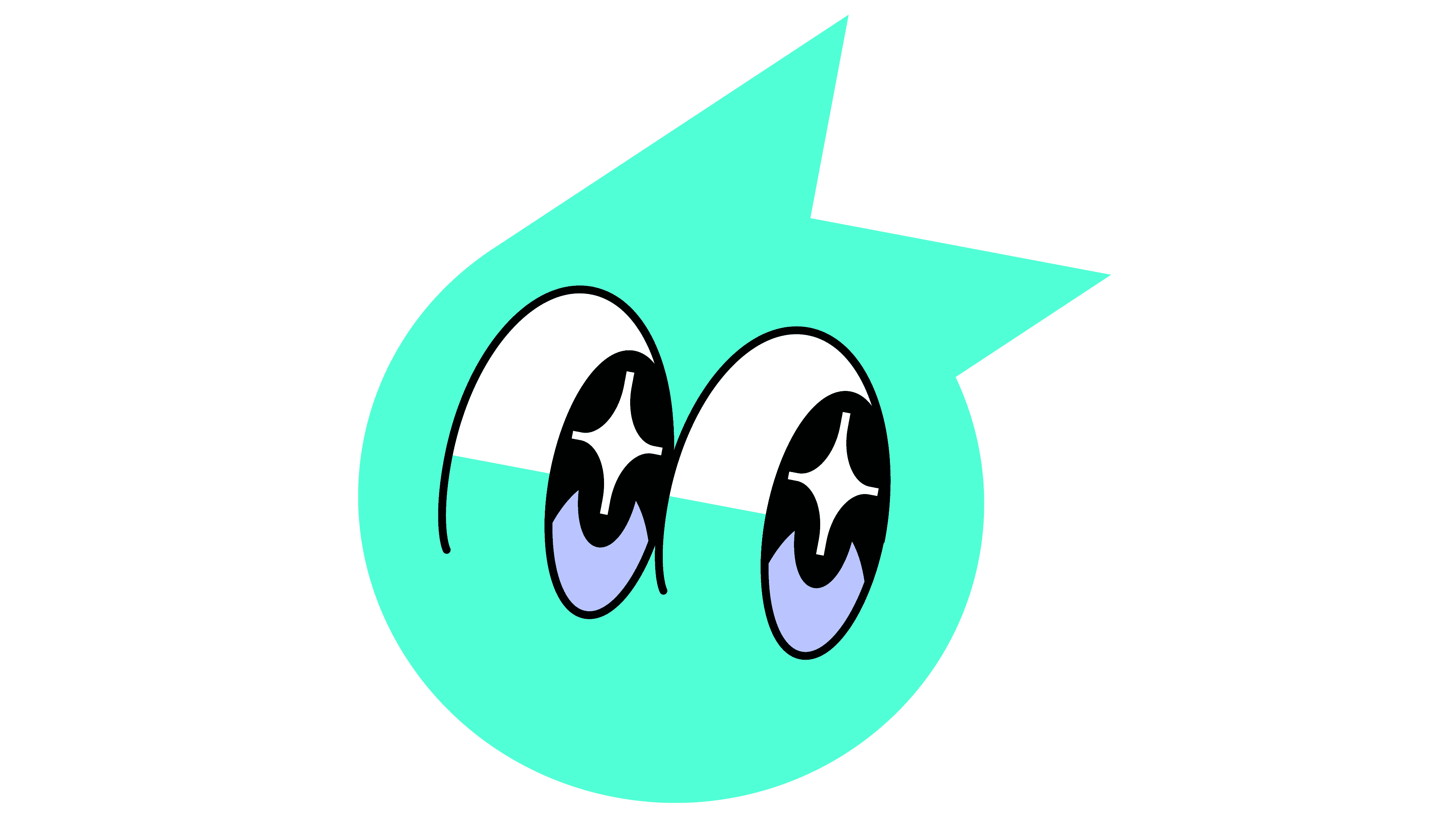
The brand color has become bolder. The palette includes neon shades and saturated contrasting combinations, evoking associations with club posters and magazine covers about Japanese culture. The palette makes the visual system energetic and youthful.
The visual language has been expanded through the use of graphics styled after game interfaces. The illustrations resemble sprites, diagrams, and schematics of mechanisms similar to those found in mecha robot constructions from anime. Such techniques help explain the work of Irys technologies through cultural metaphors familiar to the audience.
The typographic system is built on a combination of two typefaces. Headlines are set in Skrappa, which adds expression. For longer texts, GT Pressura is used, a strict typeface with a technological character. Their combination forms a balance between playfulness and serious engineering.
A separate direction is associated with the use of neural networks to generate visual textures. They create the atmosphere of digital space, supporting the concept of a project connected with blockchain and data processing. The textures add depth and form a unique aesthetic.
![]()
The renewed system goes beyond the templates familiar to the IT industry. It uses a cultural context close to the audience that grew up during the heyday of Japanese animation and gaming technologies. Irys stands out among technology companies, boasting an image as a project at the intersection of innovation and culture.