The ISO Rivolta logo is rooted in the past and highlights the company’s Italian heritage. With a lion’s strength and an eagle’s speed, the company has secured third place in the country’s market, producing cars, household appliances, and scooters.
Iso: Brand overview
Established in 1939 by Renzo Rivolta in Bresso, Italy, Iso initially focused on creating refrigerators and scooters. However, under Rivolta’s guidance, the company saw a significant shift in direction in the early 1950s. He pivoted to producing high-octane sports cars, drawing the company name “Iso” from the Greek term for “equal,” symbolizing the balanced number of cylinders in their engines.
Iso made its grand entrance into the automobile arena in 1962 with the release of the Iso Rivolta IR 300, a lavish grand tourer equipped with a Chevrolet V8 motor. The company rose to broader acclaim in 1965 upon unveiling the Iso Grifo, a sporty coupe penned by famed designer Giorgetto Giugiaro. This model could reach up to 160 miles per hour by boasting Chevrolet Corvette engines.
During the late 1960s, Iso diversified its offerings by adding luxurious sedans like the Lele and the Fidia. At its peak, the firm rolled out nearly 1,000 cars each year. Unfortunately, the 1974 oil crisis and financial woes led to the company withdrawing from the auto-making business after crafting roughly 5,000 vehicles.
Businessman Ivo Pera acquired Iso the same year, briefly resuscitating its motorcycle division. This revival, however, was short-lived, and the enterprise ultimately shuttered in 1990. Today, vehicles produced by Iso during its heyday are treasured as collectibles, epitomizing the zenith of Italian automotive artistry and performance during the 1960s and ’70s.
Meaning and History
1953 – 1955
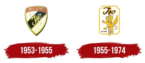
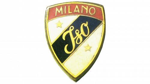
The first logo of ISO Rivolta was shaped like a shield, a common design for car brands of that era. The shield symbolized strength and reliability, reflecting traditions and heritage. The red and white colors honored Milan, the city where the company’s production facilities were located. Red represented energy and passion, while white stood for purity and perfection. The city’s name was written in gold at the top of the logo, emphasizing the company’s connection to Milan and its Italian origins.
A victory ribbon ran diagonally across the shield, displaying the brand name. This ribbon symbolizes the company’s achievements and victories, showcasing its drive for excellence and success in the automotive industry. Golden stars at the top and bottom of the logo highlight the manufacturer’s outstanding accomplishments. These stars served as a reminder of the company’s recovery after the war and the loss of its offices during bombings, marking its resilience and continued growth.
The name Iso remained from the original brand Isothermos, symbolizing the company’s continuity and stability.
1955 – 1974
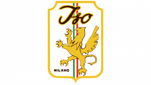
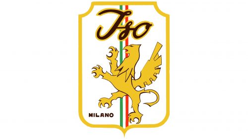
The emblem underwent significant changes, with the third attempt to revive the company as Iso Rivolta. The new emblem mirrors the coat of arms of Milan, highlighting the founder’s connection to his hometown. The name of Milan appears in the lower left corner, emphasizing the company’s Italian roots. The central part of the emblem features stripes in the colors of the Italian flag—green, white, and red—reflecting the founder’s deep patriotism and commitment to national traditions.
The emblem’s forefront showcases a rearing griffin, a blend of a lion and an eagle, representing the kings of beasts and birds. This symbol embodies the extraordinary spirit, determination, and success of the Iso Rivolta brand. With its power and nobility, the griffin is an ideal emblem for a company striving for excellence in the automotive industry.


