


![]() Jacobs Logo PNG
Jacobs Logo PNG
Just as gold is worthy of kings, coffee, represented by the Jacobs logo, has gained worldwide recognition. The emblem conveys the history of green beans, which, after roasting, acquire their distinctive color and flavor. The package contains only a natural product of the highest quality.
Meaning and History
![]()
The history of this brand began with a store opened by Johann Jacobs in the central part of his native city. A 26-year-old merchant traded coffee, chocolate, biscuits, cocoa, and tea. When he studied the craft of a salesman for several years, he was often assigned to roast coffee beans and taste coffee samples, as he turned out to have exceptional taste.
His store became the basis for a large-scale company that gained worldwide recognition thanks to the unique black-and-gold palette chosen as its personal identity. So, in 1907, Johann launched his own coffee-roasting company and began delivering it to the nearest settlements.
In 1913, he registered the Jacobs brand, and in 1929, he brought his nephew, Walther J. Jacobs, into the business. In 1934, they founded a large coffee roaster in Bremen. The company then merged with the French firm Chocolat Suchard to form Jacobs Suchard. This happened in 1982.
Almost ten years later (in 1993), Jacobs Suchard became the property of Kraft Foods. After a series of transitions, the Jacobs Douwe Egberts Corporation took over the brand. That is, today, Jacobs is part of a global structure that preserves its authenticity and sells products in more than 100 countries. As a result, it ranks second in popularity worldwide, second only to Nestlé.
Despite mergers and acquisitions, this brand has managed to remain original and retain its coffee taste and style, which consists of a word mark and a golden-black palette. They appeared at the very beginning of the brand’s life and have undergone many transformations. And there were ten of them.
What is Jacobs?
This well-known coffee brand is owned by JDE Peet’s and is especially popular in European and Eastern European markets. It offers a wide range of coffee products to suit different taste preferences. The brand’s lineup includes instant coffee, coffee capsules, specialty blends, and classic roasted and ground coffee, each crafted to deliver a rich taste and full aroma. The brand’s ability to maintain a unique flavor across all products, from whole-bean instant Millicano to the signature Krönung blend, and to deliver high quality regardless of preparation method, sets it apart in the market.
1895 – 1944
All this time, the company has been developing and has eventually turned from a small city store into the largest international coffee company. She mainly focused on the products’ taste to preserve authentic notes. Her identity came second, so a permanent, recognizable logo appeared a little later. At that time, the company owned a coffee roaster in Bremen and delivered goods to consumers in their cars.
1944 – 1964
![]()
Then the emblem with the inscription “Jacobs Kaffee” reigned for twenty years. She was black and expressive. The logo’s authors divided the words, placing them in opposite positions above and below. A marked sack occupied the central place, presumably filled with grains. Surrounding it was an oval with gear-like protrusions, a hint of ground coffee. The brand name was written in large, upper-case print and outlined in thick lines. The palette was dominated by only two colors – black, inspired by coffee beans, and yellow, reminiscent of golden foam in a cup.
1964 – 1970
![]()
In 1964, the emblem was simplified: the designers removed the bag from the label, leaving only the name. But they regrouped the inscription: they brought the words closer together, placing them in two lines. The upper part was written in black letters on a white background, the lower part was written in beige on dark brown. The developers also changed the font by simply drawing out the letters. However, they kept the style.
1970 – 1987
![]()
This period is legendary because it was during this period that a miniature crown appeared on the Jacobs logo. It was placed at the top, above the first word of the trademark name, and was set in a separate field painted in golden beige. The inscriptions are located below. However, the designers changed the last word drastically: they typed it in an italic handwritten font. The letters were thin, calligraphic, with a curl at the “K” and curly “ff,” from which a graceful loop went to the right.
1987 – 1990
![]()
Almost no changes were made. The authors only finished the upper, sharp-angled ledge on the white stripe with the word “Jacobs,” rounding the letters. The lower inscription remained golden.
1990 – 1995
![]()
In 1990, the emblem was radically modified. The developers proposed the simplest possible version for the label: with text and a schematic drawing. The letters in the word “Jacobs” became wide, golden, with a slight black shadow in the form of thin lines. The word “Kaffee” was changed to French and spelled “Kafe” with a diacritic over the last vowel. To the right was a cup on a saucer filled with steaming coffee.
1995 – 2000
![]()
The word “Cafe” was removed from the label. A hint of it remained in a cup without a bottom, depicted above the brand name and located between two thin stripes. The “Jacobs” inscription has become pronounced gold, with a sheen in some places. Below it was placed a curved line – a hint of steam from a hot drink.
2000 – 2010
![]()
The next stage in the emblem’s evolution introduced a concise version in which all elements were simplified except for the word “Jacobs.” It was thin, black, elegant, with a cursive “J” and a red swirl of impromptu steam.
2010 – 2013
![]()
The golden background was removed during this period, and another vertical winding strip was added – a hint of hot, freshly brewed coffee.
2013 – 2017
![]()
The designers were forced to add a shadow to the letters to restore the logo’s golden hue. The “Jacobs” lettering was three-dimensional, with a slight golden sheen along the right edge of each letter. Moreover, the font was also redesigned: the developers pulled it up, changing the shape of some characters. For example, in “C,” they removed the rounding at the ends.
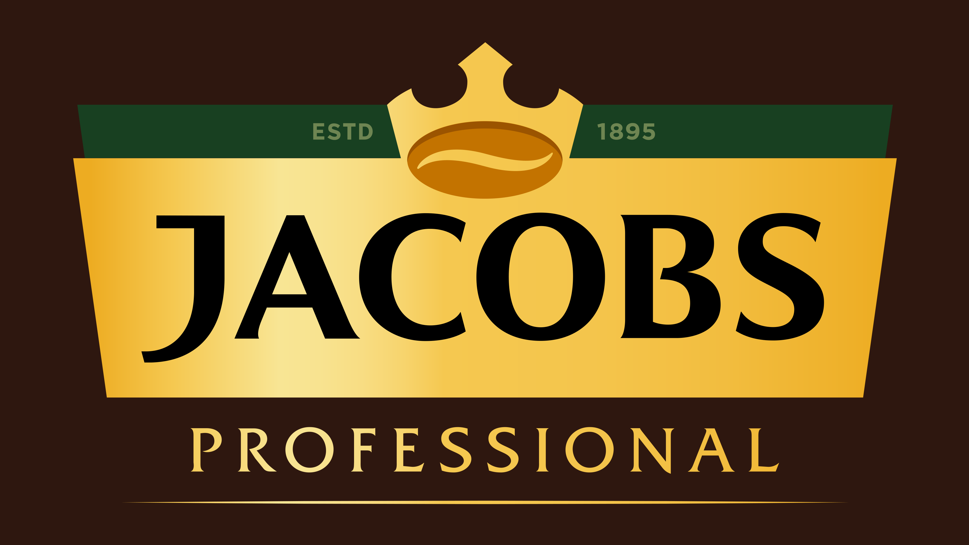
2017 – today
![]()
The current logo consists of two zones. The top shows a crown combined with a coffee bean. On a dark green background, the year the brand was founded is marked on the right and left. At the bottom is the company’s name in the usual black color. It is set against a golden background, with a slight highlight on the left.
Font and Colors
Its evolution consisted of the periodic appearance and disappearance of the crown, cup, steam, and golden background. Now the logo retains only the authentic colors and the original appearance of the monarchical attribute. The letter “J” resembles the cup’s right side.
The inscription is set in an individual sans-serif typeface. They appeared only between 1990 and 2000. The rest of the time, the grotesque was used. In later versions, the designers adapted the first letter of the name to fit the right side of the cup. The beginnings of such stylization were laid in 2000 and continue today. The basic colors of the corporate palette are gold, black, and dark green.