


![]() Jacuzzi Logo PNG
Jacuzzi Logo PNG
The Jacuzzi logo, like the name, seems musical, though there is no obvious connection to the art form. The producer of saunas, whirlpools, and spa pools used a refined logo to represent its Italian heritage and its loyalty to an extravagant style.
Jacuzzi began with seven brothers from the Jacuzzi family, who left Casarsa, Italy, and settled in Berkeley, California. In 1915, they registered Jacuzzi Brothers, Inc. and opened a workshop on San Pablo Avenue. Their first field was aviation. Rachele Jacuzzi worked near James Smith McDonnell, later cofounder of McDonnell Douglas, and developed a wooden aircraft propeller known as the “Toothpick.” The design drew attention from U.S. military buyers and was used by pilots, including Charles Lindbergh.
After World War I, aircraft orders declined, and the company moved into agricultural pumps for California farms. Its deep-well pumps gave Jacuzzi a steady business for decades. In the late 1940s, Candido Jacuzzi’s son, Kenneth, was diagnosed with juvenile rheumatoid arthritis. To bring hydrotherapy into the home, Candido and company engineers created the J-300. This portable pump turned a bathtub into a therapeutic whirlpool. It went on sale in 1955 through pharmacies and specialty stores.
Hollywood changed the product’s image. Public support from Randolph Scott and Jayne Mansfield helped move the J-300 from medical use toward luxury living. In 1968, Candido Jacuzzi patented the Roman, the first built-in whirlpool bath with jets around the tub. Roy Jacuzzi helped develop the product and later became the public face of the brand. Larger models with heaters and filtration systems followed in the early 1970s, placing Jacuzzi ahead of American Standard and Kohler in the whirlpool bathing market.
The company moved its headquarters to Walnut Creek in 1976. In 1979, Jacuzzi Brothers was sold to Kidde Inc. for about $70 million. Hanson PLC bought Kidde in 1987, later placing Jacuzzi within U.S. Industries. In 2019, Jacuzzi was acquired by Investindustrial.
Meaning and History
![]()
At the time of its founding, the company had an exquisite corporate badge that has become an invariable symbol of high quality. It was used throughout Jacuzzi’s existence and remains relevant today. This feature of the visual identity emphasizes the company’s stability and its long-standing commitment to producing only high-quality products with excellent functionality. The lack of updates also serves as a tribute to the past and a respect for the unique invention that made the company famous worldwide.
Jacuzzi had a completely different specialization when it was founded (1915). The founders, Candido and Giocondo Jacuzzi, were engaged in the creation of wooden propellers. But the production was not successful. After that, a series of events followed that became prerequisites for creating the first built-in hot tub, a real breakthrough. Since that moment, the Jacuzzi brand logo has become especially recognizable.
The elegant emblem with the inscription and the original oval frame gradually became a symbol of new products, reflecting the influence of modern technologies. In addition, other messages are also visible in the attractive brand badge. The brand values its heritage, excellent reputation, and outstanding achievements. This is directly reflected in the font and coloring.
What is Jacuzzi?
Jacuzzi is a well-known brand that supplies exclusive sanitary ware to the market. The catalog includes hot tubs, sinks, toilets, showers, and chic home systems for spa treatments. Products are manufactured not only by the company itself but also by numerous subsidiaries (Zurn, Sundance, Astracast, etc.). A feature of the company is its Italian origin, evident in every detail of its products.
before 1965
![]()
1965 – 1970s
![]()
In 1965, the company introduced a new logo associated with its hot tub products. In the center was the word “Jacuzzi” in a custom font. And below was the phrase “WHIRLPOOL BATH.” Designers used sans-serif capital letters for it. The inscription was surrounded by bubbles and swirls, symbolizing the flow of water passing through the hydromassage system. All elements were black.
1970s – 2005
![]()
In the 1970s, Jacuzzi slightly changed the emblem, retaining the original concept. This time, a yellow ellipse with a black outline appeared against the black inscription “Jacuzzi WHIRLPOOL BATH.” The swirls are neater, the lines are thinner, and the bubbles are more pronounced. All this was associated with energy, comfort, and relaxation.
2005 – 2014
![]()
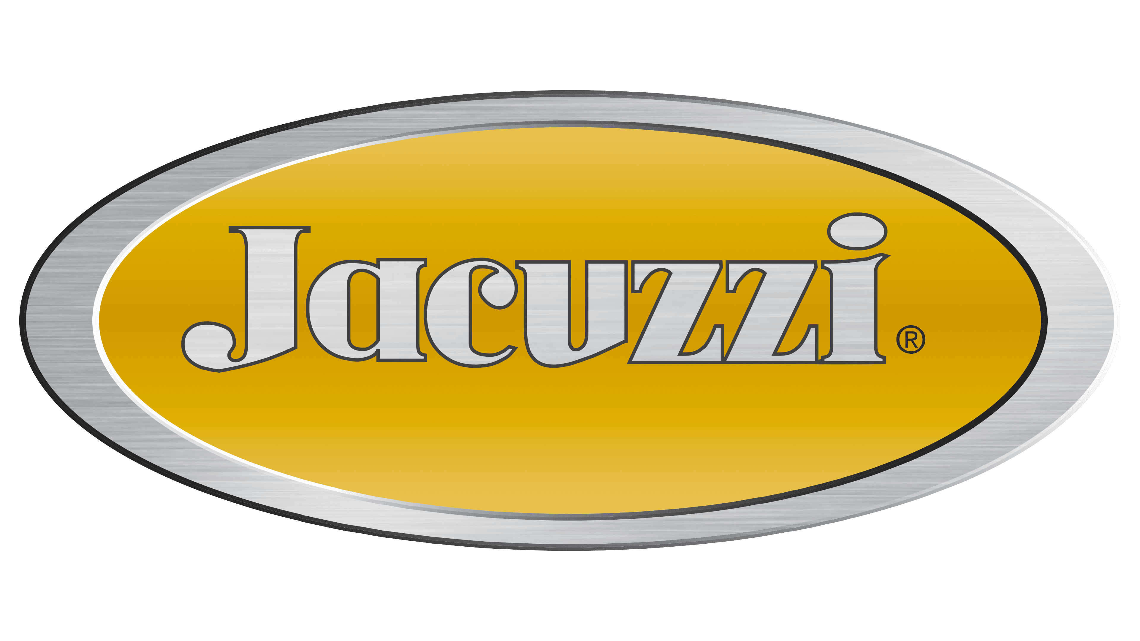
The logo, created in 2005, was different from previous versions. It contained only the brand name against a yellow ellipse with a wide border. The letters were made in silver color, using gradient fills and shadows, which gave the lettering a three-dimensional look. The same applies to the outer edging of the emblem. The noble metallic luster symbolized luxury and status – qualities that emphasize the prestige of the Jacuzzi.
2014 – today
![]()
The color scheme does not include bright, cheerful colors that distract from the main essence. It uses a classic, always-relevant palette of two traditional shades. They make the logo solid and quite expressive. This is especially evident in the combination of thin dark lines and a light background that occupies most of the space.
The predominance of a light shade demonstrates the company’s conscientiousness and honest intentions, as well as its special attention to product quality. Dark colors in the logo emphasize rigor, adherence to principles and standards, and the brand’s prestige. Dilutes the restrained color scheme with a non-standard font featuring beveled cuts on certain letters.
Font and Colors
The Jacuzzi brand logo is the perfect reflection of Italian motifs. They appear in an elegant font, classic coloring, and a detailed layout. The basis of the emblem is the company’s name, presented in a bewitching way. This effect is achieved through the use of the author’s font. Its distinctive features are:
- Unusual cuts in some of the letters.
- The presence of smooth dots.
- A rather old-fashioned shape.
Original smooth circles favorably complement the letters I, J, and C. Two Zs are decorated in a rather strict style and feature characteristic serifs. Additional decor can be seen in the letters J and U. They have a large diagonal cut that sets them apart from the general background. Despite the diverse designs within the same font category, the inscription looks quite harmonious and sophisticated.
The name itself is enclosed in a frame with lines of different widths. Both elements are finished in elegant black. It favorably distinguishes them and focuses on the brand name. In addition, black is associated with solid status and stability, which also characterizes the company. The white background in this context emphasizes honesty and a responsible approach to business.