


![]() Jaguar Logo PNG
Jaguar Logo PNG
Admiration and surprise arise upon seeing the Jaguar logo. The brand’s cars are stylish and cool. The emblem promises a quick start, speed, and stamina perfect for traveling without borders.
Jaguar traces its history to 1922, when William Lyons and William Walmsley founded Swallow Sidecar Company in Blackpool, England. The firm first made motorcycle sidecars, then moved into car bodies in 1927, mainly for the Austin Seven. In 1933, the company became SS Cars Ltd. and introduced the SS 1 and SS 2, known for stylish bodies and accessible prices. The Jaguar name first appeared in 1935 on the SS Jaguar.
In 1945, the company was renamed Jaguar Cars Ltd. to avoid postwar associations with the SS initials. Three years later, it launched the XK120, then regarded as the fastest production car in the world. During the 1950s, Jaguar built its racing reputation at Le Mans, where the D-Type took several victories. In 1961, the E-Type arrived and became one of the decade’s main British sports cars.
In the 1960s, Jaguar acquired Daimler and expanded its luxury range. Quality problems and economic pressure followed, and in 1975, the company separated from British Leyland. Under John Egan in the 1980s, Jaguar improved production standards and launched the XJ40. Ford bought the company in 1989 and funded the development of new models, including the XK8, S-Type, and X-Type.
In 2008, Tata Motors Limited acquired Jaguar and Land Rover from Ford for $2.3 billion and later merged the brands into Jaguar Land Rover. From 2010 to 2020, Jaguar expanded with the F-PACE, E-PACE, electric I-PACE, and F-Type sports car.
Meaning and History
![]()
William Lyons, the creator of SS Cars Limited, registered the name Jaguar Cars Ltd in 1938, but it did not come into effect until 1945. In the post-war period, the abbreviation “SS” was associated with the Nazi organization of the same name, so a rebranding was decided at the shareholders’ meeting. Simultaneously, the line of cars was known as Jaguar without the “SS” prefix, and it replaced its old abstract logo with an image of a leaping predator. This symbol was drawn from the bonnet mascot that appeared in 1938.
The first figurine was unsuccessful: William Lyons compared it to a cat driven off the fence. To create an “anatomically correct” version, the company owner entrusted the development of the radiator decoration to the sculptor Bill Rankin. The mascot was perfected by automotive illustrator Frederick Gordon Crosby and introduced in 1938. It also became the basis for most of Jaguar’s emblems.
What is Jaguar?
This brand has been part of the British holding Jaguar Land Rover Automotive PLC since 2013. But it appeared much earlier, in 1935, when the manufacturer of motorcycle sidecars, the Swallow Sidecar Company, introduced its first car, the Jaguar. It is planned that, starting in 2025, only electric cars will be produced under this brand.
1922 – 1935
![]()
The Swallow Sidecar Company logo reflects the spirit of the era when sidecar motorcycles were popular. The brand, which later transformed into Jaguar, began with these sidecars, and its symbolism conveyed a sense of movement and lightness.
In the center is a deep-blue circle with a red border. The inscription “Swallow Sidecar Company” is set in elegant, golden-hued italics.
On the sides of the central circle are large, stylized wings with detailed feathers. They echo the aviation aesthetic when streamlined shapes and flight motifs were popular in car and motorcycle design.
The font is italicized, the inscriptions add elegance, and the varying letter sizes make the text expressive and emphasize the company’s name.
1935 – 1945
![]()
The SS Cars Ltd logo continues to build on the visual style used by Swallow Sidecar, but with clear changes reflecting the brand’s transition before becoming Jaguar.
The main element is a hexagonal emblem in the center. Earlier, the round shape of the Swallow Sidecar logo was associated with classic automotive and motorcycle traditions. The hexagon signified technical rigidity and a strict engineering basis in that case. The hexagon symbolizes strength, precision, and reliability, which echoes the company’s car-creation approach.
Inside the hexagon are two symmetrical letters, “SS.” Unlike in the previous visual, where the name Swallow Sidecar was written in full, it is shortened to its initials here. The letters’ style has changed; they have become more elongated, with sharp edges reminiscent of lightning or dynamic lines.
The wings, which previously depicted lightness and elegance, took a different shape. They are more structured, have several clear layers, and look more massive.
At the bottom, the word “JAGUAR” appears for the first time, signaling future branding changes. It is located on a ribbon resembling the tail section, wings, or an element of a military emblem. The inscription’s font is clear and accurate, emphasizing the company’s new image.
If blue and red once prevailed, a golden-brown shade now dominates, conveying luxury and prestige.
The changes prepared the company for the next stage, transforming it into Jaguar, the brand.
1945 – 1951
![]()
The Jaguar logo of this period completed the transition from the former symbols of SS Cars Ltd to a new name that no longer connected with the pre-war past. William Lyons’ decision to drop the acronym “SS” in favor of “Jaguar” was a response to the historical context and a step towards creating a new image for the company.
The main element is stylized wings that extend to the sides; unlike the previous version, where the wings were more massive and layered, they are now more elongated, with clear parallel lines reminiscent of aviation signs or racing symbols. These changes made the logo visually lighter.
In the center is a hexagon inscribed with “JAGUAR.” Unlike the old emblems, where the letters “SS” were here, the name has completely replaced the former brand identity. The contours became rougher, and the font took on angular, slightly uneven shapes.
Underneath the main element is a section resembling feathers or ribbed detail, similar to elements of aircraft or racing cars of that era. These elements complemented the overall image, resembling military and sports signs, which were in keeping with Jaguar’s status as a high-end car manufacturer.
1951 – 1957
![]()
The Jaguar logo in this version is a clean text emblem, a step towards a concise, confident, high-status brand design. The rejection of symbols such as wings and heraldic details made the name a major visual accent.
The serif font emphasizes classicism and aristocracy, echoing the traditions of the British automotive industry. The contrast between the thick and thin lines of the letters creates a visual rhythm, adding rigor and sophistication to the logo. In such details, you can feel the influence of typography, which is typical for elite brands.
The spacing between letters is chosen to make the text look balanced and easy to understand.
1957 – 1965
![]()
The logo in this design is another step in the evolution of the corporate identity. Wings are a thing of the past, with no additional symbols, only the name, but now with slight changes in the shape of the letters.
The font remained classic, with serifs, but the lines became more confident. They have a balance between traditional and modern presentation. Serifs are not overloaded with details but only add expressiveness to the text. This is no longer a text but a brand name, in which there is no superfluous.
The letters are slightly stretched horizontally. The style makes the visual appearance massive but not heavy. It’s like a sports sedan, wide, squat, ready to move.
The proportions are even; without distortions, everything is verified. Even without the patterns and complex elements, this logo conveys Jaguar’s character: a combination of elegance, power, and confidence.
1965 – 1966
![]()
The logo features a new style. The name is composed of letters of different heights: the first letter is capital, and the rest are smaller.
The font has become more massive, with expressive serifs. These elements are visible but do not overload the design; on the contrary, they add weight and solidity to the text. The combination of thick and thin lines makes the letters embossed and expressive.
1966 – 1979
![]()
The visual appearance has become even more original and expressive. The font now has power but is not too rough. The letters look more massive, and the serifs look more confident. The contrast between thick and thin lines balances strength and elegance.
The letter “J” has become one of the most noticeable elements. Its elongated leg smoothly curves as if setting the rhythm for the whole world. This line creates a sense of movement, alluding to the speed and dynamics Jaguar cars are known for.
This logo was one of the last before transitioning to the famous emblem of the leaping jaguar, the Leaper.
1979 – 2001
![]()
The Jaguar logo is again fully typed in capital letters, and the font has become even more accurate. The serifs are strict but not overly aggressive, balancing the classic and the modern. The letters are not overloaded with details, but you can feel their character. The geometry is smooth; everything looks collected and harmonious.
The uniform proportions of the letters make the text balanced. It does not have unnecessary stretching or conciseness; everything is distributed, so the logo looks monolithic.
1982 – 2001
![]()
This logo was a real breakthrough because, for the first time, the same recognizable silhouette of a jumping jaguar appeared in “Leaper.” Previously, the corporate identity was based on strict, textual logos that emphasized the name. But now everything has changed: an image has been added to the inscription, increasing popularity and recognition.
Visually, the logo comprises two key elements: the silhouette of a jumping jaguar and the brand name beneath it. The jaguar is depicted in motion, with an elongated body and accentuated lines that create a sense of grace. The outlines of the muscles and head add character; they convey a predatory mood, energy, and power. The silhouette is like a frozen moment before the animal lands, and in that moment lies the brand’s essence: maximum concentration and readiness for action.
The font is still serif, but in capitals, which makes it look stricter and more modern. The text is placed under the jaguar, serving as the foundation for the entire composition and adding stability to the logo.
Another important element of the new design is its color scheme. The dark green font shade refers to the legendary British Racing Green, which has always been associated with British racing traditions.
This logo has become a symbol of a new era for Jaguar. Instead of the former restrained textual rigor, there is movement and dynamics. It was not just a new element but a relaunch of the brand’s visual image, now associated with the name and the powerful leap of a predator ready to take off.
Interestingly, the logo did not always look like this. The first version was rougher, with sharper corners and less elaborate details. Later, it was refined, smoothing the contours and adding small details such as ears and more pronounced muscles to make the jaguar’s silhouette look more natural. There were also experiments, for example, a short-term version with a red circle and a jaguar’s head used on some models’ radiator grilles.
2001 – 2012
![]()
The updated visual appearance, introduced in 2001, reflected a new era for the brand. After Jaguar was taken over by Ford Motor Company and merged with Land Rover, it was time to refresh its corporate identity. To do this, the “Partners” agency and a professional sculptor were involved, bringing a new look to the corporate symbol.
The jumping jaguar in the logo began to look more sophisticated and dynamic. Unlike in previous versions, the animal’s silhouette here is more streamlined, with clear lines that convey a sense of speed and lightness. The jaguar seemed to hover in a jump, demonstrating power and grace. Smooth curves appeared in the body’s lines, emphasizing the anatomy of a predator: outstretched legs, a curved back, and an expressive head with an open mouth, hinting at aggressive determination.
Previously, massive letters with expressive serifs were used, but now they have been replaced by a grotesque font. The font has become cleaner and more modern, without unnecessary details, emphasizing simplicity and clarity. Capital letters look restrained but maintain a sense of status and confidence. The proportions of the letters are aligned, creating harmony with the jaguar’s dynamic silhouette.
The color scheme has become stricter. The black logo emphasizes its versatility, making it look organic on cars and advertising materials. Moving away from bright colors and favoring monochrome emphasizes minimalism and modern style.
The brand’s new look reflects a fusion of classic heritage and modern design, with key accents of speed, grace, and power.
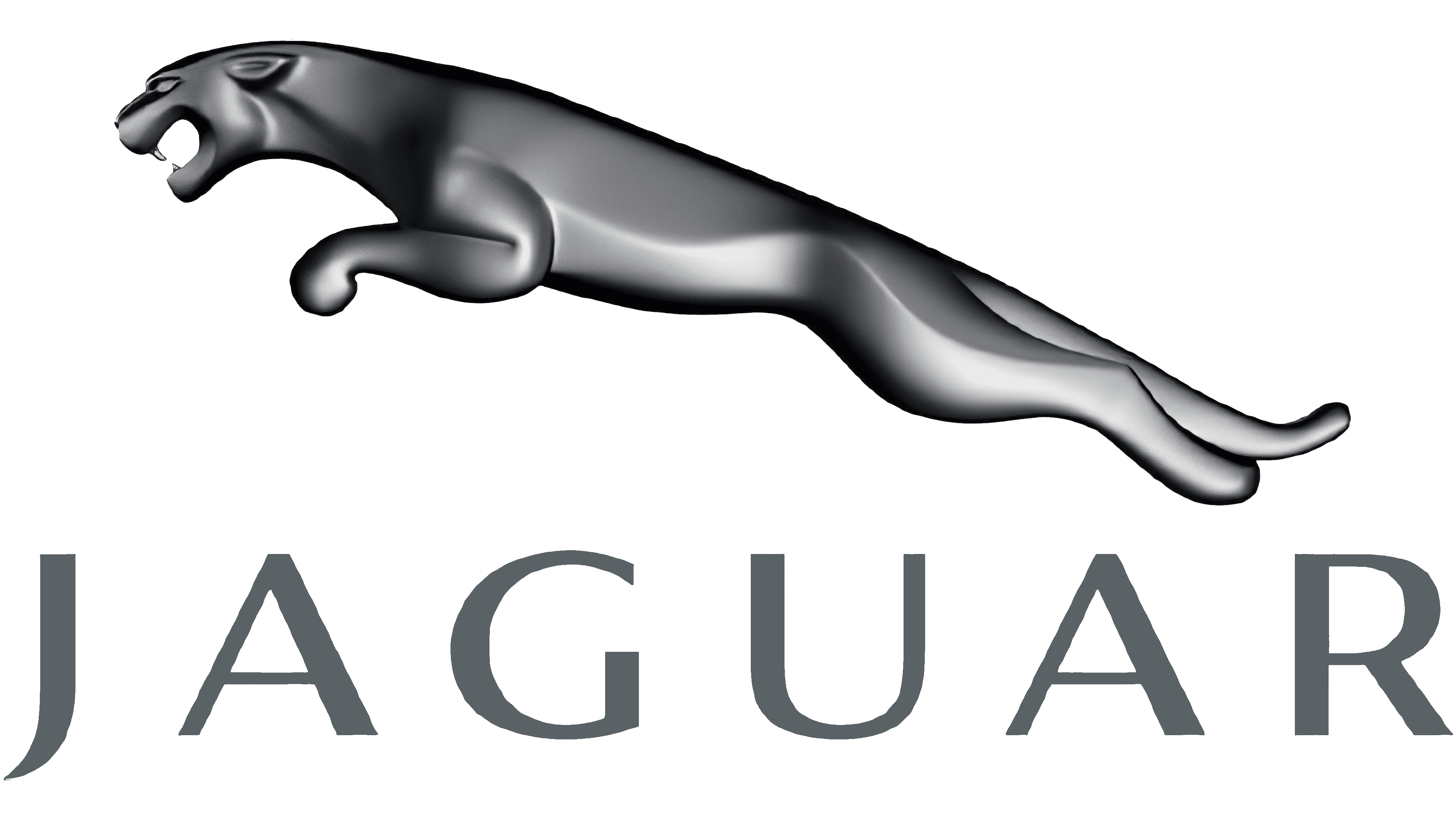
2012 – 2021
![]()
The updated Jaguar logo seems like a logical step in developing the brand’s corporate identity. The iconic “Jumping Jaguar” is not a contoured silhouette but a full-fledged three-dimensional image with a metallic sheen, giving the emblem a sense of dynamics and depth. Smooth transitions between light and shadow create the illusion of volume, evoking the look of a real metal sculpture.
The jaguar figure itself became even more anatomically accurate. Clear lines of muscles, outstretched paws, and an aggressive grin are visible. The predator is frozen mid-jump, ready to charge. Unlike previous flat versions, you feel movement and energy here, as if frozen in metal.
The inscription has also been updated. The letters have become more geometric, with slight vertical and horizontal stretching and compression, visually emphasizing width and stability. The font’s smooth metallic texture is combined with the jaguar’s figure, creating a seamless image. The sans-serif font reflects the brand’s technological progress.
After the EU law on pedestrian safety was adopted in 2005, the “Jumping Jaguar” stopped decorating car hoods. However, the brand did not abandon the iconic symbol, placing it on the radiator grilles, wheels, and the rear of the body, presented in a flat version. Some models have an alternative icon, a jaguar’s head in a circle, made in the same metal style.
The logo has become part of Jaguar’s DNA, reflecting everything the brand’s cars value: power, swiftness, and sophistication. The emblem symbolizes every car movement, ready to jump forward, leaving everything superfluous behind.
2021 – 2024
![]()
Again, the logo will be redesigned in 2021. Instead of a metallic sheen and three-dimensional effects, the designers focused on a flat, crisp contour.
The silhouette of a jumping jaguar looks even more dynamic and daring. The lines have become bolder; the geometry has become clearer. The contours of the head and paws are accentuated to convey tension and impetuosity.
The font of the inscription remained the same. The capital letters look massive and stable, contrasting with the jaguar’s lightness and swiftness from above.
The rejection of three-dimensional effects and the transition to a flatter design reflect modern trends in graphics, where the purity of form and functionality are important.
2024 – today
![]()
Jaguar has taken it to the next level. Now, we are not just rebranding; this is a complete rethinking of what a modern car brand should be. The company moved away from the usual image of a jumping jaguar and relied on clean lines, geometry, and minimalism. The new logo is a bold statement: simple but catchy. No more unnecessary details, just clear, neat letters made in a strict, modern style.
The shape of the letters is immediately attractive: rounded lines are combined with sharp cuts, creating a balance between softness and clear dynamics. The combination hints at the brand’s new course, combining technology with elegance. Using uppercase and lowercase letters in the same word is an unconventional move. Each letter looks as if it were laser-cut: precision, accuracy, style.
The color is dark gray, almost black. It lacks gloss, chrome, and pathos. It is simple and tasteful. The shade fits perfectly into the brand’s strict, modern, and versatile concept. It looks good on digital media and car bodies.
With this logo, Jaguar makes it clear that the brand is changing. The iconic Jaguar is a thing of the past, a symbol of a bygone era. The bet is on the future electric vehicles, clean technologies, and bold solutions. Although the cat has disappeared from the logo, it remains part of the brand’s DNA. Its image will still be present on cars, but in a different format as a decorative element rather than the main accent.
This whole rebranding story is not just about the logo. It’s about changing Jaguar’s perception. They no longer want to be a “just premium” automaker. They are moving towards becoming a symbol of a new time, where design speaks for itself, without unnecessary decorations.
Not everyone was enthusiastic about Jaguar’s new rebranding. The promo video, which the company released on the eve of the official presentation of the new logo and the GT model with an electric motor, caused a real stir on social networks. And not because everyone was impressed by the design, but because… There is not a single car in the video. Instead of the expected cars, models in bright, futuristic costumes walk through a surreal landscape. The inscription “Break Moulds” seems to hint that Jaguar is going against the rules, but many wonder: “Where are the cars themselves?”
The marketing slogan “Copy Nothing” sounds bold, but not everyone understands what it stands for. The company talks about the desire to “remove the ordinary,” “be bold,” and “not copy anything,” but part of the audience sees only loud slogans without specific content. Even Elon Musk couldn’t resist commenting and writing on X (formerly Twitter): “Do they even sell cars?”
Much of the criticism was directed especially toward the new logo. A stylish, minimalist font that, it would seem, was meant to emphasize the brand’s modern spirit raised questions. For many, it turned out to be too simple, sterile, lacking the energy and charisma that used to be associated with Jaguar. Jaguar is now in the process of transforming and moving towards a full transition to electric vehicles. And it seems that the rebranding has sparked more discussion than they expected. The only question is whether this hype will work for the brand or, conversely, will repel some loyal fans.
Font and Colors
Until 2001, the company used a serif font known as Jaguar JC. Then she switched to a sans-serif typeface, opting for a modified version of the Optima. The author of the original version is Hermann Zapf. He created Optima in 1958, inspired by Renaissance-era gravestone inscriptions.
The current logo has a metallic fill, so the word “JAGUAR” is styled like the lettering on XJ vehicles. It is written in a proprietary font developed by the Fontsmith typography studio.

The dominant colors are gray and silver in different shades. Additional ones are white and black. The gradient lends the image plasticity and dynamism, making it resemble the old Leaping Jaguar bonnet mascot. The cold palette creates a metallic sheen and is associated with luxury, nobility, and modernity.
![]()
FAQ
What does the Jaguar symbol mean?
The symbol features a jungle cat, reflecting the brand’s focus on performance and luxury. The Leaping Jaguar emblem is a sleek silver cat leaping, its snarling face visible. This pose demonstrates the company’s commitment to agility, speed, and forward motion. It represents movement and power, consistent with the manufacturer’s reputation for producing high-performance vehicles.
What animal is the Jaguar logo?
The Leaping Jaguar logo features a jaguar cat. This symbol depicts a silver jaguar leaping, with a growl on its face. It was first used as a hood decoration and is now a 2D icon in silver, metallic grey, and black. The Leaping Jaguar symbolizes the brand’s emphasis on agility, power, and forward motion. The dynamic stance reflects the company’s commitment to performance and elegance in its vehicles.
Does Jaguar have two logos?
Yes, the brand has two logos. The first is the Jaguar Leaper. It depicts a silver jaguar cat mid-leap, snarling, representing agility, strength, and forward momentum. Originally a hood adornment, the logo now features a 2D badge in silver, metallic gray, and black.
The second logo is the Jaguar Growler. This emblem depicts the snarling face of a jaguar, emphasizing the strength and ferocity of the company’s cars. Both logos feature the jaguar, one of the strongest big cats, and reflect the brand’s values of performance, elegance, and power.
When did Jaguar change their logo?
The company has updated its logo several times. The name “Jaguar” was first added in 1935. Older models featured leaping jaguar logos and a snarling face badge on a red-and-silver background.
The current jumping jaguar logo was introduced in 1945. It depicts a sleek silver jaguar cat in mid-leap, symbolizing agility, strength, and forward movement. The emblem has evolved from a hood ornament to a 2D badge on modern vehicles.
What does the Jaguar logo represent?
The logo depicts a jumping jaguar, symbolizing speed, a key characteristic of the brand’s cars. The jaguar represents speed, strength, endurance, and superiority, reflecting the company’s confidence and dominance on the road. The emblem signifies that the manufacturer’s vehicles are built for performance and stand up well to the competition. The Leaping Jaguar reflects the company’s commitment to producing powerful, agile, and durable vehicles.
Why did Jaguar change its logo?
The manufacturer changed its logo to honor the original radiator figurine, which was banned due to pedestrian safety concerns. The brand transformed the mascot’s silhouette into a three-dimensional image while maintaining its proportions and silvery sheen. This update allowed the company to retain the iconic leaping jaguar while adhering to safety standards. The new logo retains the elegance and power of the original design.