


![]() Jamiroquai Logo PNG
Jamiroquai Logo PNG
The Jamiroquai logo, in the style of a theatrical puppet, represents a group whose life is ruled by a higher, more powerful force of music. The emblem shows: the team comes to life only in the sound stream. And this dependence pushes participants to master new genres.
Jamiroquai formed in London in 1992 around Jay Kay, whose early exposure to jazz, soul, and funk shaped the project’s direction. Artists like Stevie Wonder and Herbie Hancock influenced the sound from the outset.
The group emerged within the acid jazz scene of the early 1990s, alongside The Brand New Heavies and Incognito. In 1992, a demo secured a deal with Sony Music, following the release of the single “When You Gonna Learn” on Acid Jazz Records.
In 1993, Emergency on Planet Earth reached number one in the UK and sold over 1 million copies. The 1994 album The Return of the Space Cowboy maintained chart visibility and continued to grow in popularity.
The key release came in 1996 with Traveling Without Moving, which sold more than 8 million copies. The video for “Virtual Insanity” won four MTV Video Music Awards and became one of the most referenced clips of the decade.
At a time when Oasis and Blur dominated UK media, Jamiroquai followed a separate path, building a global audience across Europe, Japan, and the US. In 1998, Synkronized debuted at number one in the UK, with “Deeper Underground” topping the charts. In 2001, A Funk Odyssey reached number one on both the UK and US Billboard 200 charts. Later albums included Dynamite (2005), Rock Dust Light Star (2010), and Automaton (2017), reflecting shifts between electronic and live-instrument approaches.
By the 2010s, total sales exceeded 35 million records worldwide. Lineup changes have been frequent, with Jay Kay the only constant member since 1992.
Meaning and History

Most Jamiroquai covers feature the original Buffalo Man emblem. It appeared in 1992, shortly before the release of the single When You Gonna Learn. It is believed that the sketch of the drawing was invented by Jason Kay, the frontman and songwriter. This is his self-portrait wearing his signature buffalo-horn hat.
Also, there is a text on the logo, the inscription “Jamiroquai.” The unique font, designed by Jakub Degorski, is named after the band. It consists of rounded lowercase letters.
What is Jamiroquai?
Jamiroquai is a British funk-acid-jazz band formed in 1992 in London. They played a key role in the music scene of the 90s. Initially, the musicians performed songs in various funk styles, and later added rock, Latin, electro, and disco. Jay Kay is the leader, frontman, and permanent member of the group.
But typography didn’t always look like that; in the release of the debut single, “When You Gonna Learn” (1992), the word is more angular, with thinner lines. On the promo disc Everyday (1996), stars appear above the “i” instead of dots. On the cover of Funk Odyssey (2001), the font is stretched vertically.
The image of Buffalo Man changed similarly. Its appearance depended entirely on the album’s theme. Once (for the 1996 Virtual Insanity composition), an emblem with the Ferrari label was used, in the center of which, instead of a horse, a man with a bison’s head was drawn. This is how Jason Kay expressed his love for sports cars.
Font and Colors
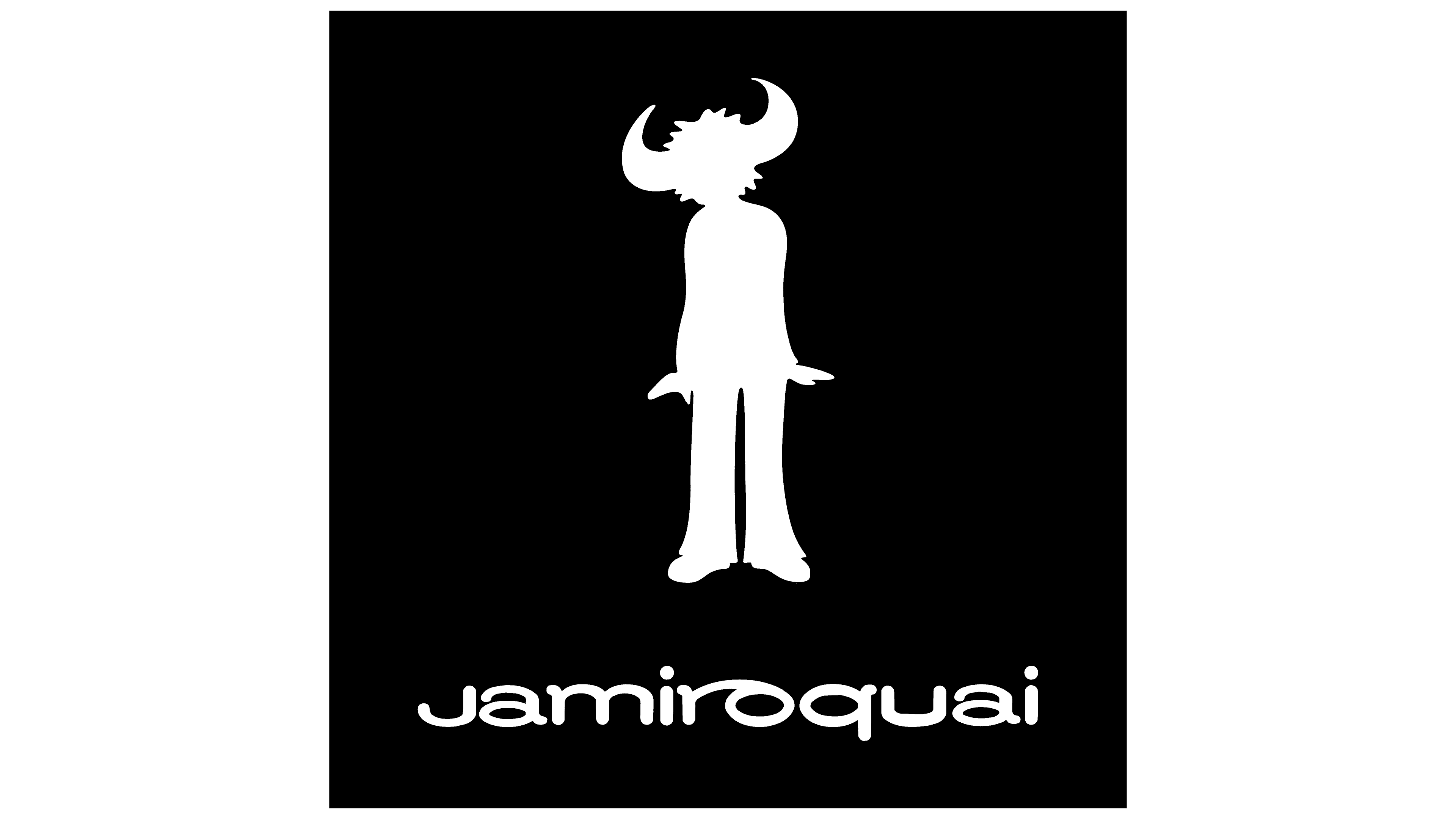
The logo style is minimalistic. The main graphic element is Buffalo Man, a man with bison horns. The character is not detailed; only a monochrome silhouette is visible in the drawing. It comes in black or white, depending on the background.
The name of the funk band is written at the bottom. “J” looks like a lowercase, although there is no dot above it. The font is similar to handwriting, as indicated by the connecting stroke between “r” and “o.”