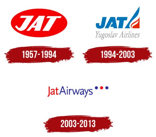
The Jat Airways logo signifies the airline has the energy to develop rapidly and improve its service quality. The emblem reflects the company’s openness, high reliability, and dynamism.
Jat Airways: Brand overview
Jat Airways, formerly Jugoslovenski Aerotransport (JAT), has a rich history as the national flag carrier and the largest airline in Yugoslavia, Serbia, Montenegro, and Serbia. Since its foundation in 1927 as Aeroput, the airline has played a crucial role in developing civil aviation in the region.
Aeroput, the predecessor of JAT Airways, paved the way for the development of civil aviation. Initially, it provided domestic flights within Yugoslavia and gradually expanded to international destinations.
As a state-owned company, Jat Airways comprised 1,250 dedicated professionals whose unwavering dedication and hard work led the airline to success.
On August 8, 2003, Jat Airways underwent a major change and was renamed JatAirways. The modernization aimed to meet the changing needs of the travel market while maintaining the airline’s respected heritage.
Tracing its history back to Aeroput in 1929, Jat Airways has adapted and evolved to meet the ever-changing needs of travelers.
Meaning and History
What is Jat Airways?
Jat Airways, once called JatAirways, was the national flag carrier and the largest airline of Yugoslavia and later Serbia, Montenegro, and Serbia. The company became a critical part of the national infrastructure, connecting the countries it served with the rest of the world.
1957 – 1994
The entire Jat Airways logo is a large red oval in a horizontal orientation. Its bright color immediately attracts potential customers’ attention and is easily memorable. Red signifies decisiveness, leadership, great potential, and immense energy.
Through this logo, the airline signals its readiness to take on high responsibility for travelers’ comfort during flights. This color conveys dynamism, resilience, and persistence in achieving goals.
In the middle of the solid-filled oval is the airline’s name. The text is rendered in a block font characterized by:
Italics (indicating the company’s flexibility in customer approach and service provision, as well as showcasing a strong dynamic potential for growth and forward movement);
Solidity (emphasizing the brand’s significant capabilities, firm stance, confidence, safety, reliability, and readiness to maintain a comfortable atmosphere consistently);
Uppercase letters (demonstrating leadership qualities, a desire to take a leading position in the European aviation market, and respect for clients and their needs);
Sans-serif glyphs (the absence of serifs suggests that the carrier sees no obstacles in the air or on the ground to improving staff qualifications, quickly transporting passengers, and providing quality service).
The text is white, symbolizing purity, integrity, and openness. It represents the company’s unblemished reputation and is the best contrasting color for the red background, ensuring good text readability. The white color frames the oval, indicating the carrier’s broad professional responsibilities.
1994 – 2003
The Jat Airways logo has undergone a complete transformation. It is now more welcoming, colorful, positive, and thematic. This change is achieved through:
- Reorganization of elements
- Modern appearance
- Change in the emblem’s shape
- Addition of new details
- Increased number of colors
- Structural modernization
The last point means the logo now includes horizontally and vertically oriented elements. For instance, there is an abstract triangle with a sharp apex. It rises at the end of the first part of the name—after the abbreviation JAT, which stands for Jugoslovenski AeroTransport. The text is in uppercase and sans-serif, indicating the brand’s strong position in the aviation industry and ability to overcome challenges.
The triangle consists of three sections: red, white, and blue. The first two resemble a flame, while the third represents an airplane wing. Together, they form an allegory of a swiftly flying airplane, ready to cover any distance quickly and deliver passengers on time.
Below is the rest of the airline’s name—Yugoslav Airlines. This text is in a narrow font with thin strokes, giving the glyphs a very tall appearance. Small serifs add elegance, and the gray color and wide letter spacing add a sense of airiness. This design perfectly aligns with the aviation brand, showcasing it as a distinguished player in the European market.
2003 – 2013
The Jat Airways logo is designed to be friendly and inviting. It conveys professionalism and a commitment to pleasing passengers by ensuring a comfortable flight experience. The logo’s soft shades of red and blue create a cheerful and welcoming atmosphere.
The logo’s centerpiece is the airline’s name, displayed in vertically elongated bold sans-serif font. Only the letters “J” and “A” are capitalized, while the other letters are lowercase. This typographic choice adds a modern touch. Behind the text are three large dots that resemble airplane portholes, reinforcing the aviation theme.
The vertically elongated text gives the impression of upward movement, aligning with flight and progress. The three large dots behind the name emphasize the airline’s aviation focus and are an eye-catching design element. This design choice reflects the airline’s attention to detail and dedication to enhancing passenger satisfaction.
The soft red and blue shades create a pleasant and approachable visual identity. Red signifies energy and warmth, while blue conveys trust and reliability. The combination creates a balanced and appealing look that invites confidence and positivity.
The bold, sans-serif font presents a strong and modern image, while the mix of uppercase and lowercase letters adds friendliness. The large dots resembling airplane portholes add a playful and memorable element to the logo.
The logo uses color, typography, and design elements to convey a message of professionalism, comfort, and joy. The blend of red and blue shades, vertically elongated text, and distinctive dots create a visually appealing and meaningful logo.
