The JCB logo represents strength and power, as well as exclusive innovations. The brand has changed the game for specialized and agricultural machinery by creating a convenient and efficient loader that has made work easier for many companies.
JCB: Brand overview
In the quaint town of Uttoxeter, England, 1945 marked the inception of JCB by its founder, Joseph Cyril Bamford. The company’s early years were dedicated to crafting agricultural machinery. But it wasn’t until 1953 that JCB unveiled its game-changing invention: the backhoe loader, which rapidly garnered global acclaim.
As the 1950s and 1960s unfolded, JCB’s portfolio burgeoned, encompassing a variety of construction equipment such as excavators, loaders, and tractors. By 1975, JCB’s footprints began to appear beyond British shores with the launch of manufacturing facilities in India and North America. This move marked the beginning of JCB’s evolution into a global enterprise. Subsequent decades saw the rise of additional production hubs in nations like Germany, Brazil, China, and even back home in the UK.
One of JCB’s crowning achievements came in 1977 with the creation of the telescopic handler, positioning the company as a pioneer in rough terrain handling equipment. Venturing into the 21st century, JCB focused on sustainable machinery solutions, integrating diesel-electric hybrid and full electric technologies into its line-up.
Presently, JCB stands tall as a global giant in the construction equipment domain, ranking as the third largest producer worldwide. With a workforce exceeding 14,000 and a diverse range of over 300 machine models, JCB’s operations span 22 manufacturing plants scattered across Europe, Asia, and the Americas. Under the leadership of Chairman Anthony Bamford, JCB continues to thrive, staying true to its roots as a family-owned enterprise.
Meaning and History
What is JCB?
JCB (J.C. Bamford Excavators Limited) is a renowned British multinational company that produces heavy machinery for construction, agriculture, waste management, and demolition. JCB is famous for its signature yellow equipment and offers a diverse range of products, including backhoe loaders, excavators, tractors, and telehandlers.
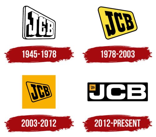
1945 – 1978
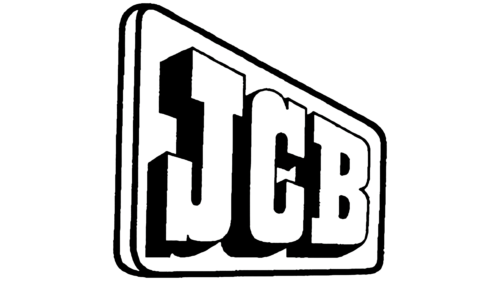
The company’s emblem, designed in 3D by Leslie Smith in 1953, was progressive. The logo appears straight on, paving the way forward and reflecting the brand’s forward-thinking philosophy and commitment to making progress easier for customers.
The straight-on view of the logo reveals the significant thickness of the base and letters, symbolizing the reliability and durability of JCB products. This design element highlights the brand’s ability to handle substantial loads and deliver high performance in various conditions.
The black and white tones of the logo emphasize the company’s focus on work. These machines are made for everyday use in diverse fields, from construction to agriculture. The contrasting colors add a sense of seriousness and professionalism, aligning with JCB’s product approach.
The brand name is an abbreviation of the founder’s name, Joseph Cyril Bamford. Each letter carries the heritage and traditions of a company built on innovation and a drive for excellence.
1978 – 2003
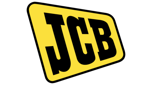
When the lifting machine was released, the company’s emblem transformed into a road sign painted in bright construction equipment colors. This step marked an important milestone in the brand’s development, symbolizing its advancement in production and technology. When the company moved to a new facility in Rochester, the founder decided to paint the equipment bright yellow, inspired by the famous Caterpillar brand.
The new emblem shows the company’s products are found during repair and construction. The bright color makes the equipment highly visible on job sites, enhancing safety and drawing attention. The yellow color creates a pleasant visual impression and supports the idea of assistance and ease of work. It conveys productivity, energy, and reliability, aligning with the company’s goals.
2003 – 2012
The previous logo image was placed in an orange square to highlight the compact size of the equipment. The small emblem within the new orange square emphasizes the company’s significant expansion and increased production capacity. This visual technique symbolizes the brand’s growth and development as it expands its manufacturing capabilities in various regions worldwide, including America and China, and opens new factories.
The logo’s square shape conveys harmony and stability. The orange represents energy and activity, reflecting the company’s dynamic growth and commitment to constant innovation. The square hints at a construction site, emphasizing the company’s primary focus on producing construction and specialized equipment.
2012 – today
As the company prepared to open its fourth facility, it significantly expanded its global reach, covering markets in Europe, South and North America, and Asia. To symbolize its global presence and scale, a new logo was developed. The logo features a black rectangle with the company’s name written in large letters, highlighting its confidence and power on the international stage.
The previous JCB emblem remains in the upper left corner of the logo. This choice demonstrates continuity and respect for the company’s history, highlighting the stark contrast between its early development and current status. The small JCB emblem in the corner emphasizes the company’s significant growth since its founding.
