


![]() Jeep Logo PNG
Jeep Logo PNG
The emblem reflects the ideal interior equipment and outstanding technical characteristics. The Jeep logo signifies premium cars that emerge with dignity from any road-based falsity.
Meaning and History
![]()
The brand began with a contract between the US Army and Bantam. To solve military problems during the Second World War, she needed a light, maneuverable, four-wheel-drive vehicle weighing no more than a quarter of a ton. The order for 70 experienced SUVs was received immediately. The plant’s chief engineer, Karl Probst, took over the work. He presented the necessary option to the management in less than five days. It was the same draft design that the modern world knows as Jeep. The military gave the manufacturer only 49 days to create and assemble the vehicles.
The test series included two batches: the first was a test cavity, and the second was revised. After the field conditions, the company made further adjustments to the design and immediately signed a contract to supply the Armed Forces of America with 1,500 units, called the Bantam BRC40. By the end of 1941, she had produced 2,605 units of such equipment.
The military liked the Jeep’s successful design so much that, without asking for the developer and manufacturer’s (American Bantam) consent, they handed over the drawings to its main competitor, Willys-Overland. Later, they did the same with her working sketches, giving them to another automaker (Ford Motor), with whom they signed a 1942 deal to assemble cars on a large scale. Willys later applied for the rights to the Jeep trademark, which, until then, was just an army term. This was the slang term for recruits and new vehicles. There are several more versions of the origin of this name, but they are unlikely.
During the registration proceedings, the initial judgment was in Bantam’s favor. The FTC then banned Willys-Overland from claiming it had designed and built the Jeep. However, in 1945, the company began manufacturing light all-wheel-drive vehicles under the Civilian Jeep (CJ) trademark. And in 1946, it received the official right to the name Jeep. As the only company to assemble these cars after the war, it owned this trademark in 1950.
Over the years, the brand has had several versions of personal emblems, all associated with events around this all-wheel-drive vehicle. The litigation between Willys MA, Bantam BRC, and Ford GPW over the trademark claim did not go unnoticed.
What is Jeep?
This renowned American automaker transformed military utility vehicles into a symbol of off-road prowess and adventure. Originally designed to meet strict military requirements, the brand became a symbol of freedom, producing vehicles capable of conquering any terrain from city streets to mountain trails. The iconic boxy design and seven-slot grille instantly made the brand’s vehicles recognizable worldwide. The lineup of SUVs and crossovers continues the tradition of versatility of the original Willys Jeep. Now owned by Stellantis, the company remains a leader in four-wheel-drive technology and off-road capabilities, adapting to modern drivers’ needs and producing vehicles that combine ruggedness with everyday practicality.
1941 – 1945
![]()
The logo dates back to when the names of all three companies were combined to create a light SUV for the military. All the companies had blueprints, and each contributed to them. Therefore, under the large red word “Jeep,” it was written “WILLYS. BANTAM. FORD.” The carmakers were listed in the order in which the Armed Forces of America contacted them. The first company designed the car from scratch; the second adjusted the drawings, and the third launched the car into mass production. The words were separated by dots, not at the bottom but in the middle.
1945 – 1963
![]()
Since 1945, the emblem has been simplified in both the number of elements and the number of colors. The designers removed the company’s copyright claims and repainted the word “Jeep” in black. In addition, they enlarged the caption, changed the font, and added one oblique stroke at the beginning and end of the text to denote quotation marks. The letters have been converted to lowercase (except for the first) and serifs (all but the “e”).
1963 – 1970
![]()
In 1963, the car brand approved another logo that introduced new elements. So, he got a background, a frame, and a color. A circle with a metalized edge served as a base. This was because the designers created edging with highlights and shadows, which produced a voluminous, mirrored effect.
The inner part of the disc was divided into five parts: one horizontal rectangle in the middle and four triangles with a rounded outer edge. Two geometric shapes were olive green, and two were pastel red. The brand name was centered on the white stripe, and the word was dyed olive.
1970 – today
![]()
1970 brought a new typeface, sleek, streamlined, sans serif. The developers chose Neue Haas Grotesk and made the lettering black. Since then, the typeface has never changed, so “Jeep” has always had a unified spelling.
1970 – 1987
![]()
The designers added an icon to the existing lettering, consisting of two geometric shapes: a red triangle at an acute angle and a blue rectangle vertically aligned. According to the concept, they depicted the letters “JP” as an abbreviation for “jeep.”
1987 – 1993
![]()
Using the previous inscription as a basis, the designers created a visually distinct emblem. They changed the font color from black to white, added a thin five-pointed star, and placed it in a dark, rounded square. Moreover, the star resembles a geometric shape, with five edges, two of which form an obtuse angle at the top. The pentagon is Chrysler’s distinctive symbol.
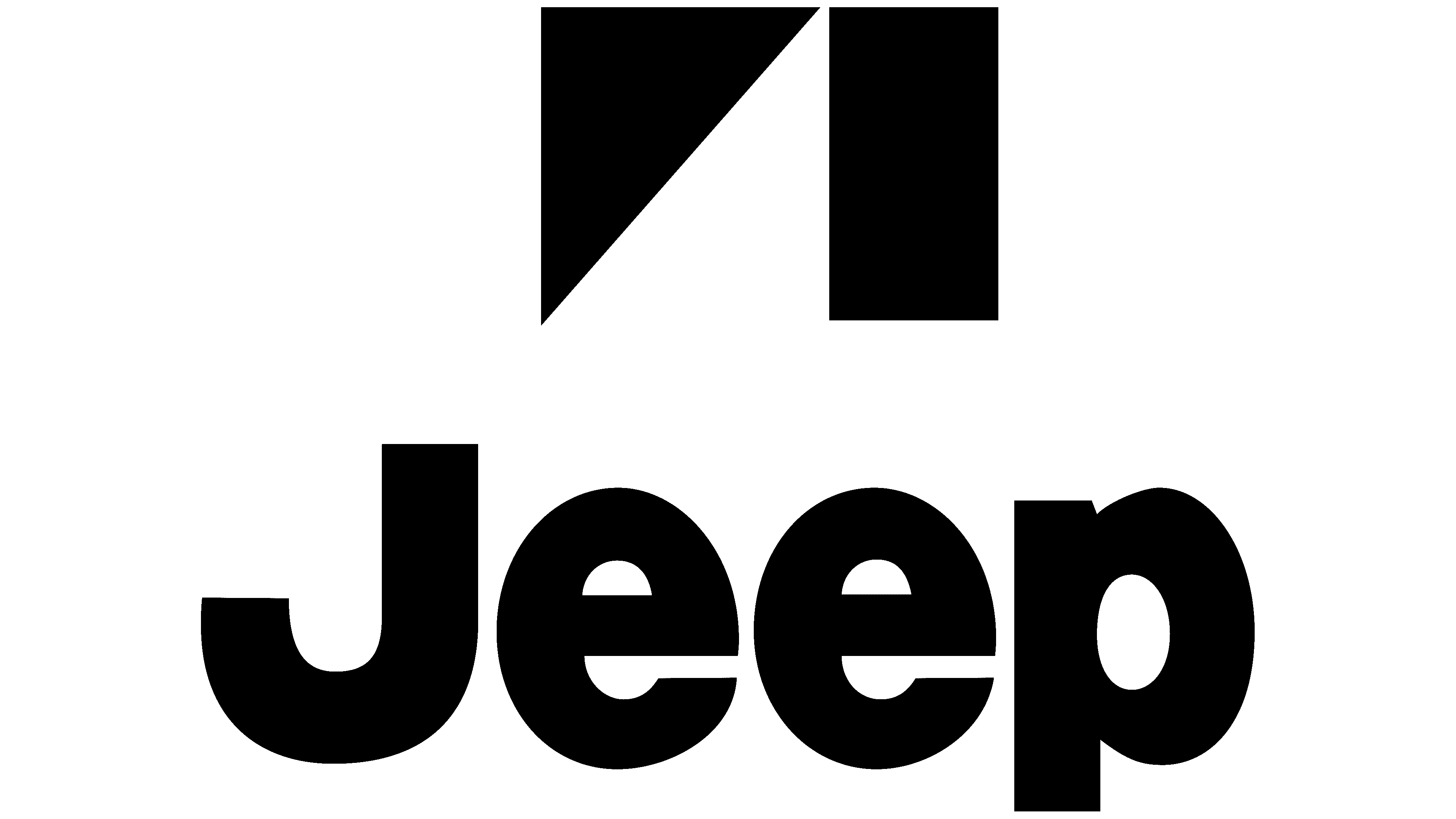
1993 – today
![]()
The current logo consists of the car brand’s name, set in the style approved in 1970. The large inscription is painted in dark olive green on a white background.
Font and Colors
Brand identity is directly related to its name. It is present in all variants of the logo. Moreover, its style changed once when the designers proposed a grotesque typeface.
Austere and simple, the Jeep emblem features classic lettering, bold lines, and clean contours. The typeface is close to Europa Grotesk SH SemiBold, Sequel Sans VF Heavy, and Helvetica Bold. But it’s Neue Haas Grotesk Black, introduced in 1970.
The original palette is solid and restrained, consisting of white and black, or olive. From 1963 to 1970, the logo also featured pastel red, graphite, and silver.
FAQ
What color is the Jeep logo?
The Jeep logo started green and then changed to black, which has remained ever since. This simple and bold black color fits well with the brand’s style. The logo has used the Helvetica Bold font since the 1970s, which helps make it bright and easily recognizable. This appearance has become a permanent element of the brand’s cars. Using black for the logo helps it stand out, which is important for getting noticed in the competitive automotive market. The logo design is simple and clear, reflecting the brand’s reputation for reliability and durability.
What does the Jeep logo mean?
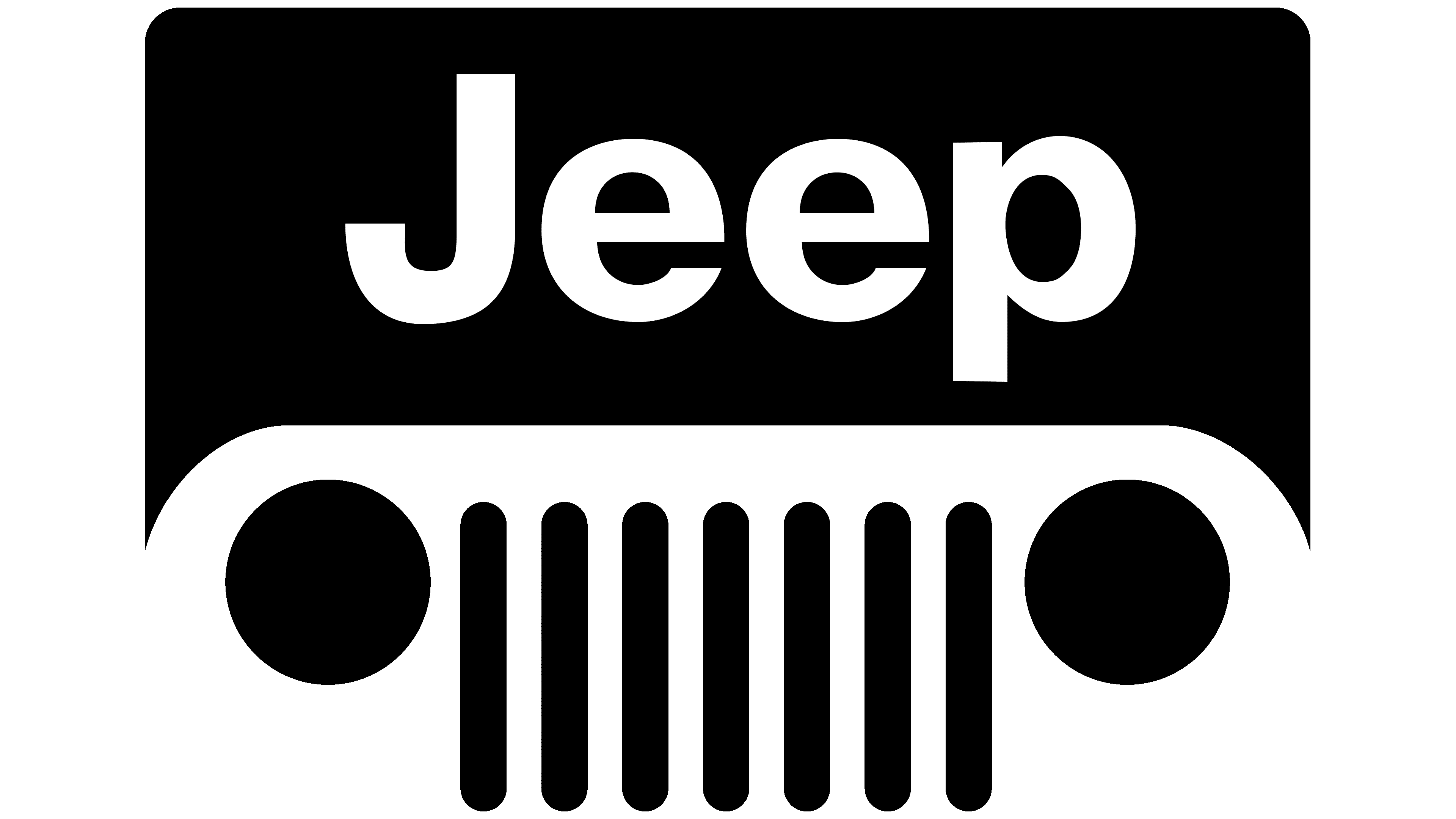
The logo is simple and meaningful: the front of the car is represented by seven vertical stripes and two circles. These stripes are the grille slots, originally an essential feature of the cars, and the circles are the headlights. This design highlights the logo and showcases the brand’s strong, reliable characteristics. This makes the logo easily recognizable to customers.
How many lines does the Jeep logo have?
The official logo consists of bold khaki letters and no lines. In addition to this logo, the brand uses a special emblem on its vehicles. This emblem consists of seven short vertical stripes flanked by two circles. These stripes mimic the slots on the grilles of its vehicles, a design unique to the brand. This combination of stripes and circles helps create a recognizable visual image for the brand.
What is the font of the Jeep logo?
The wordmark uses Helvetica Bold, a geometric sans-serif typeface known for its clear and modern appearance. This font fits well with a strong and clear brand image. Helvetica Bold belongs to the family of sans-serif fonts, known for their clean lines and good readability. Similar fonts to Helvetica Bold include Neue Haas Grotesk Black, Sequel Sans VF Heavy, and Europa Grotesk SH SemiBold. These fonts feature a geometric style and bold lettering, making them suitable for impactful and memorable branding.