![]() Jeffree Star Logo PNG
Jeffree Star Logo PNG
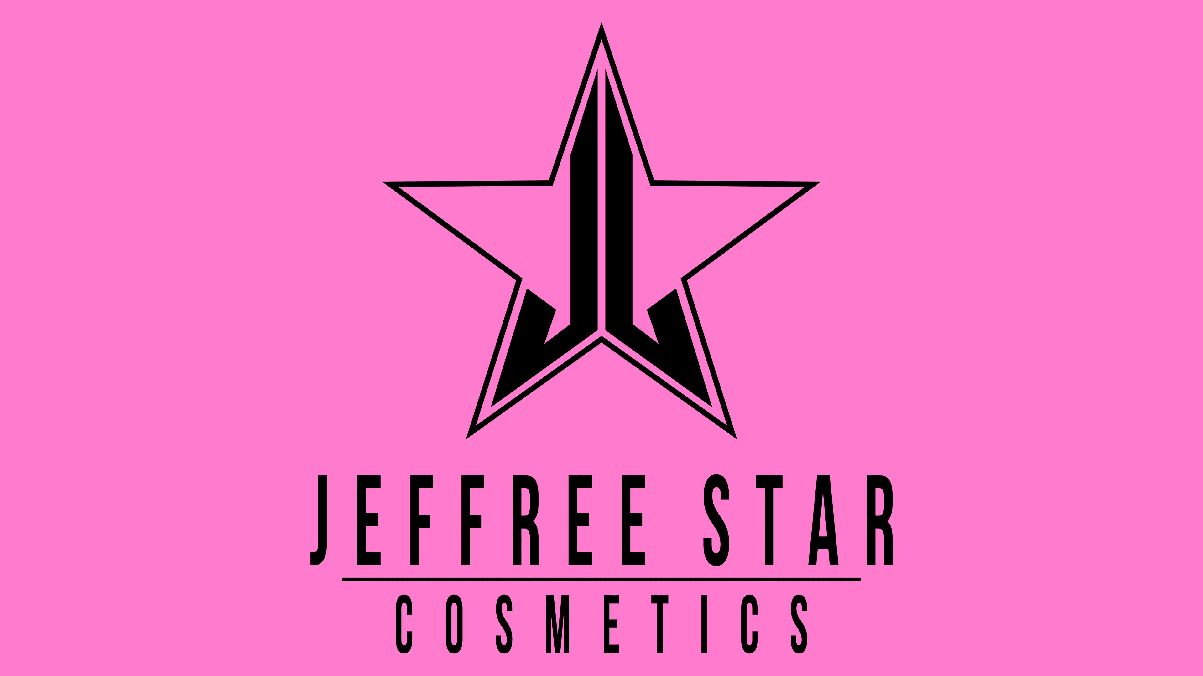
The Jeffree Star logo conveys the uniqueness of the company’s beauty products in a classic star image. It is large, five-pointed, with a thin red border and an unusual “construction” inside. It contains the initials of the brand creator and his business partner, a “J,” in both the regular and mirrored displays. The glyph conveys professionalism and trust.
Meaning and History
![]()
Jeffree Star has been thinking about creating his cosmetic line since 2013, when he unexpectedly left the music industry due to legal issues. However, these difficulties helped him gain a powerful boost to start his brand. It began with three types of liquid velvet lipsticks and expanded to eyeshadows, highlighters, scrubs, powders, foundation, and much more.
Overall, the former musician invested everything he had at the time, including his famous name. As a result, the company bears his stage pseudonym. The presence of another “J” (in the name of the investor and business partner) made it easy to solve the visual identity problem: the logo creatively plays with the names of the current brand owners. They are hidden within the outlines of a large star, which allegorically conveys the brand founder’s creative nickname.
What is Jeffree Star?
This avant-garde cosmetic brand in the makeup market is known for its powerful formulas and striking, luxurious packaging. Founded by makeup artist and beauty influencer Jeffree Star, the company has achieved cult status with its high-pigment products, including shimmering highlighters, vibrant eyeshadow palettes, and the iconic Velour Liquid Lipsticks. The brand stands out for its bold approach to creating formulas and rich shades, offering products that appeal to professional makeup artists and enthusiasts seeking expressive self-expression tools.
2014 – today
![]()
The Jeffree Star Cosmetics logo features a star. At first glance, it is concise, simple, strict, and business-like. However, upon closer inspection, you can see that it is a multi-layered image. It contains several components that symbolize the company’s founder’s creative name and even its co-owner, Jeff Cohen. That is, the emblem creatively plays with the names Jeffree and Jeff.
The star consists of thin red lines that form a white space inside. The rays are classic, precisely proportional, of equal width, with sharp points at the ends. In the center, two bold “J’s” harmoniously form a tall column. The letters are turned mirror-like towards each other and combined with a long side. The lower part of the glyphs is specifically curved, so they perfectly follow the contours of the rays. They have diagonally cut tips with a sharpening.
Below the large star, the cosmetic company’s full name is indicated in two lines. The phrase “Jeffree Star” is in the top row and serves as the founder’s creative pseudonym. Below it is written “Cosmetics.” A thin, centered line separates both parts.
The creator of the cosmetic brand used his stage name for the title. This was a well-thought-out marketing move because the singer was already recognizable and famous in certain circles. Therefore, he decided to capitalize on his prominent name and invested all his resources in the new project. A clever graphic feature was the presence of two “J” s in the names of the company’s actual owners. They are playfully presented in the logo.
Font and Colors
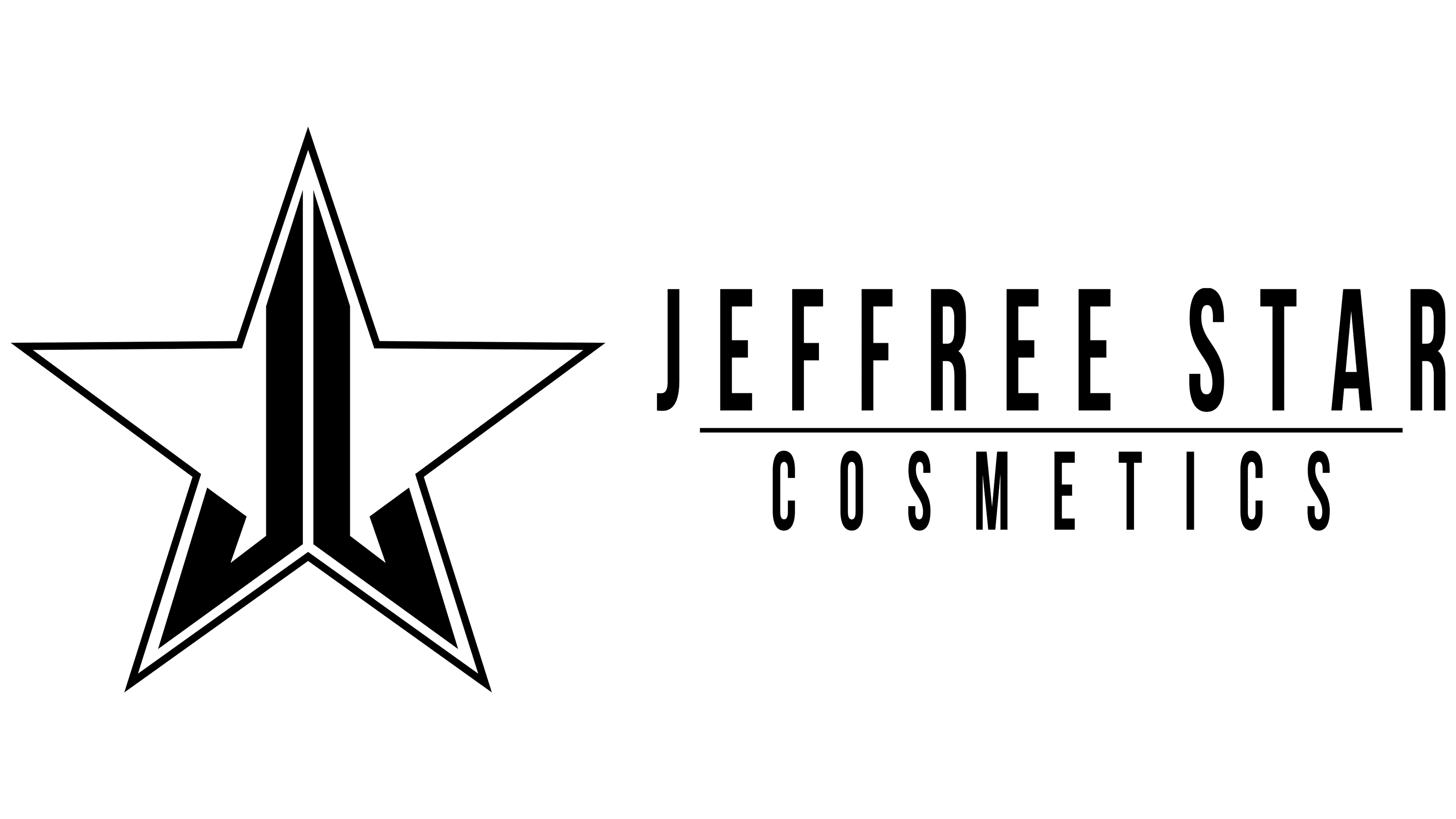
Designers used a simple sans-serif font for the inscriptions. The letters are smooth, even, and tall, resembling TT Bluescreens Rough Bold glyphs by Typetype. The color palette features a delicate red, close to a raspberry shade, with black versions available. The background, however, remains constant: it is always white.