


![]() Jessica Logo PNG
Jessica Logo PNG
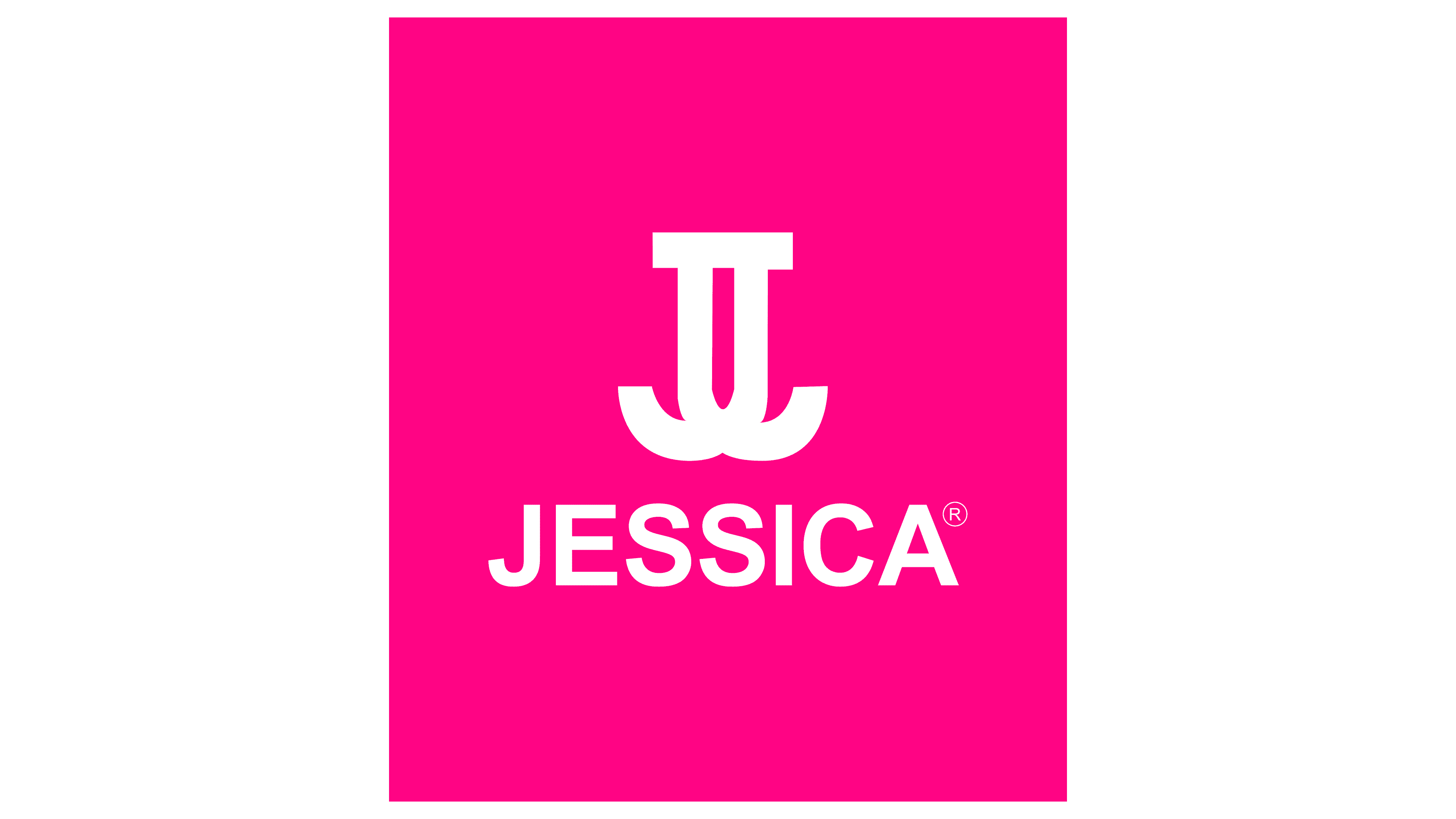
The two crossed ‘J’s are reminiscent of the two ‘C’s on the famous Chanel emblem. This was an attempt to evoke associations with a well-known figure in the fashion industry. The Jessica logo looks less like an elaborate symbol and more like interlocking fishhooks.
Jessica Vartoughian was born in Bucharest and moved to Los Angeles at age sixteen in 1962. Without fluency in English, she trained in cosmetology and obtained a license after several attempts while studying language at UCLA.
She began working at a salon on Sunset Strip and focused on nail anatomy rather than trends. Her approach emphasized natural shape and care. Early clients included Lucille Ball, and her services became the most expensive in the salon.
In 1969, she opened a nail-only salon in Beverly Hills, calling it a clinic and her staff “Nail Cultivists”. She introduced heated mittens and developed the Natural Nail Transplant technique. Clients included Barbra Streisand and Nancy Reagan.
In 1971, The New York Times referred to her as the “First Lady of Nails”. By 1973, Time covered her “natural manicure”, later known as the French manicure.
In 1978, she introduced the Natural Nail Cultivation System, which classified nails into four types and offered tailored treatments. The same year, Jessica Cosmetics International launched with Custom Color polishes.
A retail launch with Max Factor failed, prompting a shift toward direct salon sales. In 1979, the company adopted telemarketing. In 1980, it entered Japan, and in 1992, it expanded to the UK via Gerrard International.
In 2010, Jessica introduced GELeration, a gel system in a bottle. Competing brands like OPI focused on mass retail, while Jessica remained in professional channels. By 2025, the brand will operate in 60 countries.
Meaning and History
Such fashion industry representatives inspire the brand’s emblems, such as Gucci, Chanel, and Escada. Simply in style, it is very similar to their signs – a mirror connection of the abbreviation, consisting of the first letters of the name and surname. Moreover, Jessica has only one version of the logo, which it has never corrected.
The founder chose an interesting version of the monogram for her brand, a combination of two “Js” connected with the “front” side. The letters are not superimposed on each other, but they share a single upper serif and bend in different directions, as if spliced. This made the logo unique despite its similarities to the designs of some fashion houses.
What is Jessica?
Jessica is a US-based cosmetics company and salon chain that offers everything for nail art and manicures. Its distinctive feature is eco-friendly nail polishes suitable even for vegans. The brand was named after its founder, Jessica Vartoughian.
Font and Colors
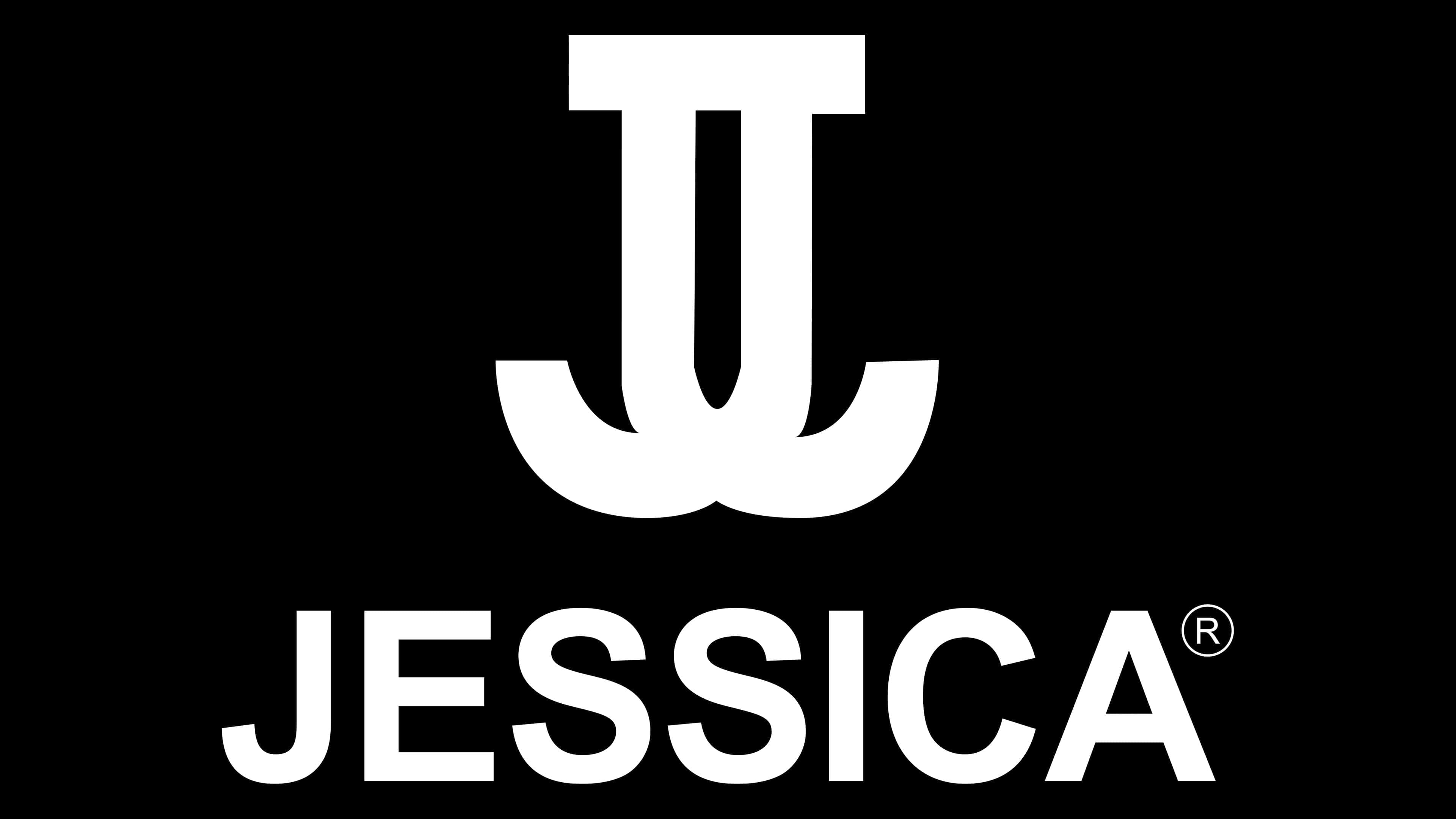
The double emblem is made in a classic serif typeface. When viewed from a new perspective, they make it both unique and easy to read, as in the word “Jessica” below. The color palette is monochrome, a traditional combination of white and black.