


![]() Jim Beam Logo PNG
Jim Beam Logo PNG
The Jim Beam logo highlights the brand’s rich history and respect for tradition. It is associated with craftsmanship, reliability, and consistent flavor, having become a symbol of quality and a recognizable mark of the finest whiskey and bourbon worldwide.
The history of Jim Beam begins with the Beam family, German immigrants who settled in America in the 18th century. In 1788, Johannes Jacob Beam moved to Kentucky and started a corn farm. Surplus grain led him to distilling, and in 1795, he sold his first barrel of whiskey, known locally as Old Jake Beam, in a region crowded with nearly two thousand distillers.
In 1820, his son, David Beam, took over at age 18 and modernized production by adopting early continuous stills. He renamed the whiskey “Old Tub,” expanded production, and used railroads and steamboats to reach distant markets. In 1854, David M. Beam relocated the distillery to Nelson County near railway lines and introduced labeled bottles, turning Old Tub into a national bourbon brand.
James B. Beam, born in 1864, led the business from 1894 and expanded its scale across the country. During Prohibition from 1920 to 1933, production stopped, but he preserved the family yeast culture. After the repeal, he rebuilt operations in Clermont within 120 days and launched the James B. Beam Distilling Company. In 1943, the bourbon was renamed Jim Beam, and he died in 1947.
Later generations continued development. Booker Noe introduced Booker’s in 1988 and the Small Batch Collection in 1992, including Knob Creek, Baker’s, and Basil Hayden’s, helping shape the premium segment alongside competitors like Jack Daniel’s. The company acquired National Distillers in 1987, became Beam Inc. in 2011, and was purchased by Suntory Holdings in 2014, forming Beam Suntory.
Meaning and History
![]()
After seven years of the Beams’ dynasty’s rule, the authentic spirits manufacturer came under the control of Suntory Holdings. The new owner retained the founding family in the company structure and the legendary brand’s former name, while promoting it widely. It also preserved the iconic Jim Beam label.
The logo is a classic print. Previously, such seals were used to stamp messages, letters, documents, goods, and other important items. They were usually sealed with melted wax, poured onto the ends of ropes, cords, twines, and ribbons, and then stamped with an individual impression. This seal has become the trademark of the alcoholic company.
The Jim Beam bottle is also legendary. Over several centuries, it has become integral to the brand’s symbolism; without it, the brand would be unimaginable. Over the years, it has remained unchanged. It has a simple appearance and harmoniously complements the label design, which features the logo and extensive information. It features portraits of the main master blenders – significant figures in the family business, with whom the production of bourbon began.
Placing representatives of all seven generations next to the logo is incredibly valuable to the company. As Fred Noe, a winemaker and descendant of Jim Beam, notes, each family member is a milestone in the family’s history and a page in the company’s development. Therefore, the new owners equated their image with the emblem, making it a source of particular pride.
The key to creating the iconic brand concept was the family’s grand idea: to encapsulate a unique heritage in a capsule bottle that future generations can open and appreciate. An entire design philosophy for the label and logo was developed to promote this idea, named “Living Legacy.”
What is Jim Beam?
It is one of the most popular bourbon brands. It got its current name in 1943, but has existed much longer. Its recipe has been perfected by seven generations of the Beam family, starting with a farmer who began producing corn whiskey in 1795. Now, the brand is owned by a Japanese conglomerate, Suntory Holdings Limited.
1795 – 1880
![]()
The first historic bourbon brand, Old Jake Beam Sour Mash, emerged through the Beam family, whose presence in the world of American whiskey dates back to the eighteenth century. The name is tied to Jacob Beam, the distiller who first produced the drink. At that time, no one thought of branding in its modern sense, and the product was simply called after the family that made it.
The earliest emblem of Old Jake Beam Sour Mash looks more like a page from an old advertising booklet than a conventional logo. This is part of its appeal. The main emphasis is on the word “Beam,” printed in large, black serif letters that evoke an antique style. The Beam family name becomes the face of the brand. Next comes an oval portrait of a man. The male profile is set against a black background and framed on both sides by two gold five-pointed stars. The stars reinforce the emblem’s historical character. Beneath the stars are the words “Sour” and “Mash,” executed in a decorative red calligraphic script that complements the portrait.
Below that appears the name Colonel JAMES B. BEAM, rendered in rich red letters with shadows and light embossing. The entire text block supports the atmosphere of early America, a time when label lettering was handcrafted, and each typeface carried its own story. Even lower, the inscription “Kentucky Straight Bourbon Whiskey” is written in elegant cursive. The long, flowing strokes resemble hand lettering, reinforcing the drink’s authenticity.
At the bottom sits a strict inscription reading JAMES B. BEAM DISTILLING CO. CLERMONT, set in a condensed dark typeface. The company name is centered, while the geographic designation CLERMONT appears on a separate line below. The lowest line returns to red, closing the composition.
The label is designed in an old-fashioned manner, rectangular in shape with softly rounded corners. The emblem’s visual style aims to convey how deeply the brand’s roots are tied to the traditions of handcrafted whiskey production.
This Old Jake Beam Sour Mash logo captures an era and a dynasty that gave the world one of the most recognizable American bourbons.
1880 – 1943
![]()
During this period, bourbon was only beginning to gain popularity. It was produced in open wooden vats called “Old Tub.” The name took hold and later became part of the bourbon’s identity, evoking its handcrafted origins.
Over time, the family distillery grew into a large-scale company, necessitating an identity update. A new Old Tub logo appeared, with emphasis placed on a red inscription at the center of the composition. The serif typeface is accented with gray shadows and curves smoothly in an arc. This treatment makes the letters appear dimensional and slightly tilted, creating an illusion of depth.
Below the main name is an illustration of a wooden barrel with three bottles. The drawing is executed in gray line shading, resembling a linear engraving. This illustration connects to the distillation process, while the ribbons on its sides, bearing the words SOUR and MASH, add a sense of history. Above the ribbons sits a subtle inscription LIMITED EDITION, arched to follow the curve of the main composition.
Beneath the illustration are the words TRADE MARK REGISTERED ESTABLISHED 1882, set in small, dense lettering. This indicates the brand’s official registration, anchoring it to a specific era and place of origin.
The composition is completed by the phrase KENTUCKY STRAIGHT BOURBON WHISKEY, printed on two lines in the same red color, but without additional effects.
The Old Tub logo design emphasizes a connection to handcrafted production methods and the Beam family’s history. The identity, from its typefaces to the engraved details, conveys an atmosphere of tradition and reliability associated with the heritage of American bourbon.
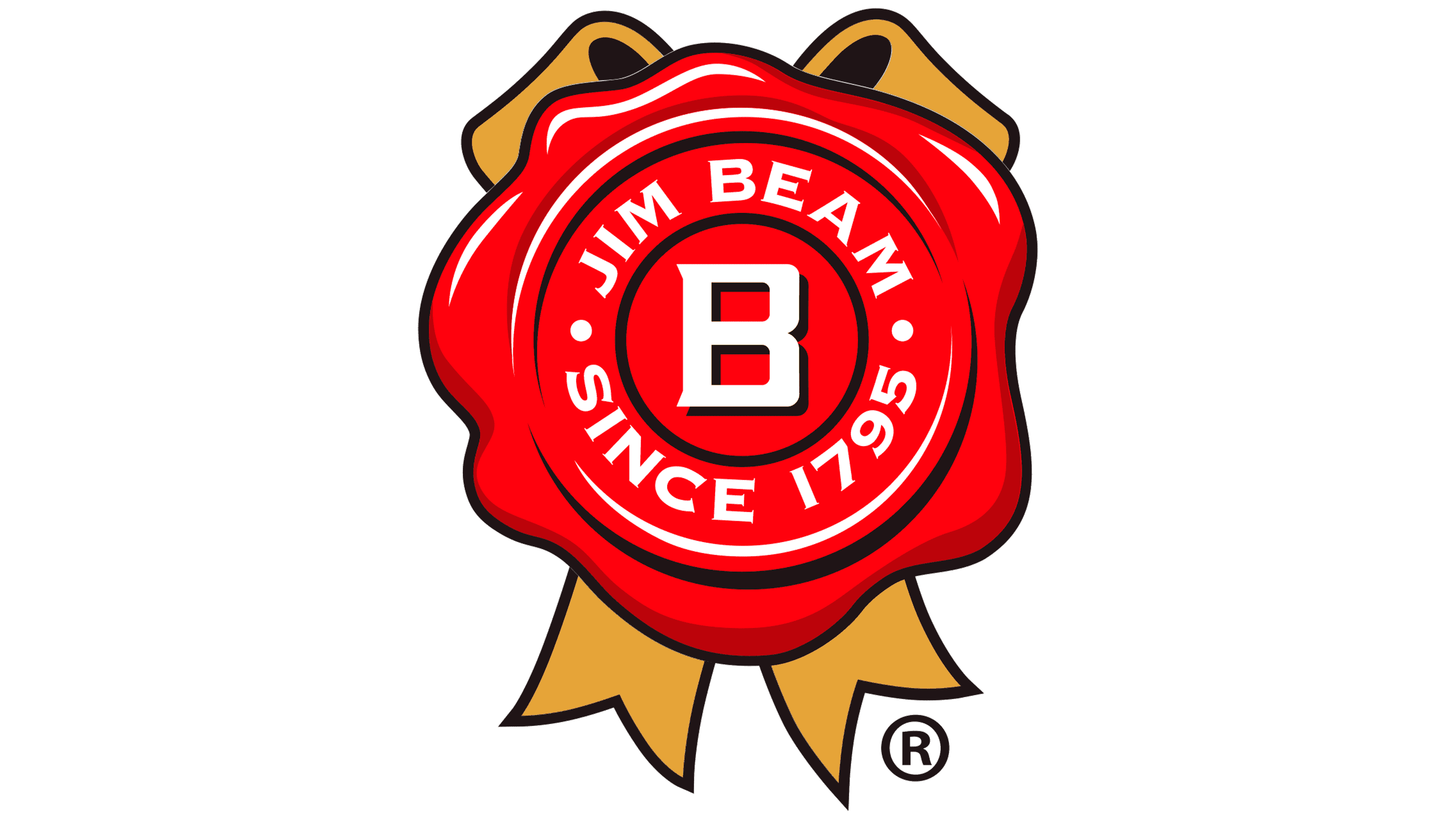
1943 – 2023
![]()
When Prohibition ended in America, the Beam family set out to revive its old business. At that time, the Old Tub bourbon brand was already history, so James Beam created a new company name: Jim Beam. Under this brand, the company began producing its flagship whiskey and achieved market success.
In the classic logo, the inscription JIM BEAM appears at the top in uppercase letters. The typeface is strict and wide, with neat serifs. The letters are black with a golden shadow. The shadow adds depth and lifts the text off the surface. The lettering is arched, giving the composition a sense of completeness.
Below the name is a red wax seal rendered in a realistic, detailed manner. It has uneven edges, highlights, and raised lines. In shape, this symbol also echoes a quality mark or an exhibition award once given at industry events in past decades. Such symbols were often part of brand visuals of that era and served as indicators of prestige or product quality.
At the center of the seal is a large white letter B enclosed within a circle. Around the letter is the text JIM BEAM SINCE 1795, also in white lettering. Two dots separate the inscription, drawing attention to the year from which the brand’s history is counted. Behind the seal are two crossed gold ribbons. Their silhouette is simple, with curves and shadows, which gives the composition a sense of volume.
The emblem highlights the bourbon’s long history, while the central letter B symbolizes the founder’s family name and the brand’s recognition far beyond America.
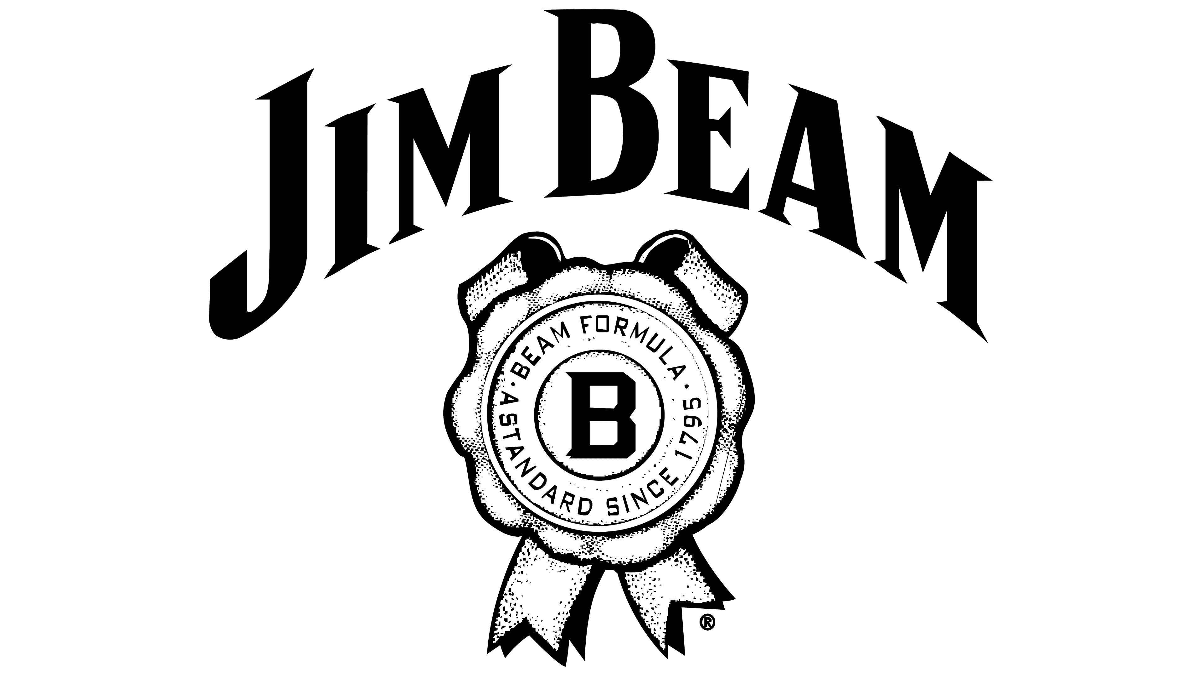
2023 – today
![]()
Jim Beam introduced an updated logo on May 1, 2023, entrusting its creation to the Turner Duckworth studio and designer Rob Clarke. While preserving key features of the past, the emblem gained a new tone. The lines became cleaner, and the shapes more precise and restrained.
The brand name JIM BEAM is set in large, tall serif letters. Their dark gray color, with an outline that mimics a shadow, gives the letters depth. The wordmark curves gently, reinforcing a sense of classic style.
Below is the brand’s signature symbol, a bright red seal with gold ribbons that resembles a wax imprint. At its center is a white letter B, surrounded by the word BEAM and the phrase THE STANDARD SINCE 1795. These words are set in a simple grotesque typeface. The seal has slightly uneven edges and subtle curves that emphasize the form’s natural quality. The ribbons that cross behind the seal are highlighted with fine line work that mimics fabric folds.
The updated logo style emphasizes the brand’s traditions and status. It is strict and concise, with carefully considered geometry. The central seal continues to resemble a mark of quality, associated with a high level of craftsmanship.
Today, the name Jim Beam is associated with the traditions and quality of American bourbon. Every element of its emblem recalls nearly two centuries of Beam family history and its role in creating one of the world’s most recognizable spirits.
Font and Colors
Jim Beam’s branding reflects its connection to its past and future. It represents a unified family of products telling the true American success story. The company immortalized it in its iconic logo, thereby establishing a strong pedigree.
It features a red imprint, as if from freshly sealed hot-seal wax. Above it is a capital letter “B” large, broad, clear, with serifs and truncated corners. It denotes the Beam dynasty and is well-known worldwide, so it is also used on other products.
A double ring of thin black lines surrounds the letter sign. Around it is the inscription “Beam Formula. The standard since 1795.” The edges of the sealing wax seal are uneven, as close to real as possible. Below is a wide ribbon folded in half. The matte finish also conveys the brand’s legend along the cap, exquisite prints, and gilded foil. The emblem’s color palette is a classic combination of white, red, yellow, and black. Their shades vary by product type.