The emblem demonstrates the full coverage of the telecommunications niche. The Jio logo promises: working with the company is a precise hit on the target. Excellent visibility, audibility, and a continuous clear signal are the main features of the operator.
Jio: Brand overview
| Founded: | 15 February 2007 |
| Founder: | Mukesh Ambani |
| Headquarters: | Navi Mumbai, Maharashtra, India |
| Website: | jio.com |
Meaning and History
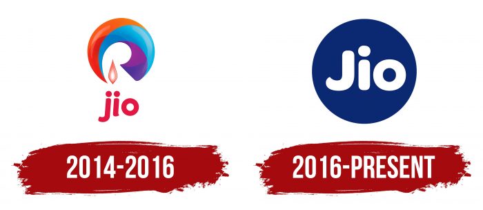
Despite the recent year of the emergence of the telecommunications operator, it has existed since 2007. Then he first started working in Ambawadi, Ahmedabad, Gujarat, where he was registered as Reliance Jio Infocomm Limited. Then the service changed several names, and with them the visual identity mark until it received the actual logo. This chain is now owned by the conglomerate Reliance Industries Limited, which reopened it in 2016. Now it is the third mobile operator in the world in terms of the number of subscribers. Since its inception, Jio has had two emblems.
What is Jio?
Jio, or Reliance Jio Infocomm Limited, is an Indian telecommunications company and the largest mobile operator in the country. It manages a national LTE network covering 22 districts. The test launch of the line took place in 2015, with the official launch in 2016. The head office is located in Navi Mumbai (Maharashtra).
2014 – 2016
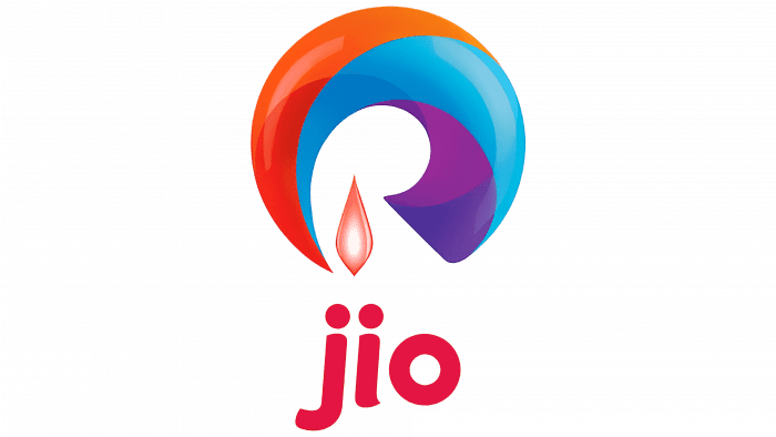
This period includes the prelaunch version, scheduled for launch in 2015 but postponed by almost 12 months. The logo depicts a rounded wave composed of several colors with a gradient. Among them are orange, red, blue, cyan, and purple. The alternating shades create shaded areas, so the drawn object also looks like a hollow dome.
Below is an element resembling a candle flame or a closed flower bud with a white core and pink edges. Below is the abbreviated company name. The word “jio” is written in deep red lowercase letters.
2016 – today
The current version is minimalistic: there is nothing superfluous in it. There are only two key elements – the name and the circle in which it is located. The word “Jio” occupies a central position with the same distance to both the top and bottom edges. Moreover, the dot at the letter “i” is slightly higher than the capital “J,” making the logo unique. At the same time, it exists in several modifications: with a blue and red circle, with a blue square, and with a slogan. Each version is relevant and used depending on the situation.
Jio: Interesting Facts
Jio is a game-changing telecom company in India, introduced by Reliance Industries in September 2016. Since its launch, it has greatly influenced the telecom sector and India’s digital landscape.
- Affordable Plans: When Jio started, it offered free or cheap data and voice plans, which encouraged many people in India to use the internet more.
- Rapid Growth: Jio quickly got 100 million users in just six months, making it the fastest-growing telecom company in the world at that time.
- Digital Access for Everyone: Jio made it easier and cheaper for people in India to get online, many for the first time. This helped more people use digital payments, shop online, and learn new things on the internet.
- Expanding into Tech: Jio isn’t just about phone services. It has started other digital services like JioCinema and JioMart, attracting big investments from companies like Facebook and Google.
- Ready for the Future: Jio’s network is currently 4G but can easily be upgraded to 5G, which means Jio can continue offering fast internet services.
- JioPhone: Jio made a very affordable phone that can go online, helping more people, especially in rural areas, to access digital services.
- More Internet Users: With Jio, many more people in India started using the internet. India has become one of the top countries for internet use, changing how people learn, shop, and do business.
- Eco-Friendly Moves: Jio is working on using renewable energy for its networks, showing it cares about the environment, too.
In short, Jio isn’t just a big name in telecom. It’s also a major force in making digital services accessible to everyone in India and pushing the country forward in technology and innovation.
Font and Colors
The main detail of the individual symbols of the Jio telecommunications service is a circle. It embodies the wide reach and unbreakable bond of subscribers. The second most important element is the name of the company. It is located in the center and is made in a contrasting color. In the first logo used in beta mode, the name is shifted downward, and the circle is not closed and looks like a wide, broken ring.
The word “Jio” is written in large upper and lower case letters. The lines are thickened, smooth, and rounded. Moreover, the dot above the “i” is above all other characters. The signature palette consists of two colors – white and Medium Persian Blue (shade # 005AAC). There are also options with red and blue colors, which are equally valid.
Jio color codes
| Medium Persian Blue | Hex color: | #005aac |
|---|---|---|
| RGB: | 0 90 172 | |
| CMYK: | 100 48 0 33 | |
| Pantone: | PMS 2945 C |
