When creating the JLL logo, designers reflected the company’s reliability and confidence. The abstract forms and contrasting colors convey a commitment to a modern business approach. Moreover, the emblem symbolizes the interconnection of all employees providing real estate services.
JLL: Brand overview
Meaning and History
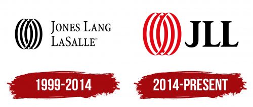
JLL officially existed since 1783, but its actual history dates back to the late 1990s when Jones Lang Wootton and LaSalle Partners merged to form Jones Lang LaSalle. The newly formed firm used a geometric symbol in its logo, known as the Worldmark. This abstract drawing consists of three vertical ellipses. It represents the close connection between employees and between the company and its clients. In 2014, the lengthy name was shortened to three letters: JLL. This abbreviation is easy to read and remember in any language and takes up little space, making it suitable for digital applications.
What is JLL?
JLL is the short name for Jones Lang LaSalle Incorporated. It is an international firm that provides services in commercial real estate, including leasing, sales, consulting, and development. It works with various properties – from offices and warehouses to stores and hotels. Additionally, the company specializes in investment and asset management. Its headquarters are located in Chicago, Illinois, with offices and representations around the world.
1999 – 2014
This logo uses the name Jones Lang LaSalle, which the company adopted in 1999 after the merger of Jones Lang Wootton and LaSalle Partners. The phrase is colored in black and written in the Minion Pro Condensed font. It is characterized by long serifs and contrasting stroke thickness. Although all letters are uppercase, some are additionally enlarged. The inscription occupies two lines on the right side, and to the left is an abstract symbol consisting of three intertwined ellipses in black. Each geometric figure is formed by two connected round brackets.
2014 – today
To signify its global presence worldwide, Jones Lang LaSalle changed its name to JLL. The rebranding is reflected in the company’s logo: instead of the long inscription, the short word “JLL” now appears. Designers from Pentagram Berlin maintained the familiar serif font style but altered the glyph shapes, making them bolder and more expressive. They also recolored the geometric abstraction in red – making it stand out more and appear three-dimensional.
Font and Colors
Before 2014, the name Jones Lang LaSalle was written in Minion Pro Condensed font. After the company became known as JLL, designers from Pentagram Berlin, along with Justus Oehler, developed its proprietary letters. They retained the familiar serifs as part of the brand’s heritage but made the “J” resemble a sharp hook.
The black inscription pairs with the red abstraction. The bright color contrast attracts attention to the emblem and symbolizes JLL’s progressiveness and boldness in using modern technologies.


