


![]() Johnson’s Baby Logo PNG
Johnson’s Baby Logo PNG
Behind the success of the brand that the Johnson’s Baby logo represents are years of hard work and dedication. The result is an ideal combination of ingredients and care for your baby’s skin. The emblem promises that each product is individually selected.
Johnson’s Baby traces back to Johnson & Johnson, founded in 1886 in New Brunswick by the Johnson brothers. The company initially produced sterile surgical dressings, focusing on antiseptic methods.
In 1892, a doctor reported skin irritation from adhesive plasters. Scientific director Frederick Kilmer suggested using talc and sent a sample. The result led to the launch of Johnson’s Baby Powder in 1893, first distributed through maternity kits and then sold widely from 1894.
The powder, made of 99.8% talc, gained popularity beyond infant care. In 1913, the slogan “Best for Baby, Best for You” reflected its dual use. The line expanded with Baby Cream and Soap in 1921, and Baby Oil in 1938.
A major step came with Johnson’s Baby Shampoo and its No More Tears formula, designed to be safe for children’s eyes. The product became a global success, while competitors such as Procter & Gamble focused on related categories, such as Pampers.
Concerns emerged in the 1970s about possible asbestos contamination in talc. Lawsuits escalated, including a $72 million verdict in 2016 and a $4.7 billion ruling in 2018. In 2019, the FDA detected contamination in a batch, leading to recalls.
In 2020, Johnson & Johnson stopped selling talc-based powder in the US and Canada. Competing brands like Mustela had already emphasized alternative formulas.
In 2023, the consumer division became Kenvue, with Johnson’s Baby included in the new structure.
Meaning and History
The parent company retained the same visual identity for its lineup that it uses itself. There are two reasons for this: the first is the brand’s instant recognition and buyers’ trust across many countries, and the second is the demonstration of close ties with its subsidiary company. Like the main manufacturer, Johnson’s Baby has had only one logo in its entire history.
The personal mark consists of the truncated name Johnson & Johnson. The fact that it does not refer to one person but several people with the same surname is evidenced by the apostrophe and the letter “s.” As a result, the ‘s’ symbol became the emblem’s primary identifier. The second word is “baby,” which indicates the product’s purpose.
What is Johnson’s Baby?
Johnson’s Baby is a famous children’s cosmetic brand. It offers hygiene and skincare products to maintain children’s skin health. Its first product was baby powder, and now the range includes lotions, shampoos, gels, wet wipes, body milk, and much more. The trademark appeared in 1893 and is owned by Johnson & Johnson.
Font and Colors
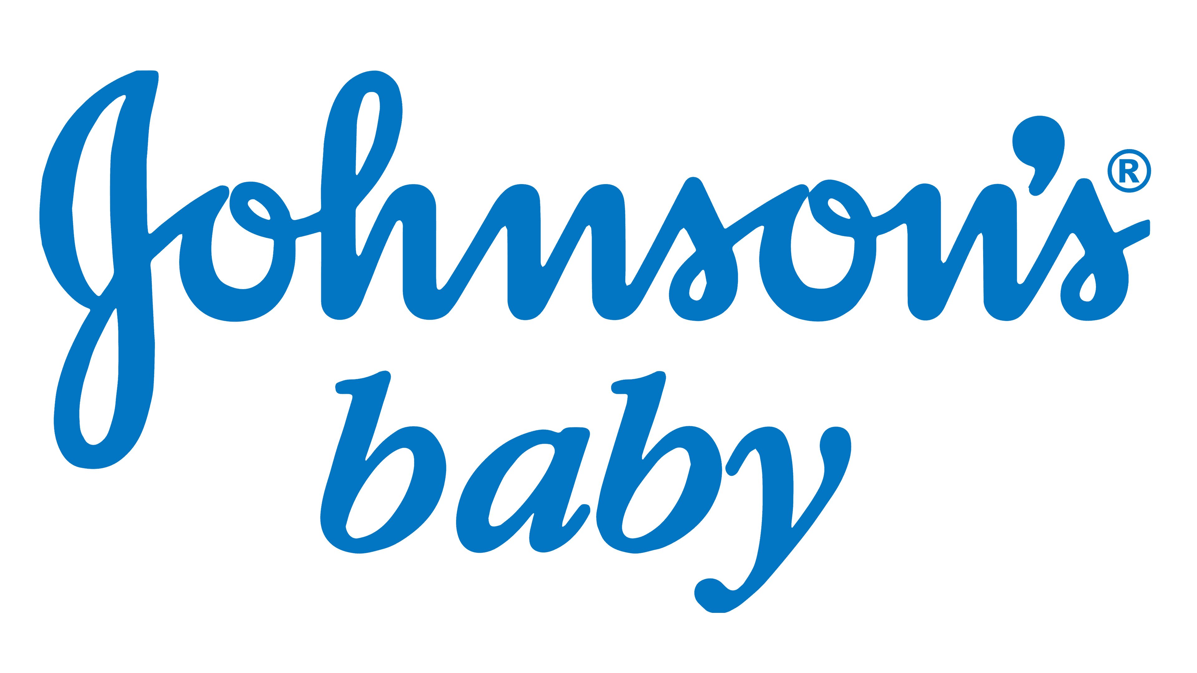
To visually differentiate the words, the designers proposed two types of typefaces for the logo. The upper inscription is made in the usual semi-handwritten style with vertical letters. The lower one is in italics, emphasizing the serifs on the legs of the two “b” s and the bend of the upper-left segment of the “y.” The color is classic blue with a blue tint.