


![]() Joy Division Logo PNG
Joy Division Logo PNG
The distinctiveness and eccentricity of the musical style are reflected in the logo of the British rock band Joy Division. The minimalist text identity and font, styled after a version of the monumental Trajan letter, symbolized the grandeur of the sensations conveyed.
On June 4, 1976, Sex Pistols played at Manchester’s Lesser Free Trade Hall. Among fewer than fifty attendees were Bernard Sumner and Peter Hook, who left convinced they could form a band without formal training. The next day, Hook bought a bass, Sumner took a guitar, and rehearsals began with Terry Mason.
A vocalist was found through a notice at Virgin Records. Ian Curtis joined based on personal familiarity, while Mason became manager. After several drummer changes, Stephen Morris joined in August 1977, completing the core lineup.
The band first performed as Warsaw, debuting on May 29, 1977, at Manchester Electric Circus with Buzzcocks. In 1977, they recorded the EP “An Ideal for Living”. In early 1978, the band changed its name to Joy Division due to confusion with the Warsaw Pact.
In 1978, Tony Wilson signed them to Factory Records. That year, Curtis was diagnosed with epilepsy, which began affecting performances and touring.
In April 1979, the band recorded tracks with Martin Hannett. The album “Unknown Pleasures” was released in July 1979, drawing comparisons with Buzzcocks but moving in a darker direction.
By 1980, Curtis’s condition worsened. After a failed suicide attempt in April, he died on May 18, 1980, shortly before a planned US tour. “Closer” and “Love Will Tear Us Apart” were released posthumously.
After his death, Sumner, Hook, and Morris formed New Order with Gillian Gilbert. Their 1983 single “Blue Monday” became the best-selling 12-inch vinyl single, and Factory Records closed in 1992; the catalog moved to London Records.
Meaning and History
![]()
In 1976-1977, the band was called Warsaw in honor of David Bowie’s composition Warszawa. In 1978, it changed its name to avoid accidental confusion with the Warsaw Pact. That same year, it adopted a logo: a simple “Joy Division” inscription on a white background.
This phrase appears in the song No Love Lost, which was included in the debut mini-album An Ideal For Living. The lyrics refer to the novel by Auschwitz prisoner and Jewish writer Ka-Tzetnik (135833). It mentions Joy Division, where Nazis kept camp prisoners in sexual slavery.
What is Joy Division?
It’s a rock band from the United Kingdom, formed in 1976 in Salford. It is considered one of the leading representatives of post-punk. Joy Division was among the first to focus on an explosion of expression and vivid mood rather than an outburst of energy and hatred.
Font and Colors
The rock band’s emblem is minimalist. It consists of the group’s full name. The font is reminiscent of Trajan, a member of the Modern Ancients display font family. It is a typeset version of the monumental script used for inscriptions on Trajan’s Column in Rome.

It is characterized by thin, sharp-angled letters with noticeable serifs, smooth lines, and elegant, gentle curves. Interestingly, this font was created only in 1989. Before that, the name Joy Division looked completely different.
FAQ
What is the Joy Division logo?
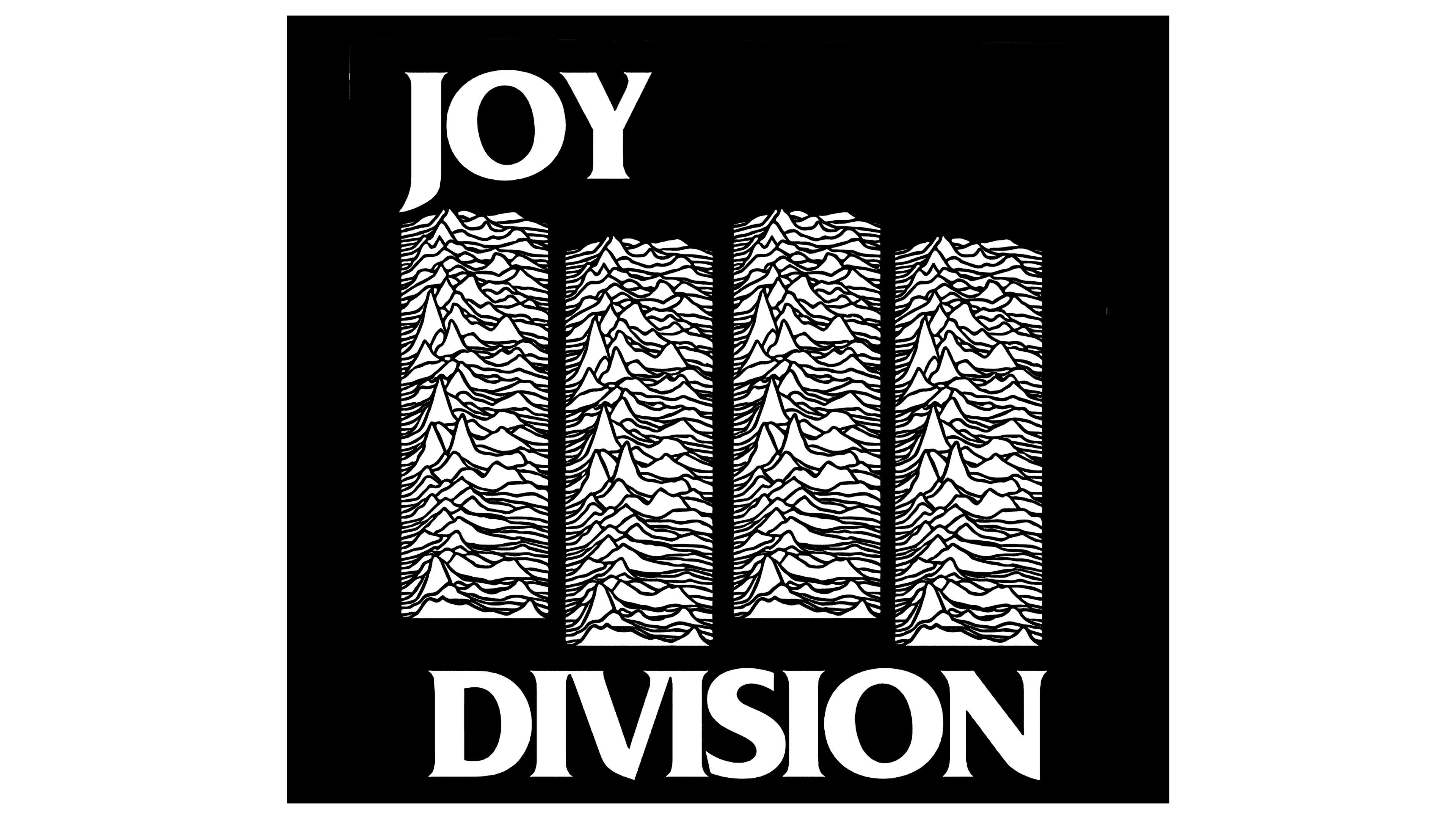
The Joy Division logo is the band’s name, which has a complex pattern of pulsar radio emissions. Representatives of Cambridge University, including student Jocelyn Bell Burnell and teacher Antony Hewish, first detected this phenomenon.
What is the Unknown Pleasures album cover?
The album cover features a diagram of pulsating radio waves from a spinning neutron star. The lines are thread-like, white, set against a black background. The Briton Peter Saville created the design.
Who designed the Joy Division album?
British designer Peter Saville designed the famous logo on the cover of the Joy Division album. He based it on pulsar radiation, reinterpreted it graphically, and made it a cult design for all time.
What genre does “Unknown Pleasures” belong to?
Unknown Pleasures is a unique project. The album combines several genres, including lyrical rock and post-punk. In its grandeur and conveyed notes, it is comparable to the sensations of Lovecraft.