The famous Jurassic Park logo looks like an artifact of the dinosaur era because the franchise is dedicated to this time. The graphic sign creates an atmosphere of tension and anticipation of new dangerous adventures. This is the most suitable symbol for stories about dinosaurs.
Jurassic Park: Brand overview
| Founded: | 1993 |
| Founder: | Universal Pictures, Amblin Entertainment |
| Headquarters: | United States |
Meaning and History
The author of the very first logo on the cover of the book was Chip Kidd. Sandy Collora made subsequent edits. There are several options in total.
What is Jurassic Park?
It is a sci-fi media franchise based on the novel of the same name by Michael Crichton. The story of cloned dinosaurs has been the inspiration for movies, games, and water attractions.
1993
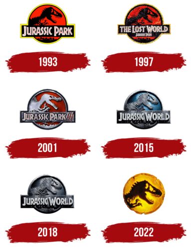
This year’s emblem belongs to the first film from the cycle of the same name. Steven Spielberg shot it at Universal Studios. Chip Kidd made the film’s brand mark. He drew a prehistoric lizard from museum pieces and albums, using only a pencil and tracing paper sheet. The logo features a dinosaur skeleton on a red background with the phrase “Jurassic Park” in the middle.
1997
That year the next film was released, filmed on the same set and by the same director. Its logo is almost identical to the previous version, both in shape and color. The only differences are more detail, a different name, and a stronger yellow line around the perimeter.
2001
The next emblem appeared in advertising brochures, posters, and in the cinema in 2001 when Joe Johnston presented his version of the film. By highlighting in gray with a metallic sheen, a dinosaur (of another species) turned out to be three-dimensional. And three claw marks next to the name of the motion picture added more realism to the logo.
2015
Colin Trevorrow was working on the fourth film in the cycle. This time, two studios participated in the filming – Legendary Pictures and Universal. The emblem of the period depicts a Tyrannosaurus rex against a cold blue background.
2018
In 2017, a film version of the Jurassic World by Juan Antonio Bayonne appeared at the box office. The film’s distinctive mark contains a three-dimensional skeleton of a dirty gray dinosaur on the same background.
2022
In June 2022, the film Jurassic World: Dominion was released in the USA, which is the conclusion of the dinosaur trilogy and the logical culmination of the Jurassic Park franchise. During the release of the sci-fi action movie, it became clear that its logo contains the traditional image of the upper part of the T-Rex skeleton: head, neck, and forelimbs. This is the same illustration that Chip Kidd created for the book’s cover in 1990, inspired by the drawings of the famous American paleontologist Henry Fairfield Osborn.
Modern designers have rethought the emblem, presenting it in a new color. Now it is not gray, not blue, and not red, as it was before, but bright yellow, with an orange gradient around the edges. The center is the brightest as if it is illuminated from the back. Because of this palette, the round base resembles a piece of amber with chipped and cracked edges. In the middle, the silhouette of a tyrannosaurus appears, which is turned to the left. It is unevenly colored orange-brown with dark and light spots. As before, the artists detailed all the bones, including the vertebrae, ribs, skull, and jaws. Sharp teeth and claws are also depicted in detail.
By the way, the creators of Jurassic World: Dominion recreated the iconic emblem right in the movie. This Easter egg can be seen towards the end – at the moment when the T-Rex is about to join the battle with the Giganotosaurus. At some point, he walks past a ring-shaped fountain, and then his profile is visible in the same way as in the Jurassic Park logo.
Jurassic Park: Interesting Facts
“Jurassic Park” is more than just a huge movie hit from 1993; it’s a movie many people love and remember. Steven Spielberg directed it, based on a book by Michael Crichton. The movie was special because it used new computer effects to make dinosaurs look real.
- Amazing Effects: The movie was one of the first to combine computer effects with real-life models to create dinosaurs. This combination made the dinosaurs look real and set a new movie standard.
- Big Money Maker: When “Jurassic Park” came out, it made more money than any other movie before it, earning over $900 million worldwide. It showed that big movies could make a lot of money.
- Cool Dinosaur Sounds: The dinosaurs made sounds by mixing sounds from different animals, like dogs and elephants. This made the dinosaurs sound scary and real.
- Got People Loving Dinosaurs: After the movie, more people got interested in dinosaurs and science. Some kids who watched the movie even grew up to be scientists.
- Science Help: The movie had science experts help ensure the dinosaurs looked right, though they changed some things to make the movie more exciting.
- Won Awards: “Jurassic Park” won three Oscars for its excellent visuals and sound. People still talk about the effects.
- Everyone Knows It: The movie has famous lines and scenes that people still talk about, like the T-Rex chase.
- Memorable Music: John Williams made the music for the movie, and it’s so good that people immediately recognize it. It helped make the movie feel magical.
- Started More Movies and Games: “Jurassic Park” led to more movies, games, toys, and even rides at theme parks. It started a whole series of movies called “Jurassic World.”
- Used in Schools: Although the movie got some science stuff wrong, teachers use it to discuss important ideas like genetics and the environment.
“Jurassic Park” is a big deal in movie history because it is new and exciting. It made people think and wonder about dinosaurs and the world around them.
Font and Colors
Before the first film launch, Sandy Collora redesigned the logo based on the Tyrannosaurus Rex skeleton that Chip Kidd drew. She made the bones longer and thinner, placed the prehistoric predator’s figure in a circle, and added a strip of palm trees. The rest of the versions followed the chosen direction. They had the same structure and shape. The artists only intervened in the details, the type of the dinosaur, the texture, and the film title.
The style of the font is similar to the one used for the book cover. Its author is Michael Crichton. The revised version was made by Doug Olena, an assistant professor at Evangel University. The font has something in common with Star Wars. The color scheme was constantly evolving: at the beginning, it was red and black, in the middle – gray and red, at the end – blue and gray.
FAQ
What font is the Jurassic Park logo?
The font used in the Jurassic Park logo is Neuland Inline. Designed by Rudolf Koch, Neuland Inline has a rough, primal quality that matches the untamed nature of the film’s setting.
Neuland Inline features bold, rugged lines that convey strength and wilderness. These qualities make it perfect for the Jurassic Park logo, reflecting the movie’s wild and prehistoric themes. The font’s rough edges and uneven strokes give it a hand-crafted feel, adding to the sense of adventure and excitement.
This font choice has helped make the Jurassic Park logo one of the most recognizable and iconic in the film industry.
What is the logo of Jurassic Park?
The logo, called the “Logosaurus” by fans, represents the various logos used to market the novels and films. The original design, created by Chip Kidd for Michael Crichton’s book, features a black T-rex skeleton silhouette.
This iconic logo symbolizes the Jurassic Park franchise. The T-rex skeleton is set against a red and yellow background, enhancing its visibility and impact. The circular shape and bold, uppercase “Jurassic Park” lettering in Neuland Inline font make it distinctive.
The design captures the essence of the story, conveying danger, excitement, and prehistoric adventure. The T-rex, one of the most fearsome dinosaurs, represents the thrilling elements of the franchise.
The logo has remained consistent, creating a strong and recognizable brand identity. It appears on movie posters, merchandise, and promotional materials, making it one of the most recognizable logos in film history.
When did Chip Kidd make the Jurassic Park logo?
Chip Kidd began designing the Jurassic Park logo in 1989 while preparing for Michael Crichton’s book. At the time, he was a 26-year-old designer at Knopf. His drawing of the iconic T-rex skeleton silhouette first appeared on the book cover in 1990.
Kidd’s design quickly became synonymous with the Jurassic Park brand. The bold and striking imagery captured the novel’s essence, conveying adventure, danger, and prehistoric wonder. The T-rex skeleton, set against a red and yellow background, created a memorable and impactful visual that resonated with readers and moviegoers.
This logo helped establish the visual identity of the Jurassic Park franchise and set a high standard for book cover design. Kidd’s work showed the power of a well-crafted logo in creating a lasting impression and contributing to a brand’s success.
Who drew the Jurassic Park logo?
Chip Kidd created the iconic logo, drawing the famous dinosaur silhouette for Michael Crichton’s book. Universal Pictures later modified this design for the film adaptation by adding the circle, typography, and palm trees.
Kidd’s original design focused on the T-rex skeleton, capturing the essence of the novel’s prehistoric adventure. This image became the foundation for the final logo in films and other media. Universal Pictures’ additions enhanced the logo, making it more dynamic and visually appealing for marketing materials.
The combined efforts of Chip Kidd and Universal Pictures resulted in a powerful and iconic logo. Its bold design and memorable imagery have made it instantly recognizable and contributed to the enduring popularity of the Jurassic Park franchise.
What dinosaur is in the Jurassic Park logo?
The Jurassic Park logo shows the top of a Tyrannosaurus rex skeleton. This image captures the franchise’s essence, symbolizing the adventure and danger central to the story.
The T. rex is a famous and fearsome predator from the age of dinosaurs. Its presence in the logo highlights the thrilling and terrifying elements of Jurassic Park.
The T. rex skeleton is set against a red and yellow background, making it stand out. The bold design and striking imagery make the logo easily recognizable and contribute to the strong visual identity of the franchise. The logo’s simplicity and power convey the excitement and danger of the Jurassic Park world.
In summary, the Jurassic Park logo features the top of a Tyrannosaurus rex skeleton, representing the franchise’s adventure and danger. This design has become an iconic symbol of the Jurassic Park series.
What are the Jurassic Park colors?
The logo shows the top of a Tyrannosaurus rex skeleton. This image captures the franchise’s essence, symbolizing the adventure and danger central to the story.
The T. rex is a famous and fearsome predator from the age of dinosaurs. Its presence in the logo highlights the thrilling and terrifying elements of Jurassic Park.
The T. rex skeleton stands out against a red and yellow background. The logo’s bold design and striking imagery make it easily recognizable and contribute to the franchise’s strong visual identity. Its simplicity and power convey the excitement and danger of the Jurassic Park world, making it an iconic symbol of the series.
