“Isn’t it time for a snack?” asks the Just Eat logo. The emblem conveys a message of warmth, home comfort, and satiety. It promises to deliver delicious food directly to the table. The sign addresses the user: set the table, and we are coming to you.
Just Eat: Brand overview
| Founded: | 2001 |
| Founder: | Just Eat Takeaway.com |
| Headquarters: | Denmark |
Just Eat is a British food delivery service covering thirteen countries globally, including countries in Europe, the Americas, and Australia. It first appeared in Kolding (Denmark), founded by three entrepreneurs: Jesper Buch, Per Meldgaard, and Henrik Ostergaard. The time of its occurrence is 2001. It is now a private limited liability company known as an online service that acts as an intermediary between catering establishments and their customers. The company helps to find restaurants, place orders, pay for them, and choose the most convenient delivery method.
It all started in 2000 when five Danish businessmen decided to start a food delivery service. It took them almost a year to settle various legal and technical nuances until, in the summer of 2001, the service began to work in full force. 2005 Jesper Buch bought out investors and founders’ shares, moving the business to the UK.
From that moment on, Just Eat’s global expansion began. First on the list were the Netherlands and Ireland, where the firm opened its offices. This was followed by mergers, acquisitions, and expansions, making the online service logo well-recognized almost worldwide. In 2016, having achieved high growth, the organization carried out the largest rebranding in its history, radically changing its image.
Meaning and History
Just Eat’s name and logo invite you to share a delicious breakfast, lunch, or dinner without leaving home. Because the platform for online food delivery brings orders to millions of customers worldwide, she helps make culinary discoveries because she cooperates with tens of thousands of restaurants and is not limited to any one type of cuisine. The creators of the Just Eat brand have carefully worked on every little thing. Central to his old visual identity was the color red. It united all the logos that were used until 2020. It symbolizes passion and love for food and expresses dynamics because the main thing in online delivery is high speed.
What is Just Eat?
It is a UK-based home delivery company operating in thirteen countries around the world. She was founded in 2001 when she first appeared in Kolding (Denmark). Now the head office is located in London (England).
2001 – 2009
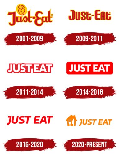
Until 2009, the Just Eat logo contained the brand name and the head of a cartoon man in a chef’s hat. The head was drawn in dark red lines and looked like a round bread with a comma-shaped eye. This element was in an orange oval, slightly tilted to the left. That, in turn, occupied the free space above “Just”—between the vertical parts of “J” and “t.”
A short dash separated the two words. For the inscription, a custom stylized font was used, in which many of the letters were pointed or serifed, and the “s” resembled a reversed and inverted “c.” Each glyph was painted dark red and outlined with an orange stripe. The outlines were the only separating element due to the lack of letter spacing.
2009 – 2011
The debut logo was a simple text in a custom font. It had no serifs, and the smooth lines visually created harmonious transitions, inspiring a sense of trust in the company. All the corners on the letters were rounded, and the ends had even cuts. The lettering was red with yellow edging. There was a hyphen (-) between the words “Just” and “Eat.” Moreover, this option was the only one where it was used.
2011 – 2014
During the 2011 redesign, the company received a completely different identity. From now on, her emblem adorned an inscription made in wide white symbols with a thick red line along the edge. All letters have been converted to uppercase and connected by a contour strip. The key element of the logo was “A,” which, instead of the usual triangular-shaped inner lumen, appeared as a miniature arrow, like on a monitor. Such changes underlined the company’s confidence and reliability and showed a virtual online ordering service.
2014 – 2016
In this version, the developers have increased the coverage area in red. They turned the border strip into a solid, rounded rectangle with the name of the delivery service. The designers did not change the letter “A” with the arrow cursor, leaving the same.
2016 – 2020
The changes made in 2016 simplified the logo. Management approved a version with italic text in a sleek, thin sans serif typeface. The background and letter colors were reversed, so the emblem looked like red text on a crisp white backing.
2020 – today
The year 2020 saw a radical change in the company’s image. The combination of Just Eat and Takeaway Com has resulted in an orange logo. It now depicts the silhouette of a house with a fork and spoon in negative space. On the right is an inscription, “Just Eat,” which is the previous style that was completely preserved.
Just Eat: Interesting Facts
Just Eat is a top food ordering and delivery service that changed how we order food.
- Start and Growth: Starting in 2001 with five people in Denmark, Just Eat has grown worldwide.
- Online Ordering Early Bird: They were among the first to use the internet to get your food orders from local restaurants when it was a new idea.
- Going Global: Just Eat grew by starting in new places and buying local delivery companies in Europe, Asia, Oceania, and the Americas.
- Stock Market Debut: In April 2014, Just Eat became public on the London Stock Exchange, showing its success and trust in online food delivery.
- Tech Innovations: They use smart tech to make delivery faster and easier and use AI to suggest what you might like.
- Caring for the Environment: Just Eat uses less plastic and eco-friendly delivery to lessen its environmental impact.
- Growing Through Deals: It’s not just growing independently; buying companies and merging with Takeaway.com in 2020 made it one of the biggest delivery services.
- Variety of Restaurants: Just Eat offers many choices by partnering with big chain restaurants and local spots.
- Helping During COVID-19: They helped restaurants stay open with contactless delivery during the pandemic and took steps to keep delivery drivers safe.
- Cultural Influence: Just Eat has become a big part of how we see food delivery, with catchy ads and tunes making the brand well-known.
From a small startup to a global name, Just Eat’s story is about growth, embracing technology, and changing our food ordering.
Font and Colors
Corporate identity has always been based on the company name. But if it was exclusively an inscription in the first years of the online service, it is supplemented with a drawing: a picture of a house and cutlery. Moreover, modernization mainly affected only the text.
Because Just Eat uses a verbal logo, it prioritizes the lettering style. In the debut version, the characters were in lowercase; in all others, they were in uppercase. The predominant fonts were Fuse V.2 Text Black or Source Sans Pro Light Regular with some revision and Jano Round Bold Italic, Amfibia Bold Expanded, or Caldina Bold Italic. The latest version uses a typeface as close as possible to Mangerica Italic Extra Bold.
On the other hand, the color of the emblems is stable. All logos, except for the current one, use a combination of red and white. The current emblem is orange # ff8100 (tentatively – Dark Orange).
FAQ
What is the meaning of Just Eat?
It is an online platform that connects customers with local takeaway food outlets. Operating in seven countries, customers can search for nearby restaurants, place orders, and pay online. Users can choose pick-up or delivery options for their meals.
The platform makes ordering food easy and convenient. Customers can browse menus, read reviews, and discover new dining options from home. The brand simplifies the process, helping people enjoy food from their favorite local eateries or explore new ones.
What are the colors of the Just Eat logo?
The logo features a bold and energizing orange color known as JET Orange. This color is central to the brand’s identity and is used across all brand touchpoints. It is considered the brand’s most unique and memorable asset, making it instantly recognizable.
The recommended color ratio for JET Orange with other colors is 50% to 100%, ensuring orange is the dominant hue in all brand materials. This consistent use of JET Orange creates a strong visual identity, helping the brand stand out. The vibrant color helps create a memorable and positive impression, reinforcing the brand’s presence and appeal.
What is the slogan of Just Eat?
The brand launched a UK campaign with the tagline “We Got It,” created by McCann London. This campaign highlights expanding delivery services to major brands like McDonald’s, KFC, and Greggs.
The “We Got It” campaign emphasizes the convenience and variety offered by delivering food from these popular brands. The ads show how easily customers can get their favorite meals delivered.
The brand continues its “Did Somebody Say” campaign featuring Snoop Dogg. This campaign has successfully made the brand memorable and reinforced its market presence. Both taglines show Just Eat’s commitment to offering a wide range of food options and making the ordering process simple and enjoyable for customers.
Why did Just Eat change their logo?
The Brand changed its logo after merging with Takeaway.com. The new design aims to create a unified brand identity.
The logo now features the silhouette of an orange house with white cutlery in the negative space, showing a fork and spoon. This symbolizes home dining and the convenience of food delivery. The orange color remains a key element, keeping a connection with the brand’s previous identity while introducing a fresh look that aligns with Takeaway.com’s branding.
This change was part of a strategy to create a cohesive and recognizable brand across different markets. It enhances the brand’s appeal and makes it easier for customers to identify and trust the service.
What is the purpose of Just Eat?
The brand provides online food ordering services for home or office delivery. Customers can browse menus from local restaurants, place orders, and pay online. They can choose either self-pickup or delivery to their door.
The company connects customers with local eateries, making enjoying restaurant-quality meals at home or work easy. The service aims to make food ordering simple and accessible, offering a wide range of cuisines and dining options to suit different tastes and preferences. This focus on convenience and variety is central to the company’s mission.
WHY WAS the Just Eat order Canceled?
Orders can be canceled in exceptional cases. These include sold-out products, extreme weather conditions, or technical problems. Orders may also be canceled if customers are unavailable to receive the delivery.
Another reason for cancellation is if the customer or the restaurant does not confirm the order. Confirmation is crucial to ensure the order is processed correctly and delivered on time. If these issues occur, the order will be canceled to avoid complications.
What is the Just Eat font?
The logo has used various fonts, including Fuse V. 2 Text Black, Amfibia Bold Expanded Italic, Caldina Bold, and Jano Round Bold Italic. Each font was slightly modified to match the brand’s design needs.
Fuse V. 2 Text Black is clean and modern with strong readability. Amfibia Bold Expanded Italic has a dynamic and bold slant. Caldina Bold offers a solid, straightforward look, while Jano Round Bold Italic has a softer, rounded appearance.
These fonts were chosen to convey Just Eat’s identity, focusing on clarity, modernity, and approachability. Using these fonts consistently helps maintain the brand’s recognition and visual coherence.

