Justin Bieber’s logo is light, mysterious, romantic, and rebellious. The emblem encompasses the multifaceted personality of the musician who grew and matured on stage while maintaining unprecedented popularity.
Justin Bieber: Brand overview
| Founded: | 2007 – present |
| Founder: | Justin Drew Bieber |
| Headquarters: | Beverly Hills, Los Angeles County, California |
| Website: | justinbiebermusic.com |
Meaning and History
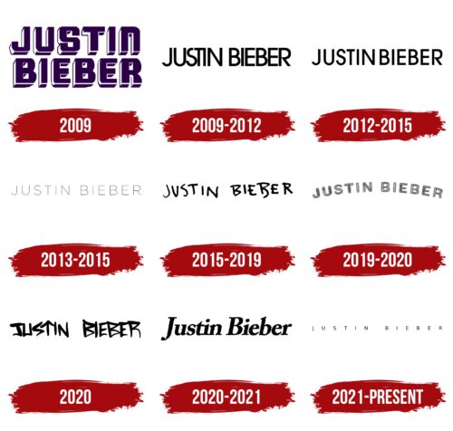
The musician performed on stage from the age of 14. However, real popularity and the first logo appeared after signing a contract with RBMG Records. The emblems reflect the changes in the singer’s personality as he grew up and are linked to individual singles and albums. The content of the songs directly affects the style of the logo’s inscription. However, in all cases, the emblem features the performer’s name.
What is Justin Bieber?
A famous singer who enjoys wild popularity among the youth. The performer is a multifaceted creative personality. His albums debuted at the top of the Billboard 200. A clothing line, perfumes, nail polish, baked goods, beer – all of this is also about Justin Bieber, who sings and successfully engages in business and stars in films about the musician’s life.
2009
For the rising star and the first single, the singer chose an overly pretentious emblem of giant capital voluminous letters, viewed from the bottom up. The image slightly “oppresses” its appearance. Perhaps, for this reason, the emblem was hardly used.
Raymond Braun Media Group’s manager- Scooter Braun- persuaded The artist’s mother to fly from Canada to America to record trial songs. After signing the contract, work began on the first single, for which they tried the majestic letter composition.
Dark purple elements with white sides testified to the artist’s creative depth and the fresh “wave” he brings to American Music. The size and position of the symbols made the singer an unattainable idol. However, considering the performer’s age and the desire to be closer to the audience, the image was changed just four months after the first EP.
2009 – 2012
Subsequent logos looked more stylish and calm. Thin, even letters with a shortened ‘S’ and combined ‘T’ and ‘I’ were created for the first (2009) and second (2010) parts of the debut album, My World.
Along with the image of the young artist, the delicacy of the glyphs spoke of the beginning of the career and the youth of the guy, and the uppercase indicated prospects and the audience’s attention to the singer.
The unusual execution of STI gave the sign individuality. The singer is close to the listeners and understands their problems since he is the same age. The close placement of letters in the sign also hinted at a narrow performance niche and still local popularity within America.
The sign took hold and was used for albums and singles until 2012.
2012 – 2015
The rebranding of 2012 was conducted for the third album, Believe, together with the new label Island Records. The sign started on the first single from the collection: Boyfriend.
Since the album has a lot of dance music, the emblem differs by increasing the distance between the characters, giving room for “movement.” The choice speaks to the fact that the singer has grown both physically (he turned 18 in 2012) and creatively. Bieber became the first artist to have five albums in top positions at a young age.
2013 – 2015
For the first time, a light and airy, almost floating sign appeared in 2011 for the fragrance Someday By Justin Bieber, embodying the scent’s theme. Later, the logo resurfaced in 2013 as part of Music Mondays, when new Bieber songs were presented every Monday before the release of the movie Justin Bieber’s Believe—a total of 10 tracks.
The emblem best represented the idea of anticipation and a gradual approach to an important date. Letters seemed to emerge from oblivion, embodying anticipation and sketching a delicate image of the future.
The definitive quintessence of the sign was the cover of the collection Journals, which included all ten songs.
2015 – 2019
Under the 2015 version of the logo, singles from the fourth album were launched. The emblem was first marked on What Do You Mean? However, the inscription is also present on the artist’s store posters.
Slightly awkward, dancing letters convey an informal youthful style closer to hip-hop than pop music. The sign indicates a conversational style with exclamations and interjections.
The songs included in the collection describe mood swings, strange behavior in relationships, and imperfection. In this key, the messy inscription embodies the young generation’s lack of logic, inconsistency, and impulsiveness.
The sign hints at mistakes, legal trials in the singer’s life associated with alcohol and marijuana, and racist statements of 2014 during the adolescent rebellion.
2019 – 2020
An unusual sweet inscription for the singer in the form of a rainbow was noticed on the only single, Yummy. The inscription embodies flirtations, romantic relationships, and the dream girl for whom one could even fetch a rainbow from the skies. It describes the period of meetings with his future wife.
2020
The sign for the compilation Intentions, recorded with Quavo, looks rap-like—arrows and triangles as angular sharp movements of dance and words of recitative.
2020 – 2021
The logo was designed for Holy and Anyone. It’s radically different from Intentions. The perfectly aligned symbols, as if drawn with a ruler and slightly slanted, represent the singer as romantic and slightly orthodox after marrying Hailey Baldwin in 2019. The inscription reflects family happiness, and lifelong love, resonating in the songs.
2021 – today
The emblem of the sixth album Justice is extremely minimalistic. It appears even more miniature than in 2013. The artist’s personality fades beside his beloved woman for the first time. The album’s tracks are dedicated to relationships and genuine feelings, in which the singer gives the leading role to his loved one.
The thin symbols indicate that the performer is rediscovering himself in a new role, reinterpreting his creativity and style.
Font and Colors
Despite multiple changes to the logo, the color palette, unlike the fonts, doesn’t vary. Black conveys the music’s rhythm, emphasizing the star’s uniqueness and loud name.
The font resembles Cadmium Expanded Regular. Wide spaces between the letters embody boundless happiness, which elevates to the clouds. Every day is special and filled with wonderful ease.
Justin Bieber color codes
| Black | Hex color: | #000000 |
|---|---|---|
| RGB: | 0 0 0 | |
| CMYK: | 0 0 0 100 | |
| Pantone: | PMS Process Black C |

