JVC: Brand overview
Appearing on September 13, 1927, as the Japanese division of the leading American record and phonograph company Victor Talking Machine Company, the organization we know today as JVC was originally called Victor Talking Machine Company of Japan. This changed in 1929 when Radio Corporation of America (RCA) acquired Victor Talking Machine Company, transferring the Japanese division to its ownership and renaming it Victor Company of Japan, Ltd. or JVC for short.
Beginning by producing phonographs for the Japanese market, JVC quickly expanded its technology portfolio. By the 1930s, phonographs and records were part of its repertoire, and it became a leader in television technology in Japan. One of the key figures along the way was Kenjiro Takayanagi, often called the “father of television,” who joined JVC after World War II. He played a crucial role in the commercialization of color televisions and co-developed the dual-head spiral scanning system that laid the foundation for future VCR technology.
An important chapter in JVC’s history was written in 1953 when Matsushita Electric, later renamed Panasonic, became its major shareholder. This partnership continued until 2008 when JVC merged with Kenwood Corporation to form JVC Kenwood Corporation. Today, JVC is a subsidiary under the JVCKenwood umbrella and is headquartered in Yokohama, Japan. The brand has established itself as a leader in a variety of electronics industries, from audio and video equipment to computer hardware and software solutions.
Meaning and History
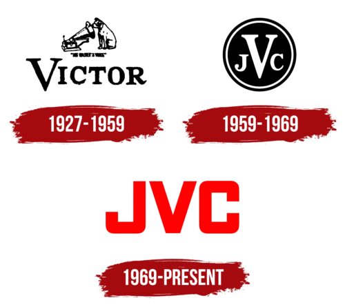
1927 – 1959
1959 – 1969
1969 – today
The logo of a Japanese company specializing in the production of consumer electronics looks professional and bright. There is only one inscription on it – “JVC,” which stands for Japan Victor Company. The font used is geometric, balancing the angles and curves. The lettering of the first and last letters is standardized, so they match in configuration. The abbreviation uses bold, chiseled glyphs in upper case. All elements are colored in light red, which gives them a positive background.
When looking at the logo, the light red color is reminiscent of a friendly greeting. The matching first and last letters give the logo a neat and tidy look. The bold letters suggest that the logo is businesslike, while the curves suggest that it is approachable. It’s a combination of seriousness and fun at the same time.
JVC color codes
| Red | Hex color: | #fe0100 |
|---|---|---|
| RGB: | 254 1 0 | |
| CMYK: | 0 100 100 0 | |
| Pantone: | PMS 1655 C |


