The K-R-I-T Motor Car logo is filled with mysterious symbolism and deep meaning. Its purpose is to attract prosperity, success, and good fortune. The emblem has a spiritual undertone and reflects the founder’s desire to create elegant cars and achieve success.
K-R-I-T Motor Car: Brand overview
In 1909, a new automobile company, the K-R-I-T Motor Car Company, was born in Detroit, Michigan. Founded by a group of investors, including Kenneth Crittenden, who is considered the inspiration for the company’s name, K-R-I-T aimed to offer affordable cars to the American middle class. The first model, a five-seat tourer with a price tag of only $500, was launched within a year.
Interestingly, the company originally incorporated the swastika, which at the time was a symbol of prosperity and good fortune, into its brand emblem long before the symbol became infamously associated with Nazism. During its existence, the company expanded its range to include compact two-seaters and larger four-cylinder touring cars. Despite these changes, K-R-I-T struggled to meet production targets, producing only a few hundred cars per year against a planned capacity of 1,000-2,000.
By 1915, the company could no longer compete with more established automakers, and sales began to decline. A year later, in 1916, the company declared bankruptcy, ending its seven-year run. During this time, K-R-I-T managed to produce about 3,000 cars. Although the company gained attention for its original name and symbol, the story of K-R-I-T is an instructive example of the challenges small independent automakers face.
Meaning and History
1909 – 1913
The K-R-I-T Motor Car brand was founded in 1909 and existed until 1913. The name comes from Kenneth Crittenden, the founder and main sponsor. The four letters form the word “Krit,” symbolizing the island of Crete. Each letter stands separately, giving the brand uniqueness and recognition.
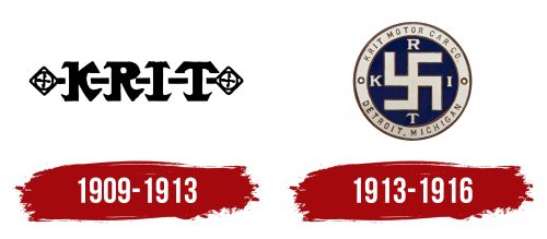
The K-R-I-T Motor Car logo features a staff with two gemstones at the ends, framing the letters. Swastikas, symbols associated with prosperity and wealth at the time, are depicted on the ends.
It is believed that Kenneth Crittenden involved specialists in creating amulets to design the logo. The elements of the logo encode magical symbols meant to ensure the brand’s success. The final design of the logo conveys a sense of completeness, fullness, and victory, highlighting the founders’ ambition and confidence in the brand’s success.
1913 – 1916
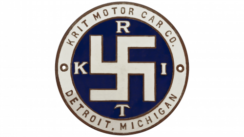
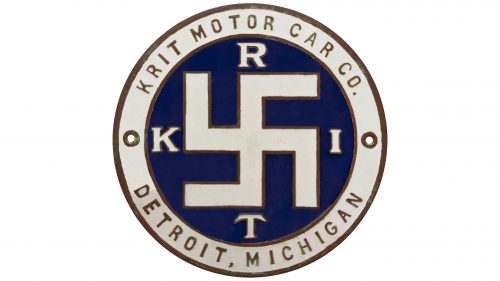
The K-R-I-T Motor Car logo features a swastika, but the company has no connection to Germany. The automaker used this symbol in the mid-1910s before it became associated with the Nazi regime. At that time, the swastika, a cross with arms bent at right angles, was seen as a representation of the sun. The swastika is inside a blue circle with the letters “K,” “R,” “I,” and “T.” The brand’s full name and hometown, Detroit, Michigan, are on the outer gray ring.
In the 1910s, the swastika was a common symbol in many ancient cultures and had positive meanings. The blue circle signifies trust and reliability, an automaker’s important qualities. The gray ring, which carries the brand’s full name and origin in Detroit, Michigan, reinforces its identity and heritage.
The swastika’s use highlights the logo’s historical significance, showing how symbols can change meanings over time. The blue circle adds security and professionalism, while the gray ring provides a solid foundation, emphasizing the company’s roots and authenticity.
The letters “K,” “R,” “I,” and “T” surrounding the swastika are key parts of the logo, reinforcing the brand’s identity. Their placement within the blue circle ensures the focus remains on the brand name while acknowledging the symbol’s historical context.


