


![]() Kahlua Logo PNG
Kahlua Logo PNG
The Kahlua logo indicates the favorite coffee bean flavor in the liquor. According to the emblem’s symbols, the drink is perfect from start to finish. It makes any cocktail perfect and requires no other additives.
Kahlúa began in 1936 in Veracruz, Mexico, a Gulf Coast region known for high-quality arabica coffee. Its name comes from Nahuatl and means “House of the Acolhua people.” The liqueur was created by Señor Blanco, Montalvo Lara, and the Alvarez brothers. Their roles spanned the coffee trade, finance, and chemistry, turning a regional coffee concept into a bottled product.
In 1940, Kahlúa was first exported to the United States. Its American rise was closely tied to Jules Berman, the first major U.S. importer, later known in the trade as “Mr. Kahlúa.” Through his network, the drink reached bars and restaurants across the country, where it gradually built a stable audience.
One of the most unusual chapters came in the 1960s, when María del Pilar Gutiérrez Sesma rose from student auditor to CEO. Under her leadership, Kahlúa was run largely by a women’s team, rare in Mexican business at the time. Berman also introduced the collectible “Preketes” figures, tying the brand’s public image to Mexican folklore and giving the bottle a stronger cultural frame.
By 1980, Kahlúa ranked first worldwide among coffee liqueurs. It competed in the sweet liqueur market with Baileys Irish Cream from Diageo. It stayed visible through cocktails such as the Black Russian and White Russian. In 1994, Pedro Domecq merged with Allied Lyons to form Allied Domecq. Kahlúa Especial followed in 2002; the classic version was reduced from 26.5% to 20% ABV in 2004; and Pernod Ricard took over the brand in 2005, placing it alongside Jameson, Absolut, and Chivas Regal. In 2019, Kahlúa released canned Espresso Martini cocktails.
Meaning and History
![]()
The Kahlua brand has been known since 1936, when the old wine company Allied Domecq introduced the first coffee liqueur. The product’s unusual name translates as “House of the Acolhua people.” That is how the Nahuatl language called the island next to the port of Veracruz. Using the toponym, the brand creator wanted to show the geographical homeland of his product.
Kahlua joined Pernod Ricard in 2005, following the acquisition of Allied Domecq. The new owner continues to develop the alcoholic beverage brand and, in 2021, even expanded the range, reducing the strength to 16%. At the same time, he changed the bottle’s style, decorating the label with a modified emblem that differs from the previous version in its cleaner design.
What is Kahlua?
This popular Mexican coffee liqueur combines silky rum and coffee with cream, two of life’s greatest pleasures. Originating from the Mexican city of Veracruz, the liqueur is crafted from sugarcane rum and local Arabica coffee beans. It gives it a distinctive flavor and deep brown hue, making it a staple in bars worldwide. Though widely known as a key ingredient in classic cocktails like the “Espresso Martini” and “White Russian,” its use is not limited to these drinks: bartenders and home mixologists continue to find new ways to incorporate its coffee flavor into original cocktails.
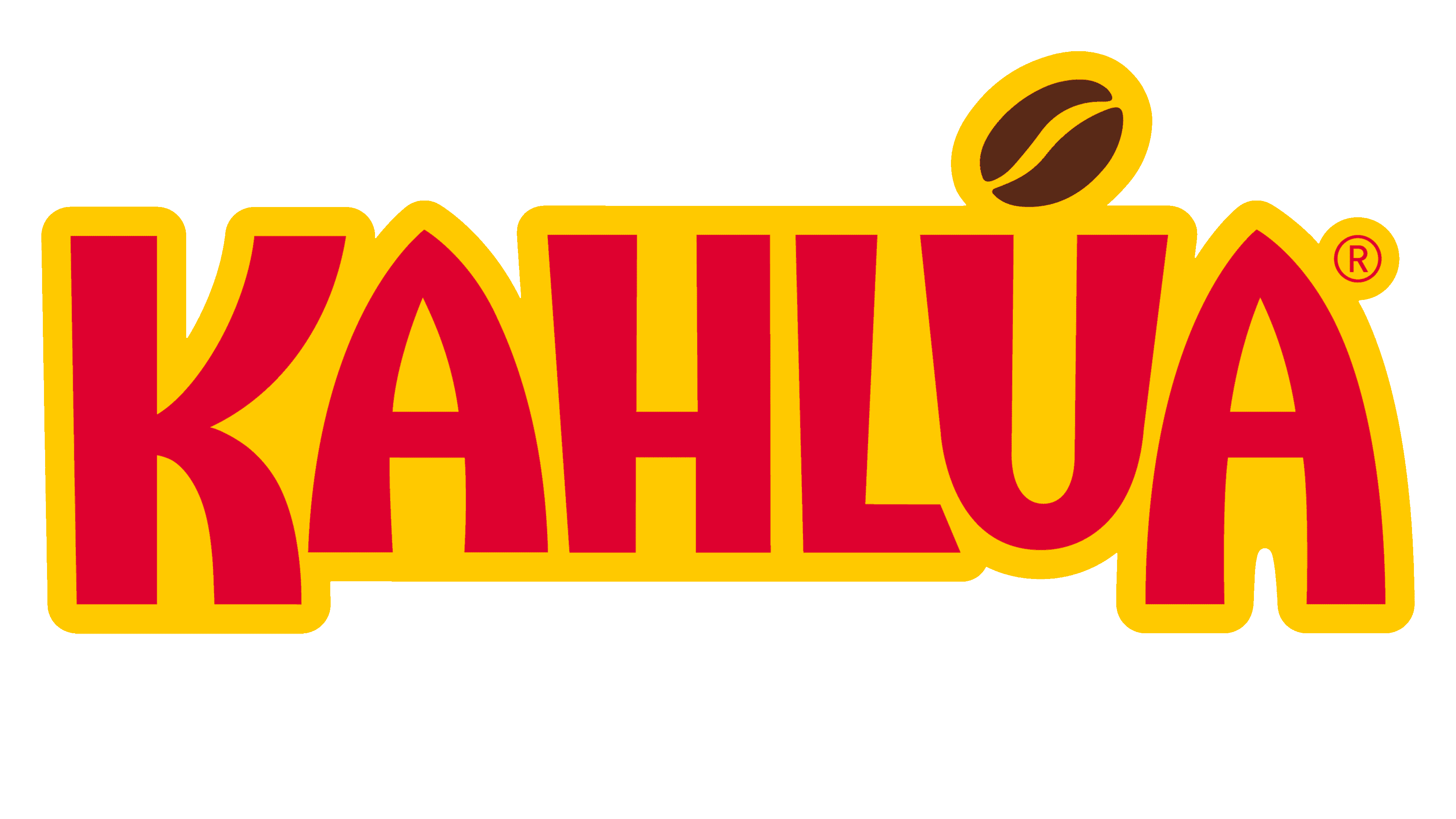
1936 – 2020
![]()
The main logo of the liquor manufacturer remained, for a long time, the inscription “KAHLÚA,” consisting of letters of varying sizes. The largest is the first “K.” The two “A’s” are slightly smaller but protrude beyond the line. Moreover, there is a pronounced asymmetry in their case, even about the shape of the intra-letter gaps. Bold geometric font with rounded corners creates a soft feel. The word is colored bright red and set against a yellow background, with a thin red line around the edge.
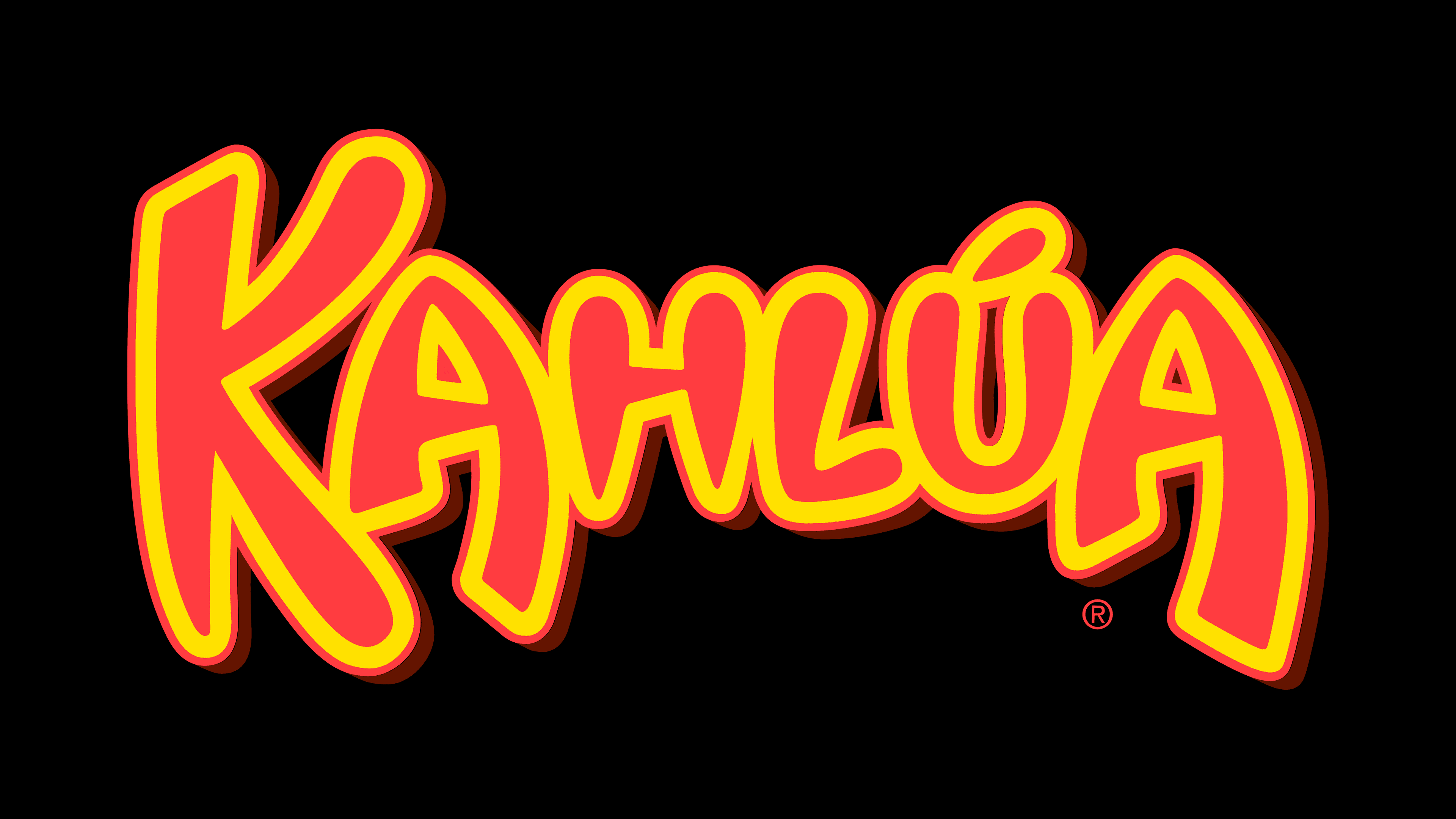
2021 – today
![]()
The growing popularity of Kahlua prompted the brand’s owners to redesign. So, in 2021, a bottle with a new label was introduced, featuring the updated logo. With angular lines and uneven stroke thickness, the developers sought to convey the drink’s Mexican character in the inscription. The letters seem to move to the beat of inaudible music. They are about the same height, although the first “K” and the last “A” extend beyond the bottom of the line. Above the “U” instead of a diacritic is a brown coffee bean, consisting of two parts.
Font and Colors
The updated logo emphasizes the liqueur’s characteristic coffee aroma and taste, including Arabica notes. The designers interestingly played with the grain, placing it above the “U” rather than as an accent. At the same time, they simplified the inscription’s design, removing the wide, bright outlines that created a festive mood. The brand name looks more restrained, even though it uses encrypted characters: “U” resembles the neck of a bottle, with a coffee bean about to fall.
In 2021, the ridiculous rounded font was replaced by a more formal, custom-made typeface. The letters remained asymmetrical, with the unevenness of the forms exacerbated by lines that narrowed and expanded. Thanks to this, the alcohol brand name is more visible on labels with a lot of text.
The color scheme has also been drastically changed. Abandoning bright red and yellow, the liquor manufacturer repainted the inscription in burgundy, with a hint of wine, to emphasize the depth of flavor. The coffee bean is traditionally dark brown, and the background of the main logo version is white.