


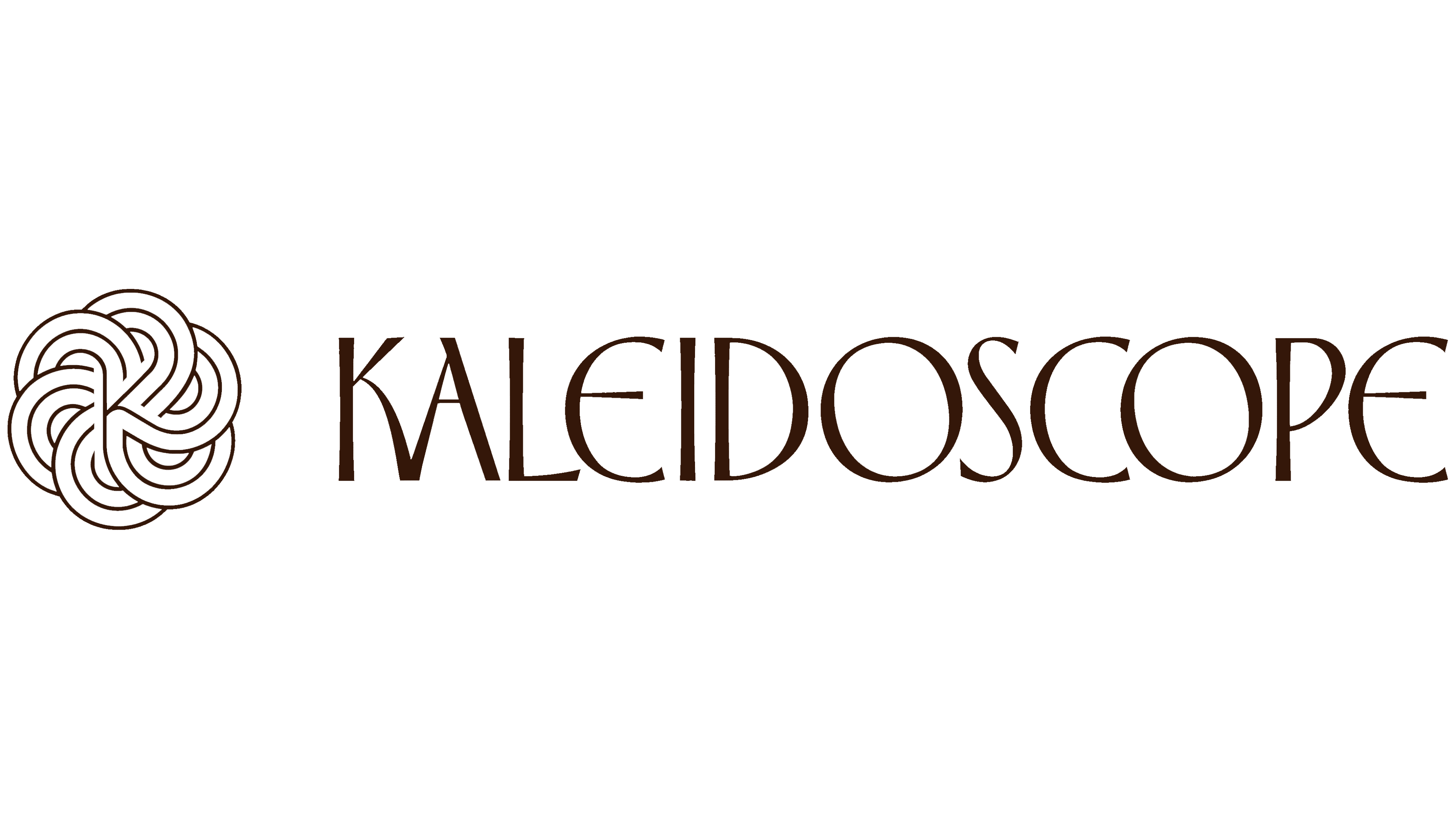
Early cinema and stage magic inspired Kaleidoscope Studios’ new logo. Lee Steffen and Nashville-based Matt Lehman Studio created an identity for the virtual production studio that evokes historic theaters. Drawing on the fantastical worlds of Georges Méliès, the designers paired decorative lettering with an interwoven emblem concealing the letter “K.”
Kaleidoscope Studios opened in 2025 with support from Treeline at The Factory in Franklin, Tennessee. The facility hosts virtual production, filming, broadcasts, and events. It uses its LED sets for educational projects. In October 2025, Lipscomb University announced a collaboration with the studio. The designers’ task was to connect contemporary production technology with theater and the craft of creating on-screen illusions.
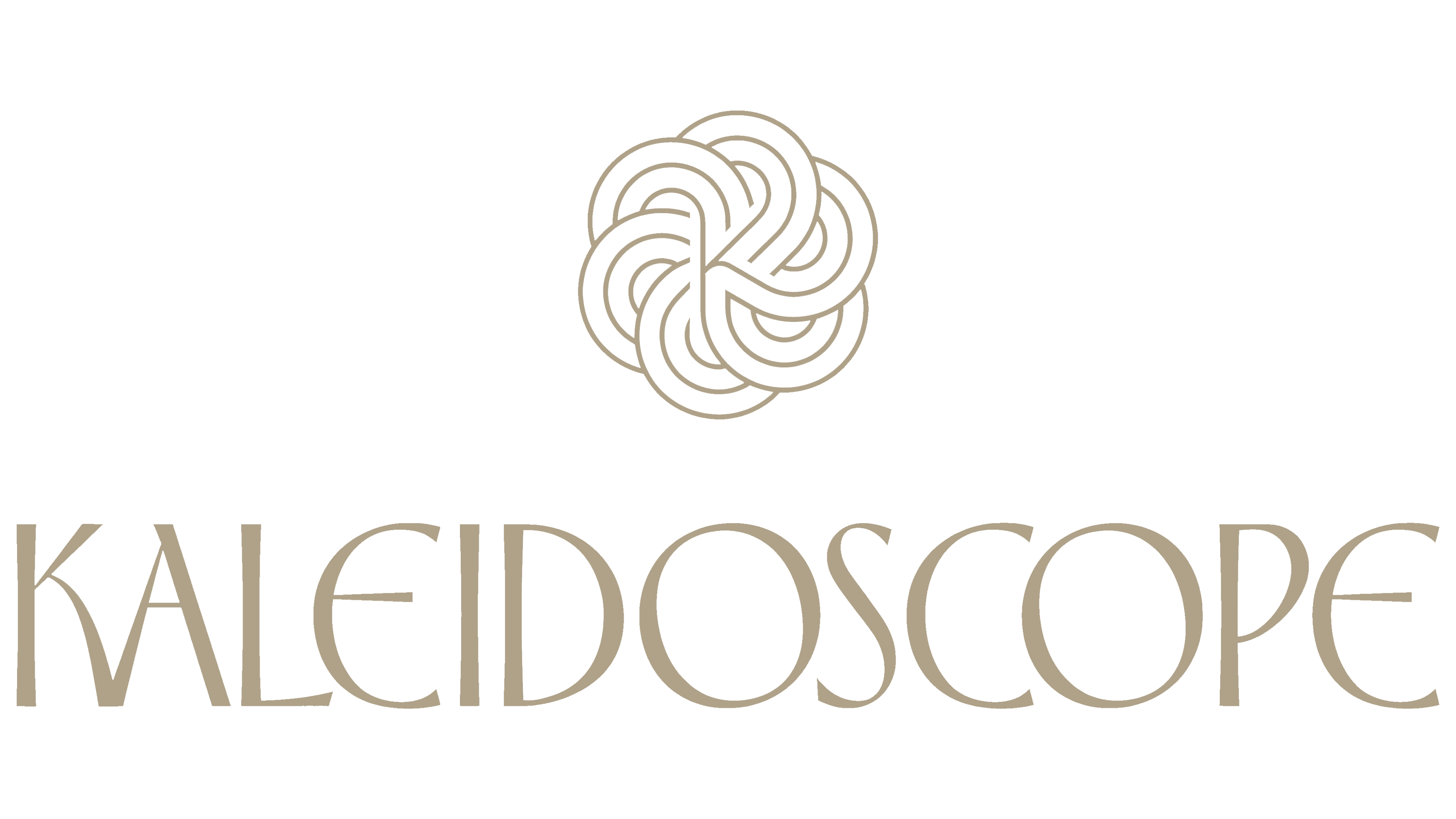
The Kaleidoscope name informed the emblem’s shape. Curved lines form a rounded ornamental pattern resembling the view through a kaleidoscope. A “K” sits within the interwoven center. Integrated into the overall design, it reveals itself after the viewer first takes in the pattern.
The emblem was constructed from a repeating segment rotated in 60° increments. Loops surround the center and intersect with one another. During development, the designers refined the “K” position, thickened the lines, and introduced gaps at the intersections. These openings separate adjacent sections and allow the eye to follow the interwoven paths. Precise construction and flowing curves reinforce the optical illusion theme.

The KALEIDOSCOPE lettering was drawn specifically for the project. Tall uppercase letters combine thin and thick strokes. Most have narrow proportions, alongside rounded “O” and “E” forms. The outer contour of the “E” resembles a “C” with an added crossbar. The lower diagonal of the “K” curves toward the neighboring “A,” linking the first two letters. Art Nouveau features in the wordmark extend the references to theater and cinema history.
In the stacked version, the emblem sits above the name. Its circular pattern echoes the rounded letters, while the longer wordmark beneath it shifts the overall logo’s proportions. Flowing lines and variations in stroke thickness unite the two parts. Lee Steffen and Matt Lehman handled creative direction and design.
One primary color combination places a pale golden-beige logo against a dark blue background. The flat color treatment supports the theatrical associations. Elsewhere in the identity, early-cinema motifs pair with references to handcraft and stage illusions.