


Stir Friday Night marked its 30th anniversary with a new logo by Studio Aperitif. For the Chicago Asian American comedy troupe, the update elevated the visual identity to match the group itself. Since 1995, the ensemble has grown into a notable part of Chicago’s AAPI comedy scene, earned status as a 501(c)(3) nonprofit theater company, and remains one of the city’s oldest teams in this segment.
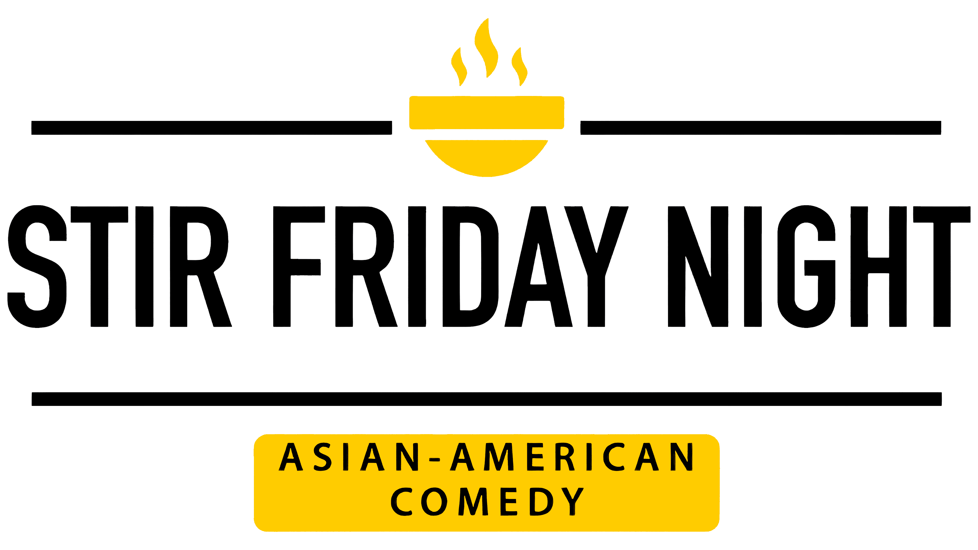
The previous mark explained the audience in detail. A neat grid, thin lines, a small steaming bowl, and the Asian-American Comedy descriptor made it feel like a festival poster or a cultural event identity. The logo showed the team’s genre and background, but the stage, improv, humor, and the group’s live voice came through less strongly.
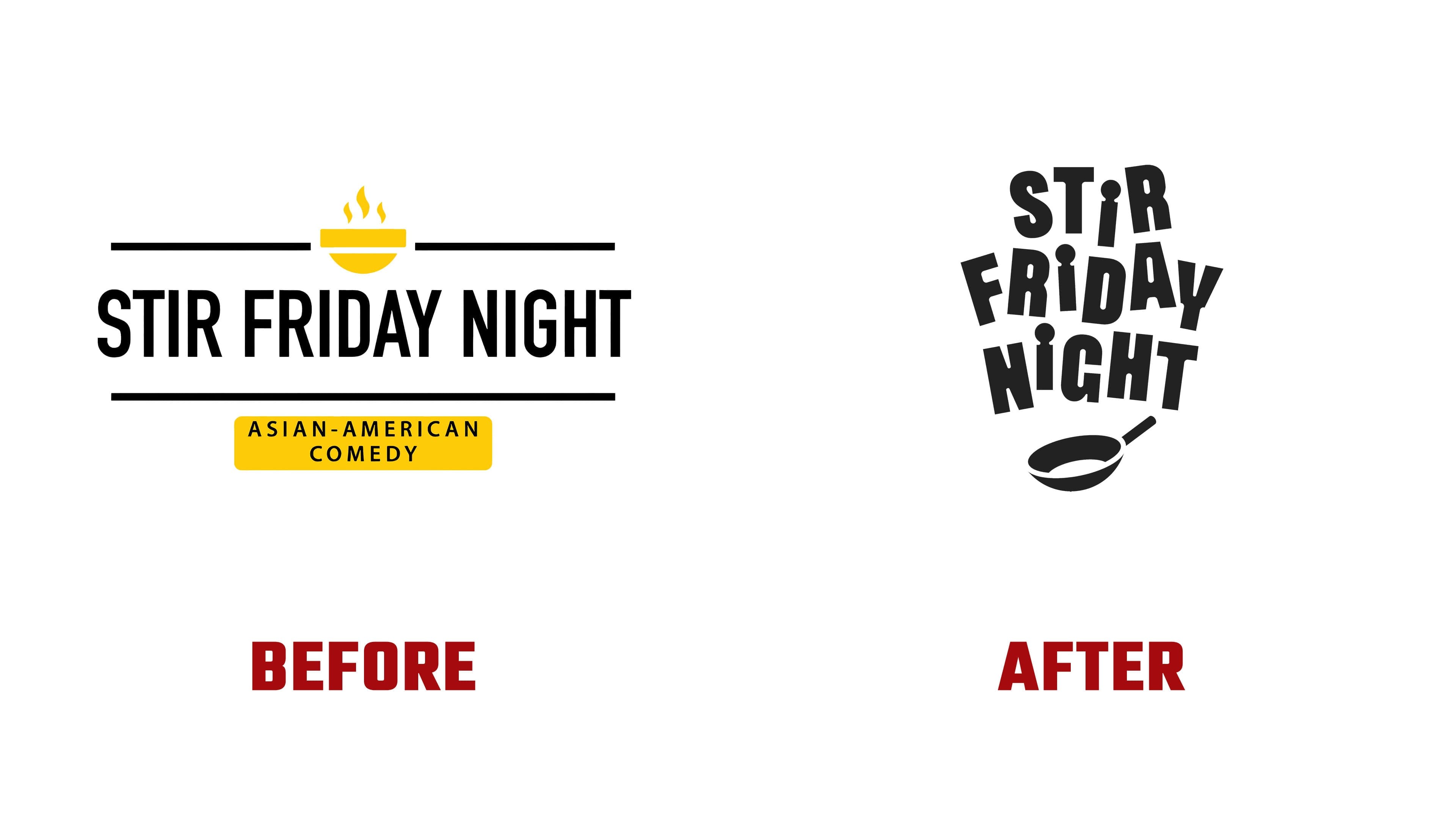
The new identity focuses on the show’s mood. The logo centers on a large name, a yellow background, uneven letters, and a pan at the bottom. The mark feels closer to a comedy-night poster, club merchandise, and a performance flyer than to a tidy cultural program organization. It looks like part of the show.
The main change is tied to typography. The old letters were narrow, stretched, and strict. In the new version, they vary in width, angle, and placement. The name “Stir Friday Night” grew louder, freer, and closer to the stage.
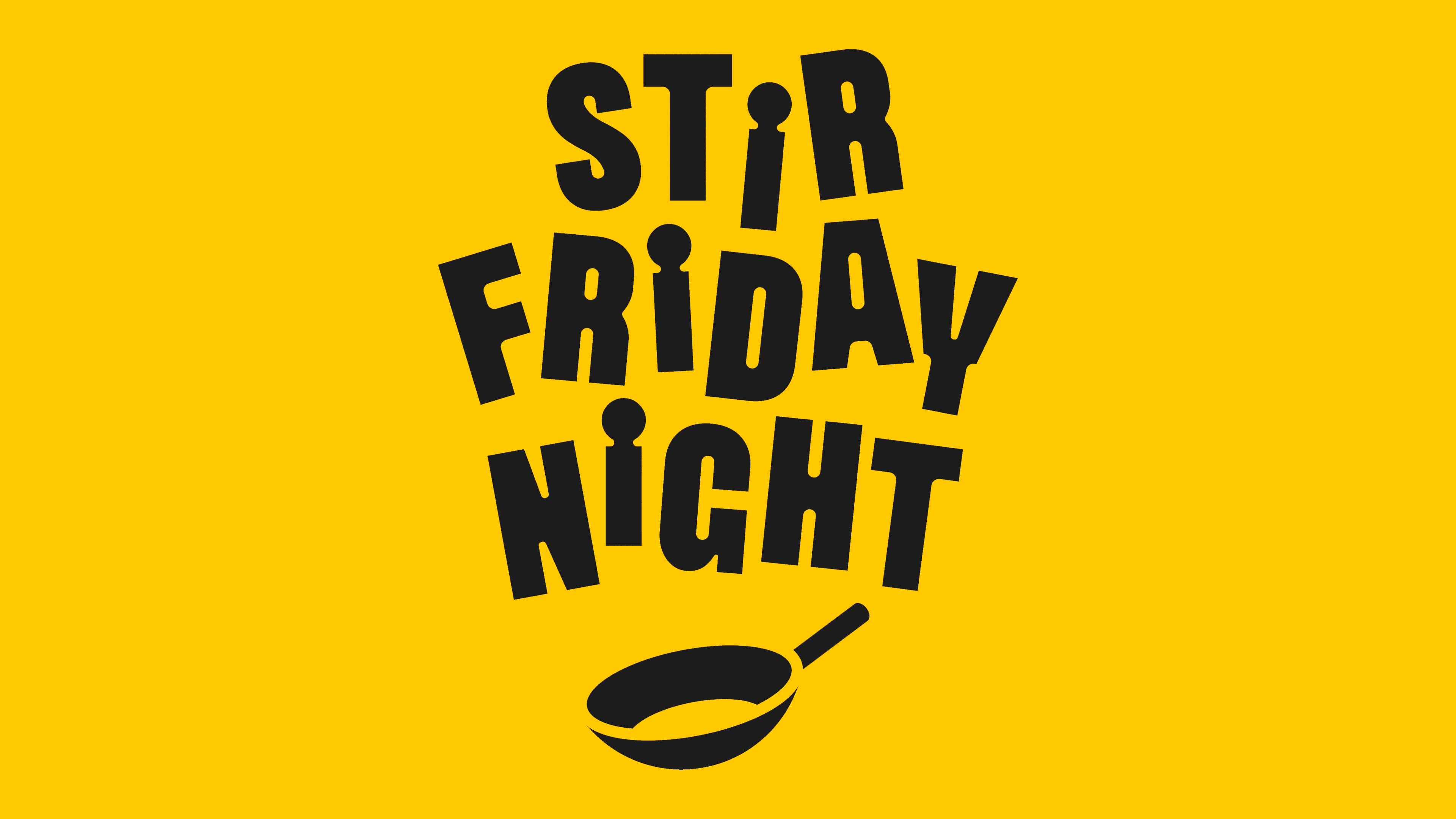
The pan in the logo connects the name with the idea of “stir” and adds a clear symbol. It supports the wordplay and cultural subtext while keeping a comedic presentation. With the yellow background and black letters, the symbol reads like a sign for an evening performance. The AAPI context comes through the stage, humor, and self-irony.
The update was driven by the gap between the troupe’s history and its previous look. Stir Friday Night has alumni, cultural relevance, a long path, and a stage. The anniversary became the occasion for a new chapter.
The new logo keeps the focus on comedy and the troupe’s collective nature. It conveys the atmosphere of an evening show, improv, and the Chicago scene.