


![]() KAROL G Logo PNG
KAROL G Logo PNG
The KAROL G logo represents her evolution from a young singer in Medellín to a worldwide reggaeton star. It shows her dedication to combining traditional Latin music with modern pop and R&B, highlighting her unique role in the music industry. The logo demonstrates her bold and genuine style, emphasizing her impact in expanding reggaeton and shaping its future globally. It reflects her commitment to musical innovation and to empowering women in the arts.
Karol G was born Carolina Giraldo Navarro on February 14, 1991, in Medellín, Colombia. Growing up, she loved the rhythms of reggaeton and Latin music. As a teenager, she entered music contests and began to gain recognition. In 2012, her career took her to New York City, where she worked on her sound and style with various artists and producers.
Her big break came in 2014 with the song “Ricos Besos,” which topped the Colombian charts. This track helped her collaborate with renowned Latin artists such as Nicky Jam, Ozuna, and Bad Bunny, and significantly grow her fan base.
In 2017, Karol G released her debut album “Unstoppable.” It was a big hit in Latin America and earned a platinum certification. Singles like “Ahora Me Llama” and “Mi Cama” made her a well-known reggaeton artist. She also worked with Anitta and J Balvin, which helped her music reach English-speaking audiences.
Her 2021 album “KG0516” topped the Billboard Top Latin Albums chart. The lead single “Tusa,” featuring Nicki Minaj, became internationally famous. Karol G has won many awards, including a Latin Grammy. She uses her fame to support women’s rights and social change. Today, she is recognized for her creativity and influence in reggaeton, inspiring many upcoming artists with her story of perseverance and dedication.
Meaning and History
![]()
The reggaeton queen from Latin America, known for hits like “Tusa,” “Bicho Malo,” “Mi Cama,” “Culpable,” and “MAMIII,” started her career at 14 by joining the show “Factor Xs.” A year later, she signed her first recording contract, during which she received her stage name and logo. The team at Flamingo Records, who began working with her at the time, likely influenced her branding. She has stuck with the same logo for nearly 20 years, showing that it reflects her personality and artistic vision and remains relevant and meaningful.
2007 – today
![]()
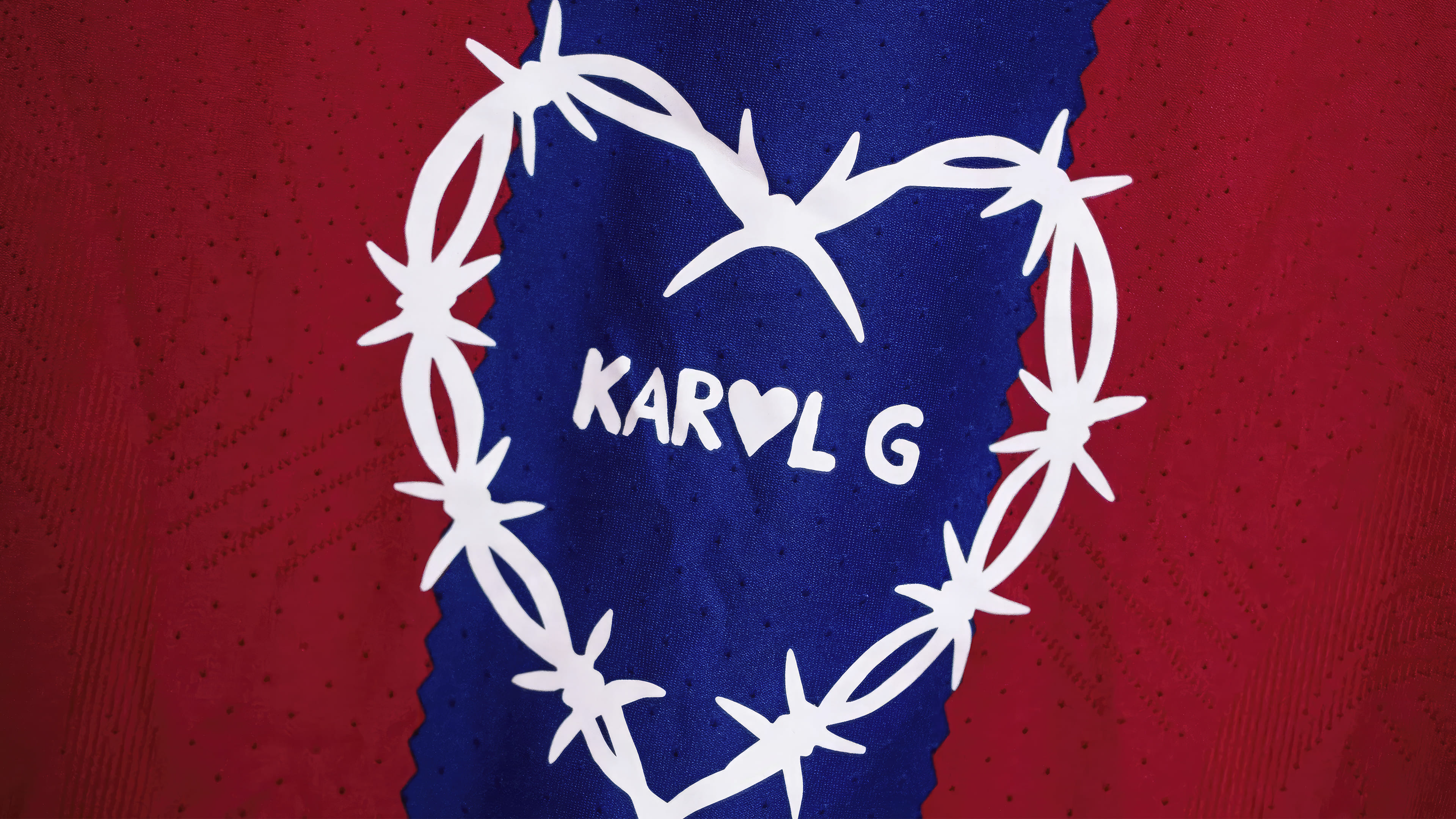
The Karol G logo is a heart woven from barbed wire. The image immediately evokes strong emotion and pain. The symbol represents betrayal, resentment, unrequited love, and personal loss. The meaning of the image is multifaceted:
- The design resonates with the singer’s work, featuring lyrics about love and female strength. Carolina addresses the most painful and complex human emotions, helping other women navigate difficult events.
- The barbed wire recalls Christ and His crown of thorns, suggesting a theme of sacrifice and readiness to serve fans despite personal struggles.
- The emblem reflects strength and resilience, telling the story of the star herself. On her path to fame, the singer endured poverty, discrimination, and skepticism. In 2021, she even got a similar tattoo on her arm to express the pain from a tough breakup, problems with her surroundings, and attacks from journalists.
Within the composition of thorns, the pseudonym Karol G is placed, with the letter “O” stylized as a heart. The name is a shortening of Carolina Giraldo. The heart emphasizes openness, the ability to accept and love people. Plus, the artist is young and in search of her other half. Experts also consider her stage image feminine and sexy. Placing the stage name within the barbed wire highlights the ability to stand up for oneself, the readiness to fight back, and the defense of one’s rights. The singer has often emphasized her admiration for fearless people who dare to be themselves. Karol G also strives to express her feelings and defend her ideals, even at risk. The logo reminds us that life isn’t always easy, but we can find the strength to overcome difficulties and achieve our goals.
Font and Colors
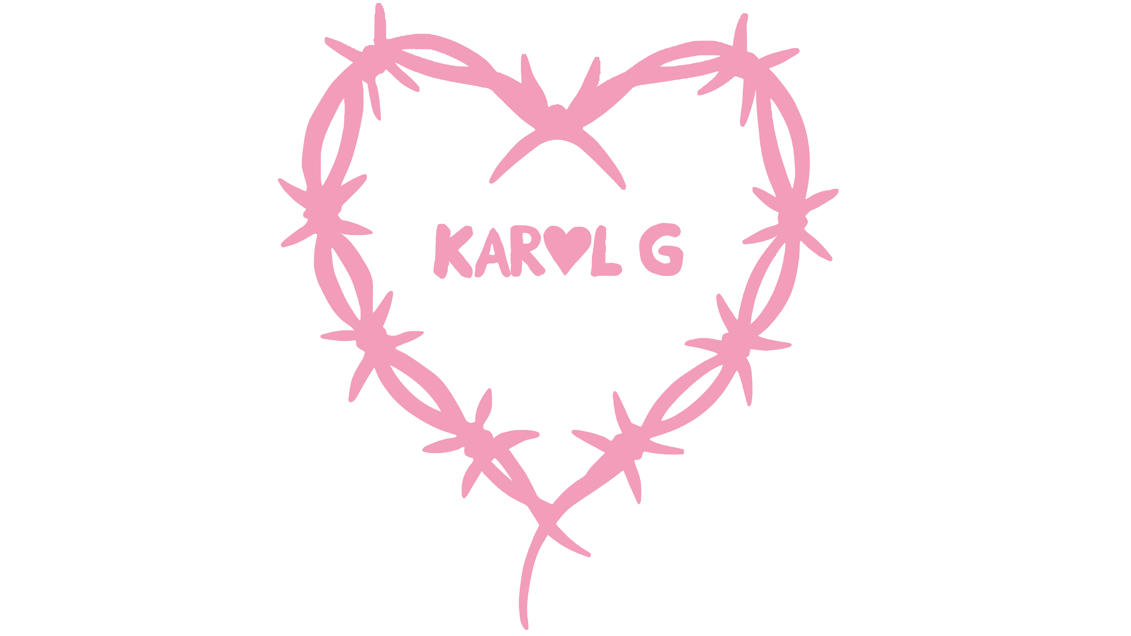
The inscription’s font is soft, with rounded serifs, to convey the singer’s gentleness and feminine beauty. The letters are uppercase, indicating popularity and the desire to be at the forefront. Carolina is one of Colombia’s most famous singers, ranking among the top 10 most-streamed artists on Spotify, and has received five Latin Grammy Awards and four Billboard Music Awards. The color black conveys a broad spectrum of emotions and character traits of the diva. It is associated with strength, power, and a rebellious spirit, symbolizing the singer’s independence and readiness to challenge stereotypes and forge her path.
FAQ
What does the KAROL G logo mean?
The KAROL G logo reflects her growth from a young singer in Medellín into an international reggaeton star. It shows how she blends traditional Latin music with modern pop and R&B, highlighting her unique role in the music landscape. The logo captures her bold, genuine style and influence in the evolution of reggaeton worldwide. It also shows her dedication to new musical ideas and her support for empowering women in the arts.
Why is there a heart with barbed wire on the KAROL G logo?
The heart with barbed wire in KAROL G’s logo symbolizes the mix of love and challenges, suggesting that love often comes with hardships. This image connects to KAROL G’s personal life and the emotional themes in her music, which discuss the complexities of love and relationships. The symbol also shows her resilience and strength in the music industry, emphasizing her determination to overcome challenges.