The Katy Perry logo is stylish and modern. The symbol is filled with sharp accents, highlighting the singer’s unique personality and creativity. Her songs resonate deeply, addressing important themes that leave no one indifferent.
Katy Perry: Brand overview
Katy Perry, born Katherine Elizabeth Hudson on October 25, 1984, has carved a niche in the global music space. From singing gospel songs as a child to dominating the music charts with her pop and rock numbers, Perry has become one of her generation’s most influential and distinctive artists and television personalities.
Katy Perry’s upbringing in Santa Barbara, California, was anything but ordinary. She was born into a devout Pentecostal family and grew up with restrictions on secular music and television. Nevertheless, her remarkable vocal talent became apparent at an early age and was often evident during church services conducted by her parents. The confines of an orthodox upbringing could not contain Perry’s undeniable love for music.
In 2001, Perry took the bold step of moving to Los Angeles to fulfill her musical dreams. Her debut album, “Katy Hudson,” did not make the sensation she had hoped for. However, renaming herself “Katy Perry” and releasing her second album “One of the Boys” in 2008 brought her into the limelight. Her singles “I Kissed a Girl,” “Teenage Dream,” and “Roar,” which broke into the charts, cemented her position in the music world.
In addition to her illustrious music career, Perry has made a significant impact on television, from her humorous role as host on Saturday Night Live to judging talent on American Idol to her riveting performance on the Super Bowl halftime show.
Perry’s activism extends to philanthropy as well. She is an outspoken advocate for LGBTQ rights, works with UNICEF to improve the well-being of children, and is an ambassador for the Children’s Health Fund. Her influence extends beyond the entertainment sphere to positively impact global communities.
Katy Perry’s journey from overcoming numerous personal and professional obstacles to achieving stellar success is inspiring. Her perseverance and exceptional musicianship have allowed her to rise to prominence in the entertainment industry. Her successful career and philanthropic endeavors have earned her countless awards and the admiration of fans worldwide.
Meaning and History
What is Katy Perry?
Katherine Elizabeth Hudson, is an American singer, songwriter and television personality. She gained fame for her unique musical style and charisma. The rise of her career began with her second album One of the Boys, which included the hit single “I Kissed a Girl”. Her subsequent works brought her numerous awards and records, making her one of the best-selling female music artists of all time.
2008 – 2010
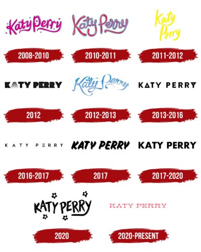
The logo created for Katy Perry’s second album, “One of the Boys,” is memorable for its unique and romantic style. The raspberry-colored letters of the star’s name, surrounded by a light blue background, give a romantic feel. Scattered stars and hearts add playfulness and charm. The name looks like it is written in raspberry jam, evoking associations with princesses, youth, and beauty.
The emblem harmonizes with the themes of first love, relationships, and kisses, which are the main motifs of the album. The romantic tone and design of the logo fully reflect the atmosphere and mood of the compositions presented in the album.
During this period in the singer’s career, she performed under the name Perry for the first time, adopting her mother’s maiden name.
2010 – 2011
The emblem for the “Teenage Dream” collection stands out with its depth and serious color scheme. The rich red color highlights sincere feelings, laughter, joy, and important thoughts throughout the album. The blue outline of the letters draws attention to the universal appeal of the songs, which are meant for both female and male audiences.
The star’s name, written in script, looks like it was squeezed out of a paint tube, giving the logo a lively and dynamic feel. The shine, smooth surface, and volume of the letters emphasize the bright, youthful style of the album, making it attractive to a young audience.
The emblem showcases the singer’s unique and extraordinary creativity with its script form and textured font.
2011 – 2012
The bright and optimistic logo for the single “The One That Got Away” contrasts with the song’s lyrics. This logo, designed specifically for the single’s cover, features a simple yellow emblem with two levels, resembling a quickly made chalk drawing on asphalt.
The division of the singer’s name into two levels symbolizes two lovers who are no longer together. This visual metaphor conveys the emotional tension and separation present in the song. The logo’s color scheme, with light and pleasant shades of yellow, highlights the bright and pleasant memories from youth despite the sadness and nostalgia in the lyrics.
2012
The single “Part of Me” logo presents the singer’s image as unbreakable and strong. The design uses sharp stripes running diagonally, turning the letter “A” into a mountain. This image symbolizes the ability to stand firm despite pain and challenges. Each line of the logo resembles a sharp thorn piercing the heart, highlighting the suffering experienced by the singer.
The outer parts of the letters in the last name look like saw blades, enhancing the impression of strength and determination. These elements show the ability to stand up for oneself and face all difficulties. The logo’s color scheme complements the theme of strength and resilience. Bright and contrasting colors enhance the impression of steadfastness and resolve.
The song “Part of Me” holds personal significance for Perry. She addressed the piece to her ex-boyfriend, Travie McCoy, and the emblem perfectly captures this message.
2012 – 2013
In 2012, the album was reissued with the new title “Teenage Dream: The Complete Confection.” This reissue featured new artwork and a new logo, with the singer’s name formed from a blue gift ribbon. The logo embodied the theme of gifts, highlighting the uniqueness and appeal of the collection.
New songs and remixes were added to the collection, making it more interesting for fans. These additions brought the album new life and freshness, attracting longtime fans and new listeners. The ribbon in the logo symbolized the singer’s aim to stay fashionable and modern, reflecting her desire to improve her work and keep it relevant continually.
2013 – 2016
The album “Prism” logo conveys its title concept, featuring the second and last letters as triangular prisms. These geometric shapes symbolize self-discovery and understanding of what a person projects into the world. Events in everyone’s life reflect their inner state and worldview.
The idea for the album emerged after the singer’s challenging divorce, which had a significant impact on her life. Many themes evolved during the project’s development, and the collection’s focus shifted to reflections on human rights and possibilities. The album became a platform for exploring personal and social issues, encouraging listeners to think about important aspects of life.
The logo’s triangles point in different directions, symbolizing the presence of two sides in any relationship or conflict. This design element highlights the idea that in every partnership or conflict, each person brings their own experiences and views events through the prism of their personal perspective.
2016 – 2017
The emblem for the single “Rise,” the anthem of the 2016 Olympic Games, accurately reflects its title and essence. The logo’s design emphasizes speed and ingenuity through simplified lettering. The absence of the crossbar in the letter “A” gives it a dynamic and modern look, symbolizing movement and progress. The letter “E” is modified, missing its vertical bar and resembling a piece of sports equipment, conveying the spirit of competition and striving for higher achievements.
The transformations in the logo design create associations with sports gear, symbolizing the gradual raising of the bar and the journey from one peak to the next. The three horizontal lines in the letter “E” remind one of the three podium places that can be earned, highlighting the importance of striving for victory and overcoming personal limitations.
The “Rise” emblem underscores physical and spiritual growth. The stripes in the letter “E” are associated with the bright trigram of creativity, Qian, from the Book of Changes, symbolizing creativity and continuous development.
2017
The logo for the single “Chained to the Rhythm” looks as if it is crafted from thin sheets of metal. This effect gives the text a modern and technological appearance, highlighting an innovative approach to music creation. The letters “Y” in the logo resemble tuning forks, symbolizing the theme of rhythm and harmony that runs throughout the single.
Each text element has a three-dimensional form, adding depth and expressiveness to the logo. The 3D letters create a structured rhythmic pattern, visually conveying a sense of continuous movement and musical flow. This rhythmic design aims to unite the singer’s fans into a cohesive group, emphasizing the community and unity among those who follow her work.
2017 – 2020
The black, simple uppercase text on the album “Witness” cover creates a formal and official impression, resembling a suit. This design choice aligns well with the album’s content, which addresses important themes of feminism and politics. The business-like style of the emblem emphasizes the seriousness and significance of these issues, making the design especially fitting for this album.
2020
The emblem for the single “Daisies” from the album “Smile” features a completely new style. Flowers surround the text, creating a relaxing and inspiring atmosphere. This design element was chosen carefully. The main themes of the songs in the album focus on finding light at the end of the tunnel, mental health, and self-understanding. These themes highlight the importance of maintaining inner joy and well-being, which is especially relevant today.
The emblem and the choice of daisies have additional significance when opening a flower shop of the same name. The flower shop represents prosperity, rebirth, and the beauty of nature, which align with the themes of the album’s songs. Daisies, symbolizing innocence, purity, and new beginnings, perfectly convey the mood and message of the single.
2020 – today
This logo first appeared on Katy Perry’s sixth studio album cover in 2020. The American pop singer’s name is written in thin letters with long, sharp serifs that have a bulky appearance due to their shape. The font closely resembles the K22 Athenian Wide Regular, created in 2011. The red color used in the logo conveys passion and expression.
The red bursts out like fireworks, capturing the essence of Katy Perry’s energetic style. The long, pointed ends of the letters bring to mind high-heeled shoes—stylish yet sharp. Despite the font’s thinness, it carries a certain heaviness, much like Katy Perry’s voice, which balances softness with strength. The 2011 font adds a touch of old-school charm, evoking the vibe of a retro t-shirt.
The bold red color enhances the logo’s visual impact, giving it a vibrant and dynamic feel. The unique combination of thin, sharp serifs and the rich red hue creates a memorable and striking design. The long, pointed letters contribute to the logo’s stylish and edgy look, perfectly reflecting Katy Perry’s persona.


