The Keinath logo represents a manufacturer capable of transforming an ordinary car into an exclusive, attractive, fast version. The gold shine highlights that owning this brand is for those who value comfort and prestige.
Keinath: Brand overview
In 1983, Horst Keinath laid the foundation for Keinath Automobilbau in Reutlingen, Germany. This venture chiefly revolved around transforming standard coupe and sedan vehicles into more aesthetically pleasing convertibles or cabriolets. Early in its journey, the company showcased its prowess by creating a convertible Opel Monza.
As the 1980s progressed, Keinath ventured into converting renowned models, notably the Vauxhall Cavalier Mk2, the Opel Ascona, and the Opel Kadett, into convertible versions. This period saw several German coachbuilders, with Keinath at the forefront, gaining recognition for their impeccable craftsmanship in convertible adaptations. A testament to their craftsmanship was the over 2,000 convertible renditions of the Opel Ascona they produced between 1983 and 1988, aptly named the Ascona C3.
As the years rolled on, Keinath continued its streak of innovation, developing convertible models of other popular cars like the Opel Astra, VW Corrado, and Mercedes SLK. The company’s hallmark was its emphasis on limited production runs, ensuring attention to detail, and tailoring vehicles to individual customer preferences. By the late 1990s, however, Keinath Automobilbau wrapped up its operations after nearly a decade and a half of serving the automobile industry. Despite its relatively brief stint, the company left an indelible mark in the automotive world, earning accolades for its meticulous engineering and fashion-forward designs.
Meaning and History
What is Keinath?
In 1983, Horst Keinath dramatically altered the car industry’s landscape with the establishment of Keinath Automobilbau. In Reutlingen, Germany, this distinguished auto manufacturing company swiftly garnered fame for its meticulous craftsmanship and precise engineering. From its streamlined sports cars known for their remarkable speed, power, and maneuverability, Keinath Automobilbau has been a beacon of contemporary automotive superiority. Under the visionary stewardship of Horst Keinath, the firm rapidly earned a reputation for top-notch quality and innovation. Its avant-garde technology and designs thrust it into the limelight of the automotive industry. In 1996, Keinath introduced his first proprietary model, the GTR. The model’s overwhelming praise cemented the company’s standing as one of the top-notch car manufacturers globally.
1983 – 1988
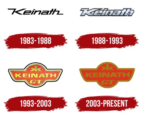
The first logo of Keinath embodied a strict, concise, and elegant style, reflecting German quality and a drive for progress and beauty. This logo symbolizes the brand’s mission to transform ordinary cars into vibrant and presentable models. The company’s name was chosen after its founder, Horst Keinath, adding individuality and a connection to its roots.
The logo featured elongated elements in the first and last letters of the name. These extended lines created the image of a road, emphasizing the idea of transformation. A car entering Keinath’s hands emerged new, improved, and more stylish.
Small serifs on the left side of each glyph added dynamism and highlighted attention to detail. These elements emphasized the uniqueness of each model produced by the company. The serifs symbolized subtle yet significant accents, making each Keinath car unique and distinct.
1988 – 1993
Keinath established itself as a reliable and professional manufacturer, earning recognition for its high-quality work with Opel cars. Aiming to expand its range and draw attention to other car brands, the company updated its logo to reflect its exclusive activities better.
The new logo was designed with all aspects of the tuning business in mind. Metallic letters with a gradient, surrounded by a black outline, create an effect of volume and depth. These symbols, appearing faceted, convey a sense of prestige and uniqueness in Keinath’s products. The gradient on the letters highlights attention to detail and technical mastery, while the black outline adds clarity, making the logo easily recognizable.
Every element of the logo was carefully considered to meet the high standard set by the company. The faceted and three-dimensional symbols reflect the complexity and sophistication of Keinath’s tuning work, emphasizing the exclusivity and individuality of each car produced.
1993 – 2003
With the introduction of its first convertible, Keinath made a significant leap forward, reaching a new level in the automotive industry. This achievement called for an updated logo to reflect the company’s new ambitions and status.
A gold logo was created, symbolizing the exclusivity and high quality of the products. The emblem’s shape resembled a car radiator and a globe with wings, evoking movement and travel. These elements highlighted dynamism and the pursuit of new horizons.
The logo was surrounded by three lines, emphasizing meticulous attention to detail and showcasing that Keinath cars are crafted with utmost precision. The gold lettering and trim indicated each car’s high value and limited production, underscoring their exclusivity.
Below the main company name were the letters GT, signifying the model name and indicating the Opel GT prototype, which served as the basis for the convertible’s design. At the top of the logo was a mirrored letter K, symbolizing the car’s versatility, which can be used with a convertible and a hardtop roof.
2003 – today
The company updated its logo for the release of its sports car. The main change involved the color scheme. The outline and letters were dark gold, highlighting the company’s expertise and the car’s premium quality. The dark red background indicated the car’s appeal to speed enthusiasts.


