The logo letters lined up like high-rise buildings run by the company. The Keller Williams logo points to a company that knows how to showcase the benefits of housing. It serves residents through the improvement and development of urban infrastructure.
Keller Williams: Brand overview
| Founded: | 1983 |
| Founder: | Gary Keller and Joe Williams |
| Headquarters: | Austin, Texas, United States |
| Website: | kw.com |
Meaning and History
After just two years, Keller Williams has become Austin’s most successful organization in selling offices and housing in its hometown. And its staff quickly grew from two people to 72. Her move to franchising was accidental, as she hadn’t planned for anything like this. Just suffering from inflation in the mid-1980s, the company switched to a different form of operation and began offering potential partners to participate in the project. That’s how it supported employees and survived the recession. In just one year, the brokerage grew to 130 employees.
In the early 1990s, the firm began to go out of state. So, in 1993, its office first appeared in Oklahoma. Then expansion across the country intensified, and the agency began to be recognized. In 1997, it was included in the Franchise Gold 100 of Success magazine list. In parallel, Keller Williams continued developing and opening various divisions and subsidiary services. This led to the fact that in 2012 the company founded its service to manage international real estate franchising.
The firm is also involved in philanthropy, providing financial support to local communities, employee families, and those in difficult situations. It regularly donates to non-profit foundations to fight serious illness and help recover from surgeries and injuries. Since 2009 the real estate agency has closed once a week to clean up parks, deliver food to shelters, donate blood, or repair houses for those in need.
This proactive approach to life is reflected in the symbolism of Keller Williams, which made its name the base of the logo. And it, by the way, is made up of the two names of its founders. A little later, their abbreviated versions were taken as the basis of the name of another firm, which received the status of the management organization.
1983 – 2013
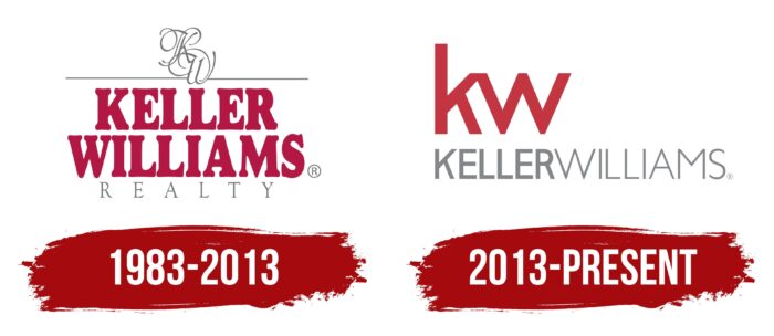
The debut emblem features a refined monogram based on an abbreviation – the first letters of the word combination Keller Williams. The monogram is done in a classic style – with multi-structured curled elements that are intricately intertwined. In contrast to the vintage monogram, a modern-looking company name is below it. It is arranged in two lines, written in bold red capital letters and complemented by short serifs. Still below is the word “Realty,” typed in uppercase font with fine lines.
2013 – today
In 2013, the designers changed the style of the acronym: now, the abbreviation of the name of the real estate agency consists of flat and geometric characters connected to each other. The lowercase letters “k” and “w” are colored red and combined at the top. Below is the expanded variant of the company name but infused writing – “KELLERWILLIAMS.” And for the two words to be different from each other and well readable, the developers colored them in different shades of gray.
The Keller Williams visual identity sign has never contained any graphic elements – it uses only text. And the inscription consists of two variations: the full and abbreviated name of the brokerage service. The color scheme is also stable.
At the same time, the abbreviation “kw” perfectly replaces the icon because it conveys the movement. This connected symbol is reminiscent of the red ribbon, which is cut at the grand opening of any object. At the same time, the designers intentionally simplified the monogram to show customers the availability of the service, as the previous version was decorated with complex curls.
Keller Williams: Interesting Facts
Keller Williams Realty, Inc. stands out in the real estate industry with its unique business model and innovative strategies.
- Beginnings and Expansion: In 1983, Gary Keller and Joe Williams founded it in Austin, Texas. Thanks to its innovative model and focus on agents, it went from one office to the largest real estate franchise by agent count.
- Agent Focus: The company puts its agents first, offering them extensive support, training, and technology to ensure their success and, by extension, the best service for clients.
- Tech Investment: Keller Williams has embraced technology, creating KW Command, a proprietary platform that helps agents with everything from marketing to client management.
- Training Excellence: Known for its training programs, Keller Williams is recognized globally across industries for educating its agents to thrive in real estate.
- Profit Sharing: Unique to Keller Williams, its profit-sharing model rewards agents who help the company grow, creating a culture of collaboration.
- Worldwide Reach: Starting from a single Texas office, it operates in multiple countries, adapting to various markets while maintaining its core vision.
- Philanthropy: Through KW Cares and RED Day, Keller Williams emphasizes giving back, supporting agents in need, and engaging in community service.
- Awards and Recognition: The company has earned numerous accolades for its workplace culture, training, and innovation, highlighting its industry impact.
- Industry Leadership: Keller Williams is at the forefront of real estate trends, using technology and data analytics to improve the property buying and selling process.
- Diverse Ventures: It has expanded into commercial real estate, luxury homes, and other areas, showing its versatility and ambition in meeting a wide range of real estate needs.
Keller Williams’ focus on supporting its agents, embracing innovation, and giving back to the community has made it a leader in real estate, showcasing a business model that empowers its workforce and benefits society.
Font and Colors
The modern emblem uses two types of fonts from the Helvetica Neue family. The word “Keller” is 77 Bold Condensed, “Williams” is 57 Condensed. Alternatives to them are Chantilly Serial and Fette Engschrift (for the first part of the name) Humanist 521 Light (for the second part).
The official palette consists of basic and complementary colors. The base colors are KW Red #B40101 and KW Main Gray #999; the secondary colors are Light Gray #CCC and Medium Gray #666.
Keller Williams color codes
| Brick Red | Hex color: | #c33541 |
|---|---|---|
| RGB: | 195 53 65 | |
| CMYK: | 0 73 67 24 | |
| Pantone: | PMS 1795 C |
| Aluminium | Hex color: | #85868a |
|---|---|---|
| RGB: | 133 134 138 | |
| CMYK: | 4 3 0 46 | |
| Pantone: | PMS Cool Gray 8 C |

