 Kent State Golden Flashes Logo PNG
Like many other sports emblems, the Kent State Golden Flashes logo embodies courage, determination, and the will to win. It conveys team spirit and reflects the athletes’ connection with the university, its history, and traditions. The visual symbol unites players and fans as a common sign of pride in their alma mater.
Kent State Golden Flashes: Brand overview
Meaning and History
The Kent State Golden Flashes logo did not always feature an eagle; the bird became the athletes’ mascot only in 1985. Before that, they unsuccessfully tried to find their identity and experimented with branding. Kent State University’s football team emerged in 1920 when the institution was still known as Kent State Normal College. Until 1923, the football players had no name. Someone then proposed “Silver Foxes” to pay homage to a nearby silver fox farm. Possibly, this was done by college president John McGilvrey, as the farm belonged to him.
After McGilvrey’s dismissal in 1926, T. Howard Winters temporarily took over. He decided to rename the sports program and held a contest where “Golden Flashes” won. The author received a $25 reward, and besides the new name, the teams got a logo featuring a lightning bolt. The experiments didn’t end there: nobody knew what the mysterious Flash should look like, so the mascots varied from pedigree dogs, a horse rider, and a caveman to various costumed characters. Some of these, of course, were represented in short-lived emblems.
Stability arrived only in 1985 when the university introduced its first official mascot – the Golden Eagle. This bird was chosen as a symbol of pride and is patriotic, associating with the United States. Since then, the Kent State Golden Flashes began using logos featuring the eagle.
What is Kent State Golden Flashes?
The Kent State Golden Flashes is the sports program of Kent State University. It includes football, softball, baseball, golf, gymnastics, basketball, and other sports. The teams compete at the NCAA Division I and Division I-A levels and participate in the Mid-American Conference. Since 1985, their mascot has been Flash the Golden Eagle, and before that, they had various characters in costumes with lightning bolts, animals, and a caveman. The official colors are the same as the university: gold and dark blue.
1985 – 2001
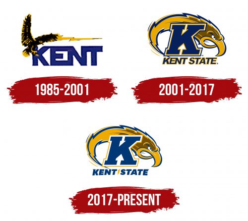
This emblem was introduced in 1985 when the sports teams chose the Golden Eagle as their mascot. The central element is the dark blue word “KENT,” written in bold sans-serif font with connected capital letters. In the upper left corner, an eagle with yellow and black plumage is depicted. It flies with its wings widely spread, partially covering the first “K.” From the bird, a long lightning bolt extends to the right, shaped like a zigzag stripe with a pointed end. The designers attempted to link the team’s name and mascot.
2001 – 2017
The centerpiece is now a large “K” with rectangular serifs, standing on the inscription “KENT STATE,” like on a pedestal. The lower line is written in bold italic with very narrow letter spacing. All glyphs are blue and outlined in gold, but the “K” has an additional white and blue frame. In the background is the head of a golden eagle, with a long lightning bolt for a neck, bent downwards. The jagged feathers mimic its zigzag shape. The bird’s gaze is fierce and confident. The empty white space formed by the two parts of the beak resembles a menacing snarl.
2017 – today
In 2017, the logo was slightly revised, mainly in the style of the inscription. The letters in “KENT STATE” became bolder, and some acquired single sharp serifs and angular cuts. Letter spacing was increased to make the sports teams’ names readable, even though it is curved into an arch shape. Between the two words is a small gold lightning bolt – likely for those who can’t see the large lightning bolt in the eagle’s head. The glyphs lack yellow outlines, so the standalone “K” now appears clearer and more expressive. In the negative space between its serifs and diagonals, two white arrows are visible: one pointing down and the other up, conveying the dynamics characteristic of sports competitions.
Font and Colors
The inscription “KENT STATE” uses a modified version of the National Black Italic from the university’s official font family. The sports teams’ logo creators transformed the glyphs, giving them a unique shape with triangular cuts and sharp serifs. The “K” sign is made in bold italic with large rectangular serifs.
The emblem is designed in KSU’s traditional colors: blue (PMS 281) and gold (PMS 124). Additional shades of yellow and white are used, the latter filling the image with open space. According to legend, the original palette of Kent State Golden Flashes included orange and blue. Still, after a laundry mishap during the washing of a basketball uniform, the orange turned gold.
