The Kenworth logo is harmonious and bright. Represents an award-winning and customer-recognized industry leader. In the logo encrypted roads, trucking, predicted a successful path to the future.
Kenworth: Brand overview
| Founded: | 1923 |
| Founder: | Edgar K. Worthington, Harry Kent |
| Headquarters: | Kirkland, Washington, U.S. |
| Website: | kenworth.com |
Kenworth is an American manufacturer of trucks, utility vehicles, and heavy-duty buses. Belongs to PACCAR since 1945; before that, it was a private company that passed by inheritance.
Meaning and History
The company logo is a symbol of a successful partnership that has left its mark on the history of machines for decades. Despite some transformations, the emblem retains the memory of the creators of the brand and the best lines. The badge speaks of a champion company that has provided successful solutions to work in the most difficult conditions used by various industries.
What is Kenworth?
Heavy machinery company, predominantly trucks, headquartered in Kirkland. Has production sites in America, Canada, Australia, and Mexico.
1923 – 1956
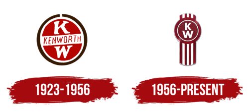
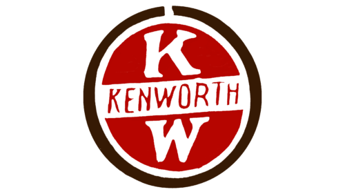
The first logo had a round shape reminiscent of:
- Seal of quality. Confirmation of compliance of machines with all requirements and standards. For example, in 1935, the manufacturer undertook a massive reorganization to comply with the Motor Carriers Act.
- Wheel. Symbol of vehicles and road.
- Steering wheel. The personification of leadership, travel, and transportation, for which the machines were created. A wide white strip across the circle enhanced the resemblance to a steering wheel.
- Road sign. The red background of the logo, the white border, and the stripe in the circle resembles a road sign. Indicating that only driving in a Kenworth car is safe. The brand allows you to drive to your destination without hindrance. Here, the white stripe is similar to the roadway, and the brand’s name is similar to the car.
Double black and white edging spoke of increased security: reinforced truck body, the ability to transport goods without damage.
The sign shows the name of the company in thin red lines. Above and below inside the circle are the letters K and W. The name appeared after the bankrupt initial company Gerlinger Motors was bought by partners Worthington and Kent in 1917.
They decided to continue producing Gersix trucks. The model was in great demand, so over time, the partners moved their headquarters to Seattle, and the brand was named after the first syllables of their surnames. The letters in the sign are an indication of two owners with equal shares.
The red background is a symbol of progress and high demand for products.
1956 – today
After the founders’ death and the rightful owners’ refusal from management, the company was acquired by the Pacific Car and Foundry Company. She made Kenworth a subsidiary and, since 1956, her division. The participation of a major owner allowed the company to expand production and sell cars in 30 countries in the Middle East, Mexico, Canada, and Europe. However, the lines were now limited to trucks.
The new logo designed for Kenworth resembled an awards medal, with a striped ribbon and a round medallion at the top. Inside a white-edged circle, the letters K and W are stacked on top of each other. The company name itself was no longer used, as the new owners did not want to emphasize it.
The initial letters of the founders’ names were now associated with truck lines: W900, K100, etc.
Font and Colors
Red and white are the main colors of the company’s visual signs.
- Red is the color of the leader. Many of Kenworth’s technical solutions were copied by other manufacturers. Hue shows concentration on business and dedication. The company remained consistently true to the theme of trucks. Each model became a hit and then improved and refined many times. For example, the W900 became the W900A and then the W900B.
- White – conveys the theme of research, design, and development. The company changed its locations, organizing work at new plants from scratch, which is also indicated by the white color. Starting from a move from Portland to Seattle, the firm moved on to a larger factory in the city, then temporarily to Yakima, then to the Fisher Body factory, then added additional production at Chillicothe, and also expanded to other countries.
The letters of the logo are massive and simple. Corresponding to large appliances, the design of which stems from the interest in functionality.
Kenworth color codes
| Crimson | Hex color: | #d41f3c |
|---|---|---|
| RGB: | 212 31 60 | |
| CMYK: | 0 85 72 17 | |
| Pantone: | PMS 200 C |


