The company logo reflects the smoothness of movement and the harmonious combination of “stuffing” and external design. “Vehicles that come off our assembly line are able to overcome any bends in the road,” the Kia logo says to customers.
Kia: Brand overview
Meaning and History
The modern brand name is simple but full of meaning. It was created based on two hieroglyphs: “ki” (indicates upward movement, the beginning of a continuous action) and “a” (house, Asia). One meaning is that it can be deciphered as “native of Asia.”
Before the company saw the automotive industry’s potential, it used many different logos that varied in color and design. Significant changes to the identity came in 1994 when Kia acquired the famous lettering symbol inside the oval. Over time, it was modified and disappeared altogether, giving way to a minimalistic and abstract word sign.
What is Kia?
Kia is a South Korean corporation that ranks second in size among all automakers in its country. It was established in 1944 and initially produced only bicycle parts. Then its assortment was replenished with motorcycles, trucks, and cars. Kia’s current parent company is Hyundai Motor Group.
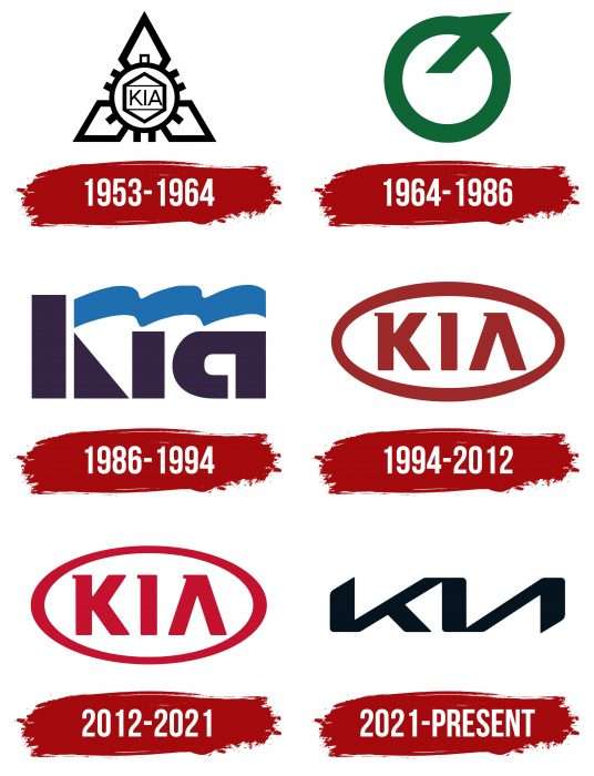
1953 – 1964
In 1953, the Kyungsung Precision Industry became Kia Industries. This almost did not affect its range: it continued to produce bicycle parts and only four years later switched to Honda’s motorcycle production. However, the rebranding was reflected in the logo. It contained a complex geometric composition comprising many polygons, including squares, rectangles, triangles, and diamond shapes. The centerpiece – a circle with rectangular jaggies – looked like a cogwheel. Inside it was the word “KIA.”
1964 – 1986
One thousand nine hundred sixty-four, the inscription disappeared, and the emblem acquired a simplified form. It was a green circle with an angled ledge at the top right, like an inverted Q. It resembled the stylized “K” badge used on vehicles sold only in South Korea.
1986 – 1994
In 1986, the firm returned to the automotive industry. This happened after a forced hiatus because the dictator Chun Doo-hwan banned passenger car production in 1981. The first car of the new era was the Kia Pride, commissioned by Ford and Mazda. The Kia Motors enterprise was little-known and was considered cheap labor, but it received the right to export Pride under its brand. However, due to the contractor’s status, the company used a logo representing it as a steel pipe factory. The inscription was stylized as a factory: the letter “K” was shaped like a chimney, and above the “ia,” there was a wavy blue line in the form of puffs of smoke.
1994 – 2012
1994, the company expanded its lineup with the Sportage SUV and the Mentor family car. The emblem with the factory’s image appeared briefly in the center of the red oval, but then it was replaced by the inscription “KIA.” Notably, the “A” lacked a crossbar, so the letter looked like an unfinished delta symbol. The word and frame around the oval were chrome on cars, and the interior was burgundy. The white background was used in documents and promotional materials, and the company name and outline were red.
2012 – 2021
After Hyundai saved Kia from bankruptcy, the logo changed slightly again. The badge on the Sorento 4×4 and Picanto vehicles now has a dark gray background. The official emblem remains unchanged, but the red has become noticeably brighter.
2021 – today
The company has adopted a German agency’s new logo in anticipation of the flagship electric vehicle due in 2021. This became known back in late 2019 when Kia patented the symbol in the form of the connected letters “K,” “I,” and “A.” A similarly styled badge was previously featured on the Imagined concept car in the Spring of 2019.
The logo’s official presentation occurred in January 2021 in the sky over Incheon. The company held a grand celebration on this occasion and set a new world record by using the maximum number of drones in a pyrotechnic show, simultaneously releasing fireworks. Many lights formed into the inscription “KIA” and the new motto, “Movement that inspires.”
Kia: Interesting Facts
Kia Corporation, which started as Kyungsung Precision Industry in South Korea, has become a major player in the car industry since it was founded in 1944. It’s the second-largest car maker in South Korea, right after Hyundai. Kia has made a big splash worldwide with a wide range of vehicles.
- Bicycle Beginnings: Kia began making steel tubing and bicycle parts in 1944, eventually creating Korea’s first domestic bicycle in 1951. This was the first step towards becoming a mobility company.
- Automotive Entry: In 1962, Kia entered the automotive world by making Korea’s first domestic truck, the K-360, and later expanded into making cars.
- Name Meaning: “Kia” combines two Sino-Korean characters, “ki” (to arise) and “a” (Asia), reflecting its goal to become a leading Asian car manufacturer.
- Global Reach: Kia entered the North American market in 1994 and now operates globally, with factories in countries like the United States, Slovakia, and India.
- Hyundai Partnership: During the 1998 Asian financial crisis, Hyundai acquired a 33.88% stake in Kia, forming a strong alliance that has benefited both in sharing resources and technology.
- Design Transformation: With Chief Design Officer Peter Schreyer joining in 2006, Kia introduced the “Tiger Nose” grille, marking a new era in its vehicle design that’s been widely recognized and awarded.
- Awards: Kia’s models, such as the Telluride, Stinger, and Soul, have received numerous awards for quality, design, and safety, underscoring Kia’s commitment to excellence.
- Green Initiatives: Kia is focused on becoming a leader in eco-friendly cars, offering hybrids, plug-in hybrids, and electric vehicles like the Niro and Soul EV.
- Sports Sponsorships: Kia sponsors various sports teams and events, including the FIFA World Cup and the Australian Open, helping to promote its brand worldwide.
- Marketing Success: The Kia hamster campaigns, especially for the Kia Soul, have been a hit, making the Soul a popular choice for a fun, youthful car.
From making bicycle parts to becoming a global automotive giant, Kia’s journey is a story of innovation, quality, and a commitment to moving forward in design, technology, and sustainability.
Font and Colors
The latest symbol change coincides with adopting the Plan S business strategy. Its essence lies in the fact that Kia is gradually switching to the production of electric vehicles. Therefore, the brand’s emblem looks ambitious and modern: upward lines represent growth, and symmetry shows decisiveness. A wordmark has a specific rhythm: it looks like a heart rate graph or a wave, which corresponds to the idea of movement.
The company’s name is stylized as a handwritten signature, for which the designers used the font of their design. All three letters are connected, with most lines running parallel. “A” is in italics. She, as before, has no crossbar. New typography makes the lettering resemble the iconic NASA worm of the 1980s. However, unlike the old NASA logo, Kia emphasizes sharp angles and no curves.
After the redesign, the traditional red color changed to black. According to the documents, the word “KIA” may be white on a dark background. A simple palette and two-dimensional form are other manifestations of minimalism.
FAQ
Why did Kia change their logo to KN?
Changing the logo to resemble “KN” was a deliberate move, and the redesign is part of a larger effort to modernize the brand’s image.
The new branding shifts toward innovation, indicating to customers and the industry that the brand is serious about its future in mobility. This change represents a significant shift in the brand’s position in the market.
This change has caused some confusion among consumers, as the stylized letters “IA” look like the letter “N.” This increased internet searches for the “KN car brand” as people tried to understand the new logo. The brand is aware of this confusion, but the goal is to create a clear and recognizable identity that aligns with its future goals.
What does the Kia symbol mean?
The symbol is a “stylized Korean letter K,” indicating the brand’s focus on quality and innovation.
Under this logo, the brand introduced the Brisa pickup truck in 1973. The following year, the company released its first passenger car, the Brisa sedan. These first cars played an important role in the brand’s growth in the global market.
The symbol represents the company’s journey from its early days to its current status as an industry leader. It reflects the company’s values and goals. This design demonstrates confidence and energy, reinforcing the brand’s new direction.
Why does Kia have different logos?
The brand uses different logos for international and domestic markets to maintain individuality and cater to local preferences.
The international logo is a stylized version of the brand name with all the letters connected. The connected letters symbolize movement and progress, reflecting the company’s vision for the future of mobility.
The domestic logo used in South Korea includes an inverted swoosh representing the letter K. This version resonates with local consumers as it incorporates culturally significant and familiar elements.
Using different logos allows the brand to communicate its uniqueness in different markets.
What does the Kia logo stand for?
The logo, stylized as KIΛ, represents the brand name. The word comes from two Chinese characters: “Ki,” which means “to rise,” and “A,” which means “Asia.” These symbols mean “rising from Asia,” showing the company’s origins.
The logo design reflects the brand’s journey and desire for growth in the global market. It has a modern appearance with sleek lines that convey progress and innovation. The inverted “V” instead of the “A” gives the logo a unique and recognizable look.
Using elements that reflect its origins and purpose, the brand communicates its values to consumers worldwide.
Does Kia have two logos?
Yes, the brand has two logos. One is for international use, and the other is for models sold in South Korea.
The international logo is a modern, stylized version of the brand name with all the letters connected.
The domestic logo in South Korea includes an inverted swoosh representing the letter K. This version is culturally relevant and resonates with local consumers, helping the brand maintain a strong connection with its home market.
Having two logos allows the brand to adapt its image to different markets.
