


![]() Kiehls Logo PNG
Kiehls Logo PNG
The brand’s products are a tandem of chemistry, cosmetology, and perfumery. Kiehl’s logo symbolizes beauty and the many years of youth that the brand’s cosmetics deliver. The company combines past and modern knowledge in one bottle.
In 1851, German immigrant Louis Brunswick opened Brunswick Apotheke at Third Avenue and East 13th Street in New York’s East Village. The shop served a working-class district with herbs, oils, and ready-made remedies. About thirty years later, he sold the business to Engelhardt and Huber. By the 1880s, John Kiehl joined as an apprentice, later took ownership, and renamed it Kiehl’s Pharmacy. The store built a reputation for eclectic formulas, including botanical blends and unusual remedies.
In 1921, Kiehl sold the business to Irving Morse, a Columbia University graduate and World War I veteran. Morse renamed it “Kiehl’s Since 1851” and expanded the product line to include tinctures, honey, and essential oils. He introduced product tastings and released the original musk oil, often compared to Chanel No. 5. He also began listing ingredients on labels before it became a legal requirement.
In 1961, Aaron Morse took over. A former Air Force pilot, he shifted focus toward skincare. In 1964, Blue Astringent Herbal Lotion became a key product. The brand remained a single-store operation for decades before entering department stores. Vintage motorcycles, such as Harley-Davidsons and Indians, were displayed inside, attracting male customers.
In 1988, Jami Morse Heidegger and Klaus Heidegger assumed control. They modernized mail orders and built partnerships with high-end retailers. By 2000, revenue reached $40 million with one store, competing with Aveda and Origins.
In April 2000, Kiehl’s was acquired by L’Oréal through Cosmair Inc. Sales grew from $40 million to $200 million by 2009. The first international store opened in London in 2002, and by 2016, annual revenue exceeded $1 billion.
Meaning and History
This company has only one logo, and it remains relevant today. It has a clear imprint of its time: the retro writing style and the year below.
The logo’s structure is simple, reflecting the need to convey all the information to the buyer at once. The upper part features the word “Kiehl’s,” which mimics handwriting. Below is the inscription “since” and the date “1851”. There is a dividing line between the two parts, thin on the right and thickened on the left. It emphasizes the top element.
What is Kiehl’s?
Kiehl’s is a cosmetics store in the USA. Its foundation was laid by an old pharmacy in Manhattan that has operated since 1851. The company was acquired by L’Oréal in 2000 and expanded into a large retail chain, with 400 stores abroad and 65 in the country. It also sells products through points of sale in airports, department stores, and independent agents.
Font and Colors
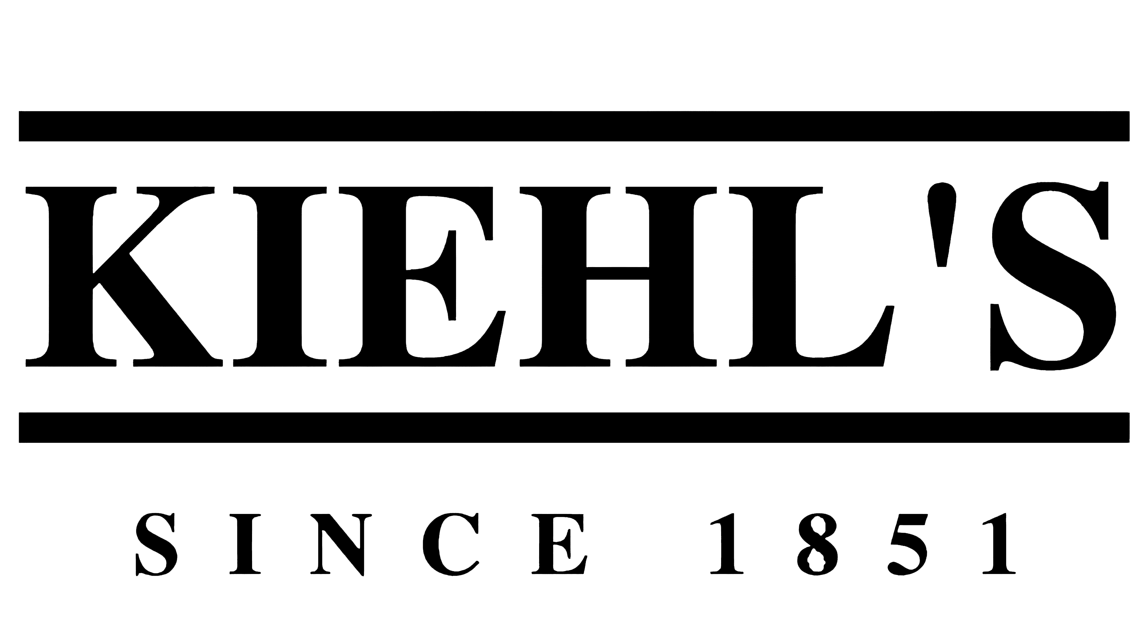
The emblem’s key lettering is made in a typeface reminiscent of Adine Kirnberg Script light, fluent, cursive, as if handwritten. For the lower word, a traditional grotesque font is used. The logo palette is as simple as possible: black (text, date, line) and white (background).