
Kindle Energy is updating its visual identity to reflect its role as an infrastructure company in an economy where computing, data centers, and reliable energy are increasingly important. The company was founded in 2016. It owns, develops, and operates gas-fired power plants in the United States. Its clients include municipal utilities, cloud services, data center operators, and industrial companies. The new identity was developed by New York-based FUNDAMENTALco.
The company participates in major thermal generation projects, operates facilities daily, and works in a sector where demand is growing alongside the expansion of digital infrastructure. The old image looked too traditional and did not show the scale of the work. The brand needed a form connected with reliability, power, and engineering readiness.
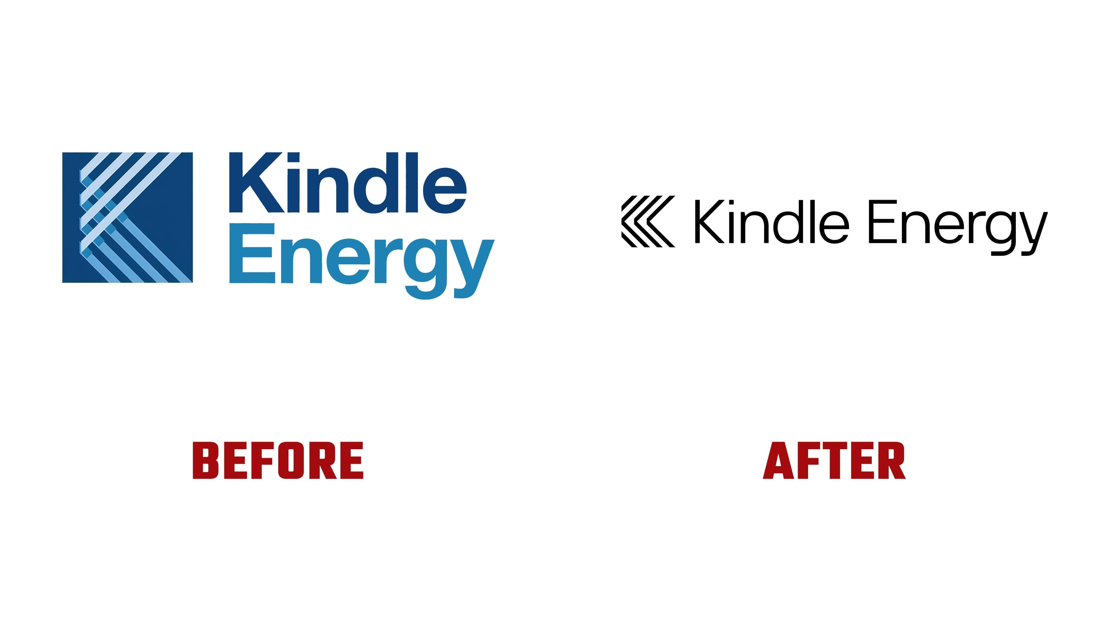
The previous logo featured an abstract “K” composed of parallel lines, but the design was hard to read. The icon looked uneven, and the wordmark felt too generic for a company with major infrastructure responsibilities. The new mark retains the linear basis of the old symbol but makes it stricter and more useful for the system.
The Kindle Energy icon is built as a series of chevrons forming a “K.” The diagonals convey directed energy, flow, and technical structure. The mark has become simpler and denser, and it works better at small sizes on facilities, documents, digital interfaces, and industrial applications. Its task is to appear to be a working element of an infrastructure brand.
The wordmark supports the symbol in weight and geometry. It is based on a modified version of NB International. The letter “K” was adapted so its diagonals echo the chevrons and connect the name with the icon. Through this connection, the mark and the lettering appear as a single corporate signature.

For Kindle Energy, the logo became a way to change perception without breaking from the past. The linear structure preserves continuity, while the new line order removes the untidiness of the old version. The brand gains a more mature, engineering-driven, and scalable image for a company working with power plants and major clients.
A separate part of the identity is connected with the logos of individual facilities. Each site receives a local mark based on the same line system, but featuring motifs specific to the region or facility. The new Kindle Energy image makes the company more organized and serious, moving it from outdated energy communication into the field of infrastructure for digital growth.