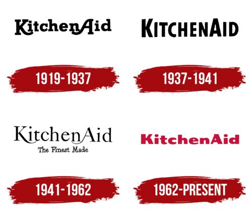
The KitchenAid logo is bright and festive, as the company’s product is a gift to every woman to ease kitchen work. The emblem uses a color range and unique letter shapes to emphasize product uniqueness.
KitchenAid: Brand overview
| Founded: | 1919 |
| Founder: | Whirlpool Corporation |
| Headquarters: | United States |
| Website: | kitchenaid.com |
Originating in 1919 under the auspices of The Hobart Manufacturing Company, KitchenAid initially entered the market with a single focus: the production of stand mixers. Their inaugural offering was a model named “H-5,” marking the brand’s first foray into the appliance market.
In the 1930s, KitchenAid took a major leap forward in design. Working with designer Egmont Arens, they unveiled the “Model K” stand mixer, which would define the signature look for KitchenAid mixers that remains largely unchanged. This aesthetically pleasing and functional design helped cement the brand’s reputation for quality and durability.
However, the company didn’t rest on its laurels; in 1949, it diversified its product line by entering the dishwasher market. Their brand presence got a significant boost in the late 1980s thanks to an aggressive advertising strategy that successfully doubled public awareness of the brand within three years.
Ownership of KitchenAid shifted in 1986 when Whirlpool Corporation took the reins. This acquisition paved the way for the brand’s expansion into various large and small kitchen appliances. Yet, despite its wide offerings, KitchenAid’s identity remains intrinsically tied to its stand mixers, which have maintained a consistent design language since the 1930s.
Today, KitchenAid is a preeminent name in the kitchen appliance sector, offering a comprehensive suite of products. But it’s clear that the brand’s initial breakthrough product—the iconic stand mixer—still encapsulates what KitchenAid represents: quality, durability, and timeless design.
Meaning and History
KitchenAid is one of the old brands that originated over 100 years ago at the dawn of the 20th century. Its logo has not been updated for a long time, remaining a standard of beauty and consistency. The first emblem appeared in 1919 when the Hobart Corporation established the brand for making mixers. The latest logo was introduced in 1966. Even the change of millennia and the 100th anniversary did not prompt new owners to alter the visual identity. The emblem doesn’t need it, having achieved perfection through three rebrandings.
What is KitchenAid?
The company introduced women to the stand mixer. The first appliance was launched in 1919. The modern brand produces kitchen machines, coffee grinders, ovens, dishwashers, and microwaves. Yet mixers continue to be the central product.
1919 – 1937
The first logo consisted of the brand name, rendered in a black font with large serifs. A standout feature of the inscription was the enlarged legs of the letters K and A, which seemed to hug the adjacent letters.
This design element conveyed the idea of care and support, resonating with the brand name formed by the fusion of two words: “Kitchen” and “Aid.” The company owed its name to the wife of one of Hobart’s executives, who, after testing the mixer, stated that it didn’t matter what the product was called as it was the best kitchen helper she had ever encountered.
The letter swirls resembled bowls – mixing containers that came with the mixers. Initially, these were shallow vessels for stirring eggs.
Interestingly, the letters involved in the underlining spelled out “Kin A,” portraying mixers as “relative number 1,” a close helper, and a friend.
The logo, name, and design formed a unified tandem, promoting the product by appealing to women’s emotions. The main message of the emblem fully aligned with product advertising, which promised to save time and energy while guaranteeing better quality and a wider variety of dishes.
1937 – 1941
In 1936, Egmont Arens, a marketing legend and editor of two iconic fashion, design, and style magazines, joined the exterior design development. He designed the look of the famous K model. The mixer’s silhouette is still visible in KitchenAid products today.
The updated logo matched the new products. Simple, slightly uneven letters lost their pretentiousness. They now pointed to equipment for regular home kitchen work. As if hand-drawn by a layperson, Glyphs emphasized the relief of routine labor. The inscription conveyed that KitchenAid products were for everyone.
1941 – 1962
In 1941, another model by Egmont Arens was introduced – the K5A. Elegant curves, soft shapes, and the streamlined design of the mixers called for a return to the previous swirls in the emblem.
The letters of the inscription were given a more refined font, matching the beauty of the products. The brand name was supplemented with the inscription “The Finest Made,” executed in a “handmade” style. The signature highlighted the iconic designs by Arens, which had received numerous awards.
1962 – today
By the 1960s, the company was famous not just for mixers. The first dishwashers and other appliances had been added to its inventory. This expansion was followed by a revamp of the marketing strategy and logo.
The emblem was given a red hue to emphasize the brand’s unique feature—using a broad color palette for their appliances. For instance, in 1955, mixers came in four bright shades. Dishwashers were offered in pink as well as white. These various colors became a hallmark feature of KitchenAid, and the bright logo highlighted this innovation.
Font and Colors
Red is the primary color of the emblem and is dominant in the design of tabletop appliances. This shade evokes a sense of festivity and lifts the mood. Subconsciously, the color conveys a message about the performance and speed of the products and their power.
As a bright focal point in the interior, the company’s mixer draws attention. A logo in a red hue serves a similar purpose—it stands out and attracts female shoppers.
Designed for a female audience, the brand uses color to evoke associations with roses, love, passion, and a femme fatale, thereby subconsciously driving purchases.
The font of the inscription is unique. Broad glyphs, tapering at the ends, mimic the shape of the mixer, which had thin beaters attached for mixing.
KitchenAid color codes
| Cardinal | Hex color: | #c41239 |
|---|---|---|
| RGB: | 196 18 57 | |
| CMYK: | 0 91 71 23 | |
| Pantone: | PMS 199 C |


