Traces of thorough cleaning are embedded in the elements of the Kleenex logo. The emblem cleans the surface on which it is placed, demonstrating the harmony, order, and purity that remain after the use of brand products.
Kleenex: Brand overview
| Founded: | July 12, 1924 |
| Founder: | Kimberly-Clark |
| Headquarters: | United States |
| Website: | kleenex.com |
Meaning and History
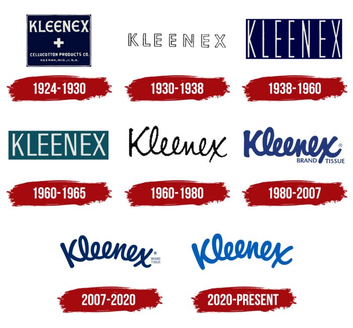
The brand’s logo appeared immediately – in the year of the debut of the product line. It is associated with its name. Therefore it consists of only one word, which has gone from a clear geometric shape to a free rounded inscription. In total, he has seven logo options. All variants of visual identification of a trademark are associated with its name.
What is Kleenex?
Kleenex is an American brand specializing in facial tissues. It was launched in 1924 and is owned by Kimberly-Clark. Its production facilities are located in 78 countries worldwide.
1924 – 1930
The original emblem has heavy lettering with wide letters and around “E.”
1930 – 1938
The word “Kleenex” has become hollow inside. Each mark is outlined with a thin black outline.
1938 – 1960
The designers changed the style of the lettering using elongated threadlike letters.
1960 – 1965
The navy blue has been replaced by turquoise, which significantly refreshes the look of the Kleenex logo. The base has become narrower, and with it, the letters have decreased. They are still vertically elongated but not as filiform as in the previous wordmark. The sans-serif font is roughly similar to Sign Stickers JNL Frontfill by Jeff Levine Fonts.
1960 – 1980
During this period, the legendary form of the word “Kleenex” was approved, as much as possible, resembling a handwritten text.
1980 – 2007
Management changed the writing style almost immediately, choosing bold letters and adding the phrase “Brand Tissue.”
In 1992, the brand name was placed in a blue oval.
2007 – 2020
The current logo is with handwritten text arranged in an arch.
2020 – today
The 2020 redesign hasn’t gone unnoticed, even though the wording of “Kleenex” hasn’t changed at all. Designers worked with color, using deep azure instead of dark blue. They also removed the registered trademark sign and the phrase “BRAND TISSUE” located on the right in two lines. The brand name is written in one unbroken line. It looks like it’s a long, twisted ribbon because all the “l” and “e” form loops.
Kleenex: Interesting Facts
- Makeup Removal: Kleenex tissues were first used to remove makeup. They were a hit because you could throw them away after using them, which was neater than using a cloth towel. Later, people started using them instead of handkerchiefs to blow their noses because they were cleaner.
- During the War: During World War II, Kleenex material was also used for medical dressings, which showed how useful and versatile Kleenex could be.
- Easy to Get One: In the 1930s, Kleenex made a box that let you easily pull out one tissue at a time. This smart box design is now used everywhere.
- Bigger Tissues: In the 1950s, they made “Man-Sized” tissues for those who wanted bigger tissues. They’re now called Kleenex Extra Large.
- Fighting Germs: In 2004, Kleenex made the first tissue to kill viruses, showing they’re serious about keeping things clean and safe.
- Helping the Planet: The company that makes Kleenex, Kimberly-Clark, is improving the environment by using recycled materials, using less water, and ensuring that its products don’t harm forests.
- Everyone Knows Kleenex: Many use “Kleenex” to mean any tissue. That shows how popular and well-known Kleenex is.
- Around the World: You can buy Kleenex in more than 170 countries because people everywhere like them.
- For sensitive skin, Kleenex uses lotion and aloe and makes soft tissues for people with sensitive skin.
- Pretty Boxes: Kleenex boxes come in many designs, thanks to collaborations with artists and designers, making them attractive in homes.
Kleenex has come a long way from being just for removing makeup to becoming a must-have for hygiene. They keep developing new ideas, caring about the environment, and making products people need, making Kleenex a big name in personal care.
Font and Colors
First, the founding company chose a strict typeface for the logo – a classic one with angular signs. Then I switched to a freestyle cursive that mimics curved handwriting. The color scheme of the emblem is simple: it consists of white, blue, and black.
Kleenex color codes
| Medium Sapphire | Hex color: | #0e59a9 |
|---|---|---|
| RGB: | 14 89 169/td> | |
| CMYK: | 92 47 0 34 | |
| Pantone: | PMS 2945 C |

