


![]() Kodak Logo PNG
Kodak Logo PNG
The Kodak logo is associated with cameras, lenses, shooting, and film. Amazing compactness and a wide range of thoughtful details in a small emblem area echo the company’s full coverage of the chosen field of work.
Eastman Kodak built its business around photo equipment, film, printers, and imaging materials. The story begins in 1880, when George Eastman, a bank clerk in Rochester, started experimenting with dry plates. In 1881, he launched the Eastman Dry Plate Company.
In 1888, Kodak introduced its first camera with roll film for 100 exposures. Users mailed the camera back for processing and reloading. The slogan “You press the button, we do the rest” framed a service model that simplified the photography process. In 1892, the firm became Eastman Kodak Company, with a short, distinctive name chosen by Eastman.
In 1900, the Brownie camera, priced at $1, expanded access to amateur photography. During the 1920s and 1930s, Kodak opened plants in Canada, the UK, and France, and strengthened its position in motion-picture film. In 1935, Kodachrome set a new standard for color reversal film.
Postwar growth continued. In 1963, the Instamatic system with cartridge loading sold over 50 million units in seven years. In the 1970s, competition intensified, including from Fujifilm. In 1975, engineer Steven Sasson built a prototype digital camera, though the company did not prioritize the technology.
Throughout the 1980s and 1990s, Kodak remained profitable but lost market share in film. The DCS-100 digital camera arrived in 1991, yet film stayed central. By the early 2000s, a rapid shift in the market toward digital imaging led to a decline in revenue. In 2003, Kodak announced a transition, closed plants, and cut staff.
In 2012, the company filed for bankruptcy and exited in 2013 as a smaller business focused on specialty film and printing. By 2023, it operated in packaging, chemicals, and commercial print, with a reduced role in consumer photography.
Meaning and History
![]()
The word “Kodak,” which formed the modern logo, was registered as a trademark in 1888. It means nothing: it is a random set of symbols. Eastman wanted the brand name to begin and end with “K” and found the perfect-sounding letter combination. Since the early 1900s, the emblem’s inscription has been played differently, but the general style has not changed.
What is Kodak?
Kodak is an American manufacturer of cameras, camcorders, photographic materials, film, scanners, printers, and related technologies. The company was founded in 1892, but the name “Kodak” was registered in 1888 and was initially used only for the film camera brand. The word is a random combination of letters invented by George Eastman and his mother, Maria. In the 21st century, the company faced difficulties due to the rise of digital photography.
1889 – 1907
![]()
The legendary company debuted with an informational and advertising logo that included brief details. This technique was suitable for an undisclosed, little-known brand, so Kodak went with it. He collected all the important data about himself in a single space.
In the center, on a vertical rectangle in black, it says “THE EASTMAN DRY PLATE AND FILM CO” in white letters. On the left side is the phrase “BRANCH OFFICE 155 OXFORD ST. LONDON.” The city and state of Rochester, N.Y., are marked on the right. In addition to the text, the emblem features design elements: decorative leaves, dividing stripes, strokes, and a floral-ornamented frame.
1907 – 1935
![]()
The designer of the first Kodak logo was George Eastman himself, and the idea was his mother’s, who suggested using anagrams. Based on this concept, the company’s owner focused on “E,” “K,” and “C.” The letters are inside a white circle with a black outline.
1935 – 1960
![]()
![]()
In 1935, two new emblems appeared at once. The first is the red word “Kodak” with large square serifs. The second is the same inscription, centered within a light-orange rectangle with a black border. It was the debut of the corporate palette, which took root in subsequent logos.
1960 – 1971
![]()
In the 1960s, the focus shifted to the corner-curl triangle. The geometric shape imitates a folded sheet of photographic paper. The abbreviated brand name is located at the bottom right.
1971 – 1987
![]()
The artist-designer C. Peter Oestrich removed the triangle and put the yellow “Kodak” lettering inside the square. He also added another interesting element, a stylized “K”-shaped graphic sign. The composition in the background resembles a camera shutter.
1984 – 2006
![]()
The 1984 emblem is “Kodak” on a white background. The word is depicted in a simple sans-serif typeface.
1983 – 1987
![]()
1987 – 2006
![]()
The company returned to the iconic 1971 logo three years after the redesign. Only the lettering style has changed: the letters have no serifs.
2006 – today
![]()
The yellow square disappeared again. The font with the rounded “d” and “a” gives the name an unusual look. This version of the logo was designed by the British marketing agency Ogilvy & Mather. The renewal of the graphic sign is associated with increasing market competition and pressure from digital camera manufacturers. Kodak thus tried to save the situation by attracting attention to itself.
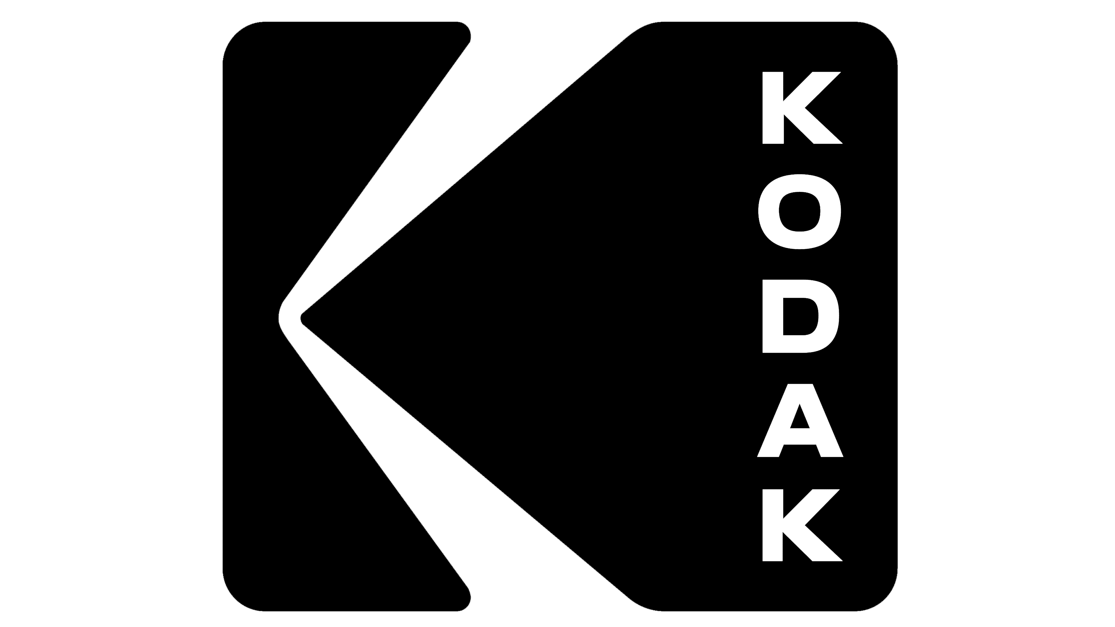
2016 – today
![]()
In 2012, the company went bankrupt, but a year later, it resumed operations. After that, it was decided to rebrand. The result was a redesign of the classic 1971 logo. New York-based studio Work-Order retained the original proportions. All she did was write the word “Kodak” in all caps. The symbols are located vertically along the right side of the square. As conceived by the designers, they should resemble the holes along the edges of perforated photographic film.
Font and Colors
The modern logo demonstrates that its development history is striving for perfection. Therefore, developers often resorted to the combination method, combining parts from the same year with new ones. This creative pursuit was a simple visual sign, the foundation of which was laid in 1971. It was its shape that the designers used for the current version, adding the name in a modernized form. The word “Kodak” is no longer horizontal; it is now vertical with a large letter break. The wide frame, sharp pointer, and figured “butterfly wings” element remain the same.
Allen Hori of Identity Design developed the typeface currently featured in the logo. He modernized the previous version of the name: he made the letters thinner and more graceful, added lightness, and cut off the protruding parts at the “d” and “a” below. Kodak’s signature palette has remained stable, with warm shades of red and yellow, since 1935.