The Komatsu logo looks solid and impressive, as all the equipment is produced under this brand. And the designers showed a creative approach, transforming the ordinary elements into a highlight of the logo. The result was a unique, recognizable symbol.
Komatsu: Brand overview
| Founded: | May 13, 1921 |
| Founder: | Meitaro Takeuchi |
| Headquarters: | Tokyo, Japan |
| Website: | komatsu.jp |
Komatsu is a Japanese corporation that manufactures mining, construction, military and forestry equipment. It also produces industrial equipment, diesel engines, thermoelectric generators.
The company is located in Tokyo, Japan. The corporation is named after the city of Komatsu. This is Ishikawa Prefecture, where the company was founded in 1921. Today, the Komatsu Group includes Komatsu and 258 other subsidiaries. It occupies a leading position in the production of construction and mining equipment.
In its activities, the corporation seeks to adhere to the principle of simplicity and efficiency. This is noticeable not only in the manufactured equipment and technology, which goes beyond the production facilities of the company, but also in the company logo. The first and current logo of the company are distinguished by their simplicity and abstraction, but at this time they look quite impressive.
Meaning and History
The corporation’s production is located in Europe, America, Asia and Japan. Throughout its activities, it introduces exclusively innovations, thanks to which it is able to rapidly develop and conquer the market around the world.
What is Komatsu?
Komatsu is a Japanese engineering transnational corporation. It is engaged in the production of construction and industrial equipment and is one of the world leaders in its industry. It is the second largest manufacturer of construction and mining equipment after Caterpillar, although it has a large market share in China and Japan.
1921 – 1991
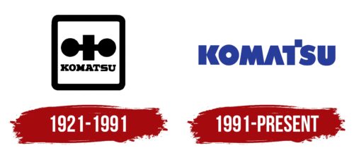
The company acquired its first logo back in 1921, with which the brand achieved its success. The literal translation of the brand name is a small pine tree, so the first logo was based on the meaning of the company name. On a white background is a black image of a tree with an inscription underneath. All this is in a square frame with rounded corners. Everything is as simple and conservative as possible. This logo served as a symbol of the company until 1991.
1991 – today
Since 1991, Komatsu Corporation has had a new logo, which is still used today. The logo was designed by talented illustrator and animator of Wolf Design Partners Bob Wolf. Representatives of the company decided not to move away from minimalism, but made the logo more modern and they succeeded. Most buyers are familiar with the brand’s products under the new brand, which makes it recognizable all over the world.
Font and Colors
The current Komatsu logo was done in a standard bold font. There are no serifs on it – the letters are clear and even. The logo is as saturated as possible, but at this time it remains balanced and balanced, so no additional elements are needed there.
Only the letters “A” and “T” differ in the Komatsu logo, which are not similar to others. For example, the letter “A” does not have a horizontal stripe, thereby adding uniqueness to the lines of the wordmark “T”. The letter “T” is the only one in the logo that has a horizontal line.
To the right of the letter “T” there is a stripe that is higher than the rest and forms a square. This is the only element in the entire logo that is raised.
As for the color scheme, here is the royal blue color, which looks great against the white background of various online resources and typographic products. Also, the blue logo looks great against the background of the company’s equipment, which is painted yellow.
Komatsu color codes
| Royal Azure | Hex color: | #273d99 |
|---|---|---|
| RGB: | 39 61 153 | |
| CMYK: | 75 60 0 40 | |
| Pantone: | PMS 661 C |


