Koni: Brand overview
Koni, a well-known brand of automotive shock absorbers and suspension components, is a subsidiary of ITT Corporation. Founded in 1857 in the Netherlands, Koni originally began its business journey as a leather goods manufacturer and shifted its focus to shock absorbers in 1932.
The company is widely recognized for its unique Frequency Selective Damping (FSD) technology, which is an integral part of shock absorbers and struts. This patented technology has been a key factor in establishing Koni as a reputable manufacturer of premium shock absorbers, coils, struts, and dampers designed specifically for racing and sports cars.
The company’s diverse product lineup includes Yellow adjustable shocks, Special Active shocks, and various suspension kits. Koni also offers replacement shock absorbers, each carefully selected to meet the requirements of specific vehicles such as the Ford Mustang, Chevy Corvette, and BMW M3.
Although Koni was acquired by ITT Corporation in 2000, the company has maintained its independence as an independent brand within the Motion Technologies division of ITT Corporation. Although the company’s roots are in the Netherlands, the U.S. division operates from its headquarters in Compton, California, and its products are manufactured in Europe and the United States.
Koni’s influence extends to conventional vehicles and to the competitive world of motorsports. The company is proud to supply equipment to more than 200 racing teams competing in such prestigious events as F1, WRC, NASCAR, and Le Mans.
In the shock absorber segment, Koni faces stiff competition from well-known brands such as Bilstein, KYB, Sachs, and Monroe. Despite this, Koni has made a mark in the industry due to its commitment to innovative design and superior performance.
Meaning and History
What is Koni?
Koni was founded in 1857 by A. de Koning in Oude-Beyerland, Netherlands, and began its journey as a manufacturer of horsehide dressing equipment. In 1928, the company officially adopted its current name, and in 1932, it took a significant leap forward with the first friction shock absorbers. Today, Koni is a prominent member of the automotive industry, known for its first-class shock absorbers and suspension systems.
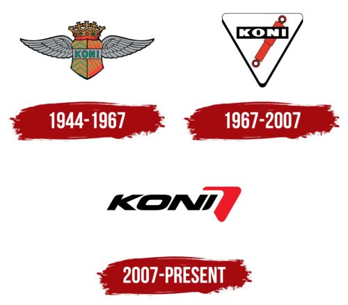
1944 – 1967
1967 – 2007
2007 – today
The Koni logo used to feature a hydraulic shock absorber, but in 2007, it was replaced by an abstract red stripe that looks like a flying boomerang. Now, it is not just a stylized car part but a symbol of high speed. The rounded edges symbolize safety, which is very important when driving fast. The black letters are also dynamic: they are tilted to the right as if rushing forward.
The red stripe, reminiscent of a boomerang, brings to mind something rushing past. The slanted letters are also great. They remind you of racers on the starting line who can’t wait to get off the line. It’s a simple logo, but it tells a pretty interesting story.
Koni color codes
| Pigment Red | Hex color: | #ec1b29 |
|---|---|---|
| RGB: | 236 27 41 | |
| CMYK: | 0 89 83 7 | |
| Pantone: | PMS Bright Red C |
| Black | Hex color: | #000000 |
|---|---|---|
| RGB: | 0 0 0 | |
| CMYK: | 0 0 0 100 | |
| Pantone: | PMS Process Black C |

