The Korean Air logo is a true calling card of the airline that embodies its values and philosophy. Korean Air is written in bold blue, symbolizing reliability and confidence in the company’s capabilities. The letter “O,” decorated with comma-shaped symbols, conveys the dynamism, movement, and movement in the air that is so characteristic of the airline. The red, white, and blue colors inside the “O” represent the flag of Korea and the traditions of Korean culture, part of the company’s national identity.
The significance of the Korean Air emblem is related to the company’s philosophy. It strives to be the safest, most comfortable, and most reliable airline for passengers and to achieve world aviation leadership. Each letter and symbol in the logo reflects the company’s unique history and traditions, which are the foundation of its operations.
Korean Air: Brand overview
Korean Air is a cargo and passenger carrier in Korea. Its fleet includes Airbus and Boeing jet aircraft. It flies to 120 destinations in 50 countries. The main landing airports are Seoul and Busan. The headquarters are in Seoul.
Korean Air, the largest airline in South Korea, has a rich history marked by significant milestones and growth.
In June 1962, the airline was founded under the name Korean Air Lines (KAL) and served as South Korea’s national carrier. The pivotal moment came in 1969 when Korean Air Lines transitioned to private ownership under the Hanjin Group, led by Cho Choong-Hoon.
The 1970s marked the beginning of the company’s international expansion. In 1972, the airline launched its first transcontinental flight to Los Angeles. A year later, flights to Paris commenced, and in 1979, New York was added to its growing list of destinations.
A significant rebranding occurred in 1984, officially changing the company’s name to Korean Air. The subsequent decade saw a substantial modernization of the fleet, introducing advanced wide-body aircraft such as the Boeing 747-300 and Airbus A300.
The air operator played a crucial role in the 1988 Seoul Olympics, enhancing international recognition and contributing to the event’s success through efficient transportation.
The 1990s presented challenges and opportunities. Despite financial difficulties during the 1997 Asian financial crisis, the airline overcame these obstacles. In 1999, the aviation firm became a founding member of the global aviation alliance SkyTeam.
Entering the 2000s, the company focused on fleet modernization and service improvement. The brand welcomed its first Airbus A330 in 2000. By 2005, it had introduced enhanced service classes, including the upgraded Prestige Class. In 2009, the aviation firm delivered its first Airbus A380, joining the ranks of the few airlines operating this advanced aircraft.
The 2010s were characterized by further development and innovation. In 2011, the company became the first airline to operate the Airbus A380 on transcontinental flights to the United States. The opening of a new terminal at Incheon International Airport in 2014 further solidified its status. The aviation operator added the Boeing 787 Dreamliner to its fleet in 2017.
Significant structural changes marked the period from 2018 to 2019. Leadership shifts occurred in 2018 following scandals involving the Cho family. In 2019, the airline announced plans to merge with Asiana Airlines, another major South Korean carrier, marking a significant step in its evolution.
Meaning and History
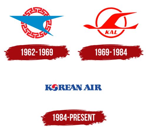
All the carrier’s emblems are connected with the theme of flight and change. Rebrandings demonstrate the path from images and pictures to verbal signs. Each update reflects the company’s desire to be closer to passengers from different countries. English, as an international language, is freely readable in the US, Europe, and Asia, whereas the first symbols of the emblem are hardly understandable outside of Korea without explanatory captions. Therefore, the transformations have made the carrier more modern and presented it as an international enterprise.
What is Korean Air?
This is the largest airline in South Korea, and its national carrier is based in Seoul. The company offers an extensive global route network covering numerous destinations in Asia, Europe, North America, Latin America, and Oceania. The carrier operates a modern and diverse wide-body and narrow-body aircraft, including the Airbus A380, Boeing 747, Boeing 787, and Airbus A220, ensuring high comfort, service, and efficiency levels. In addition to passenger transport, the company manages a significant cargo division with specialized freighter aircraft to meet global logistics needs.
1962 – 1969
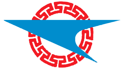
The company’s first logo consisted of a red openwork circle and a blue checkmark on its background. The choice of colors is associated with Singapore’s state symbolism.
The circular shape was associated with the sun. The bends and curls around the element’s edges are close to Egyptian ones. In the culture of Ancient Egypt, the celestial luminary was represented similarly. The unusual ornament in the logo showed the movement of aircraft in different directions. The blue figure in the center reminded of:
- A bird.
- A paper airplane.
- An arrow.
All associations are connected with flight. The upwardly tilted nose of the arrow intensified this impression.
1969 – 1984
1969 is considered the birth year of modern Korean Air. The small company was purchased by the conglomerate Hanjin Group. The new owners introduced it to the SkyTeam alliance, making it the world’s largest carrier.
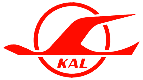
The new company logo is still based on a circle. The figure personifies the sun. The luminary was chosen as a symbol of the East, the part of the world where the sun rises and where the company emerged. An airplane is flying against the backdrop of the circle. The contours of the machine are slightly transformed and resemble a bird.
At the bottom are the letters KLA, which stands for Korean Air Lines. The abbreviated inscription gives a sense of lightness and simplicity.
The composition is filled with romance, dreams, and movement. The company’s airliners soar high, sparkling in the sun’s rays. The sign calls to travel.
1984 – today
1984, the company was renamed Korean Air without Lines to refresh and leave behind a tragic plane crash the year before. The name change entailed a change in identity. The new emblem consists of a large capitalized inscription joined by lower elements. The letter O is stylized and personifies:
- Yin and yang to convey harmony in the carrier’s work. To communicate equal respect for male and female passengers.
- A Pepsi cap. The famous drink’s logo is called the Pepsi Globe. It conveys the popularity of Pepsi worldwide. The image of the carrier’s emblem is associated with a favorite flavor and tells about flights on the company’s planes worldwide.
- Warm and cold currents over which airplanes fly and airflows that the liners encounter.
- Flights to countries with warm and cold climates. Constant shuttling between countries and cities at different times of the year.
- The combination of passenger and cargo transportation.
It reminds me of the central point on the Korean flag, only with the addition of white space between the whirlwinds, which indicates air and flights. White is also the country’s national color. This stylized image was developed for airplanes in cooperation with Boeing Corporation.
Font and Colors
Blue, red, and white have specific meanings in the Korean worldview. Red represents wisdom. Blue conveys independence, reliability, and consistency. And white signifies purity and freedom. In the company’s logo, each color takes on a similar meaning. Red indicates speed, development, change, and growth. The blue shade instills confidence. Passengers can feel secure about their safety and timely arrival at their destination. The white color is a prototype of airspace. It’s the primary color in painting the planes, symbolizing the cleanliness on board and the lightness of the aircraft.
The logo’s font is unique due to the transformation of the letter O and the connection between letters. Large, bulky symbols have delicate ends with serifs, indicating a combination of the aircraft’s reliability and capacity with the precision of coordinates and punctuality.
