Elements of the Kronenbourg 1664 logo directly indicate the country of origin of the lager. The emblem pays tribute to the centuries-old traditions that have been preserved since the recipe’s creation and invites you to try the oldest beer in the world.
Kronenbourg 1664: Brand overview
| Founded: | 1664 |
| Founder: | Geronimus Hatt |
| Headquarters: | Strasbourg, France |
| Website: | kronenbourg.com |
Meaning and History
Kronenbourg 1664 is the most popular French lager globally, and Kronenbourg Brewery is the largest division of the Carlsberg Group. The name of the beer brand reflects the year Geronimus Hatt opened the Brasserie du Canon. In 1947, the company was renamed in honor of the Kronenbourg district, where it had to move in 1850 due to the frequent floods of the river in the place where it used to be. Its flagship brand, which sells premium beer at 5.5% alcohol (in the UK) and 5% alcohol (in the rest of Europe), has been given a similar name.
The manufacturer positions Kronenbourg 1664 as the oldest lager and claims that its original recipe was created in 1664 when the Geronimus Hatt brewery was founded. But experts question this fact because the world’s first premium lager appeared only 200 years later. The most likely year of the beer brand’s appearance is 1952. It is assumed that it was then that the brewery brewed the first batch of Kronenbourg in 1664 to pay tribute to its founder Hatt and celebrate the ascension to the throne of Queen Elizabeth II of England.
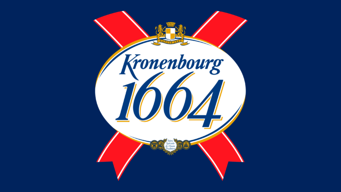
The drink is sold in bottles of a unique shape with a label that closes the neck. It is decorated with a large logo in the form of a white oval on two crossed ribbons. It has changed only once in the history of the brand.
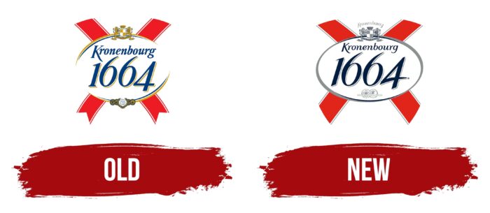
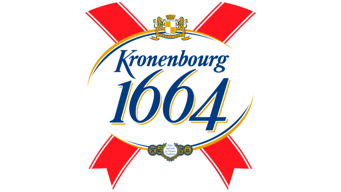
Old
The original version looked almost the same as the current one but was more colorful. In the center was a white oval with an open contour: it was formed by two golden arcs located above and below and complemented by thin blue stripes. The same blue name of the beer brand was written inside. The word “Kronenbourg” used a serif italic typeface, and the year consisted of italic, bold numerals with gold strokes. Above the text was the white and gold coat of arms of Kronenbourg, below – a laurel wreath and medals confirming the quality of the product. In the background were depicted two intersecting red ribbons.
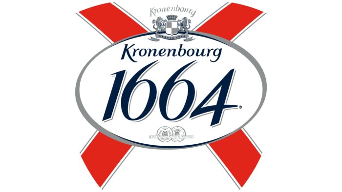
New
The modern design of the logo is almost the same as the original, except for a few minor details. The designers changed the font of the “Kronenbourg” lettering, making the letters smaller and thinner, and added another similar word above the coat of arms, which is now predominantly grey. The frame of the oval has become solid and silver. The awards were moved a little higher and repainted in silver and the contours of the numbers. The triangular protrusions at the bottom have disappeared from the ribbons: the ends are cut diagonally in the new version.
Both the name and logo of Kronenbourg 1664 are a tribute to the village near Strasbourg, where the Kronenbourg Brewery moved in 1850. Therefore, an important, albeit inconspicuous, detail of the emblem is the coat of arms of the area. It depicts two heraldic lions supporting a rectangular shield with a pointed base and a brick tower crown.
The overall minimalist design emphasizes the luxury of the lager because the logo looks like an award (or wax seal) due to its oval shape and two red ribbons. Although after the redesign, when the developers removed the triangular ends of the bottom lines, they became a little less associated with medal ribbons.
Font and Colors
The brand name is written in a custom cursive font that mimics handwriting. It is similar to Emigre’s Eidetic Neo Bold Italic, but the match is inaccurate. The most unique is the capital letter “K”: the designers lengthened its lower right stroke to fold under the “r.” The varying line weights and gentle curves make the word elegant and convey the high quality of a premium lager.
The color scheme, in turn, symbolizes the country of origin of Kronenbourg 1664 because the combination of red, blue, and white is reminiscent of the French tricolor. The gamut complemented by a silver shade that goes well with blue is only in the new version of the logo.
Kronenbourg 1664 color codes
| Lust | Hex color: | #e1251a |
|---|---|---|
| RGB: | 225 37 26 | |
| CMYK: | 0 84 88 12 | |
| Pantone: | PMS Bright Red C |
| Space Cadet | Hex color: | #011e40 |
|---|---|---|
| RGB: | 1 30 64 | |
| CMYK: | 98 53 0 75 | |
| Pantone: | PMS 282 C |
| Aluminium | Hex color: | #8c9091 |
|---|---|---|
| RGB: | 140 144 145 | |
| CMYK: | 3 1 0 43 | |
| Pantone: | PMS 877 C |

