


![]() Krusovice Logo PNG
Krusovice Logo PNG
The Krusovice logo positions the brand’s beer as one of the best representatives of Czech alcoholic beverages. Royal dignity and excellent premium taste are visible in the elements of the emblem. The brand has won numerous awards for a reason.
Meaning and History
The exact date of the company’s founding is unknown. According to experts, it is somewhere between 1517, when a treaty allowed the nobles to brew beer on their land, and 1581, when the Royal Brewery of Krusovice was first mentioned in documents. It was then that Jifi Birka (a member of a titled family and the owner of the Krusovice estate) sent a letter to Emperor Rudolf II offering to buy a brewery from him, comprising fermentation equipment, mills, hop fields, cellars, and a tavern. From that moment on, Birka became a beer supplier to the ruling elite and received official permission to feature the Imperial Crown of Austria on its logo. She is still depicted there.
And in 1583, the emperor nevertheless bought the brewery and made it royal, hence the name Royal Brewery. Interestingly, at the beginning of the 17th century, the quality of the beer was determined by its stickiness. If the trousers of a brewer in Krusovice stuck to a bench soaked in alcohol, then everything was in order with the drink.
What is Krusovice?
This beer, originating from the namesake village in Central Bohemia, is a gem of Czech brewing, earning the title of royal brewery of Bohemian kings. Brewed using an ancient technique with select Moravian grain, pure spring water from the nearby Křivoklát forests, and local Saaz hops, it features a unique lineup that includes the well-known Imperial and Royal varieties. The balanced blend of gentle sweetness, pleasant hoppy bitterness, and clean finish in every bottle reflects the highest level of Czech brewing craftsmanship and tradition.
Then the company changed hands, and each new owner brought something of their own into production. In 1945, it became the state’s property and continued to operate in this status until 1992, when it was registered as a joint-stock company.
At least two Krusovice logos are now known. The first of these was adopted in the mid-1990s when the brewery was bought by Binding-Gruppe, now known as Radeberger Gruppe. In 1995, the new owner renamed the distillery Královský pivovar Krušovice and ordered a redesign of the emblem. As a result, a graphic sign appeared with the image of a red scroll, surrounded by gold stripes and topped with a crown, next to which were written “15” and “81”. Below are two coats of arms and medals that confirm the quality of the beer. And right on the scroll was written the white word “KRUŠOVICE” (in the center) and the yellow phrase “KRÁLOVSKÝ PIVOVAR” (at the bottom).
The second, the more modern logo, is now used as the official mark of the Royal Brewery of Krusovice. It is also featured on the company’s website. In this version, the scroll became darker and took the form of a quadrilateral with deformed edges bent in opposite directions. Due to the thin golden lines on the background, it seems there is the same figure behind them, just in a different color. The crown’s design has also changed: it now has a simpler structure and has been moved from the center to the left. The numbers next to her disappeared. The main inscriptions are preserved, but the font has been changed to a sharper and smoother one.
The main distinctive element of the Krusovice emblem is the crown. And this is not a hypothetical symbol of power but an image of the Imperial Crown of Austria. The company was granted the right to place it on its logo as early as 1581, when it began supplying beer to Prague Castle on the personal order of Emperor Rudolf II. Of course, the brewery has long had nothing to do with the ruling elites, but it continues to use its historical heritage in its advertising.
Font and Colors
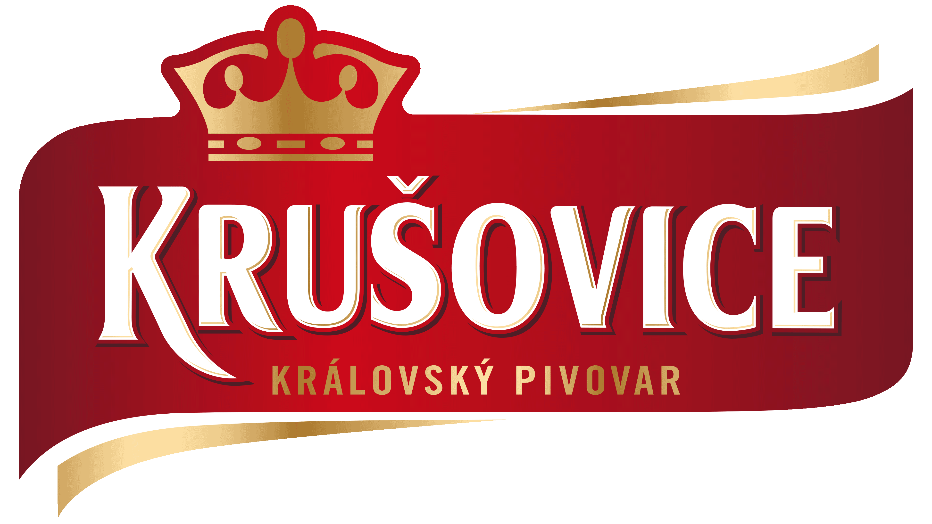
This brand has unique typography because the word “KRUŠOVICE” is written in a custom font with no analogs. All letters are bold, geometric, and vertically elongated. Small, sharp serifs complement some of them. The first “K” in the modern version of the logo has an elongated stem that goes under the “R.” And for the phrase “KRÁLOVSKÝ PIVOVAR,” the designers used a high-contrast typeface similar to Vera Humana 95 Bold by BX Fonts or Ophian Bold by FontSite Inc. (less).
The color selections in the two cases differ. The first emblem appears brighter due to its rich, light shades. The main range includes red and gold with a gradient. They are complemented by the classic white-and-black combination, used mainly for inscriptions. And the modern logo is darkened: red at the edges turns into burgundy. Gold and white have been preserved, which cannot be said about the black color, which has disappeared even from the contours of the letters.