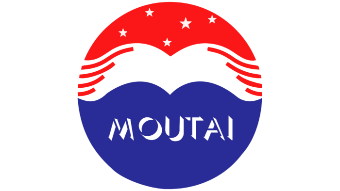
The alcohol of the company, like the waves of the ocean, envelops the taster. “With each sip, a unique bouquet will emerge that will gradually lift you to the pinnacle of pleasure,” the Kweichow Moutai logo promises. The emblem conveys the purity and softness of elite drinks.
Kweichow Moutai: Brand overview
| Founded: | 1951 |
| Founder: | Guizhou SASAC |
| Headquarters: | Maotai, Guizhou, China |
| Website: | moutaichina.com |
Meaning and History
Moutai Baijiu is part of China’s intangible cultural heritage, as it predates the company that produces it. This liquor has been the favorite drink of kings for about 2,000 years, ever since Emperor Wu of the Han Dynasty first tasted it and appreciated its delicious taste. And on the day of the founding of the PRC, he received the status of the national alcohol of the country. Therefore, Kweichow Moutai Distillery, founded in 1951 due to the merger of Hengxing, Ronghe, and Chengyi, was initially doomed to success.
The enterprise developed rapidly and turned into a large Chinese group of companies. It has become a leader in the baijiu industry due to its favorable geographical location. Only where this distillery is located – in the city of Maotai, Guizhou province, on the east coast of the Chishui River – produces a unique drink with pronounced notes of soy sauce, mushrooms, grains, nuts, herbs, fermented tropical fruits, yeast, and flowers. According to experts, it contains about 300 different flavors. An attempt to produce alcohol in the nearby river sections did not give the desired result.
Nature itself contributes to the production of original baijiu: a unique climate, special bacteria, pure water, soil, and air saturated with microelements give the drink a unique piquant taste. Therefore, the Kweichow Moutai logo depicts nothing more than a local landscape enclosed in a circle with the inscription “MOUTAI.”
The lower half of the badge is painted in dark blue because it represents the Chishui River, on the banks of which the plant is located. The white stripe in the middle is a chain of hills. It was added because Guizhou Province is famous for its mountainous terrain. The red top with five stars of different sizes simultaneously symbolizes the night sky and pays tribute to the national flag of China. When the logo is used on a bottle, it mimics a print as it is attached to the side of the cap and complemented by a red ribbon.
Some believe that the round Kweichow Moutai sign was “stolen” from Pepsi and has a similar structure. The emblem of the Chinese manufacturer has a lot of hidden meanings, so any comparisons are inappropriate. The white stripe with two curves simultaneously looks like a stylized letter “M” (the first in the company’s name and its flagship brand) and resembles an abstract bird. This is an eagle – a symbol of success, inspiration, striving for heights. It personifies the splendor of alcoholic beverages and the plant where they are made. And eight curvy red lines (four on each side) hint that the logo was adopted 80 years after the baijiu from Maotai City was awarded the Panama International Gold Award.
Font and Colors
The word “MOUTAI” is written in forked letters, which are nothing special. The font can be attributed to standard non-contrasting sans serifs. Unlike typography, a color scheme isn’t simple. The combination of red, white, and blue symbolizes the soy flavor of the liqueur, its sweetness, and its piquancy. Red also matches the color of the PRC flag and represents the company’s innovativeness.
Kweichow Moutai color codes
| Neon Red | Hex color: | #fb1617 |
|---|---|---|
| RGB: | 251 22 23 | |
| CMYK: | 0 91 91 2 | |
| Pantone: | PMS Bright Red C |
| Cosmic Cobalt | Hex color: | #292c96 |
|---|---|---|
| RGB: | 41 44 150 | |
| CMYK: | 73 71 0 41 | |
| Pantone: | PMS 2746 C |


