The feeling of speed and flight arises when looking at the La Poste logo. The image is like an arrow shot at the target. The emblem is filled with good positive energy, which helps to deliver correspondence to the recipients.
La Poste: Brand overview
| Founded: | 1991 |
| Founder: | Caisse des dépôts, French government |
| Headquarters: | Paris, France |
| Website: | laposte.fr |
Meaning and History
The current enterprise is the result of the evolution of the royal court’s postal houses in 1477 to deliver imperial messages. In 1576 they were also allowed to engage in the distribution of private correspondence. In 1879, the post office entered the general structure along with the telegraph and telephone. The new service is called PTT.
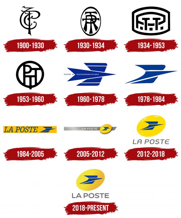
The key stages in the French postal company’s development were naturally reflected in its identity, which dates back to the first half of the 20th century. The beginning of the official history of the La Poste logo is 1900. Since then, the service has changed nine personal identification characters.
What is La Poste?
La Poste is a French organization responsible for delivering parcels and written correspondence. It is a state-owned enterprise, part of Groupe La Poste, and has been in existence since 1991. Its predecessor, the national postal service of France, was established in 1477 by King Louis XI. La Poste has many subsidiaries, including La Banque Postale, which provides banking services.
1900 – 1930
The logo looks like a monogram composed of thin lines and intertwined letters. Among the symbols, an elongated “P” stands out clearly, located in the center of the emblem. The lines on the monogram are smooth and streamlined, with curves. An exception is the “P” leg with a sharp spike at the end due to the oblique cut. All elements are colored black.
1930 – 1934
In this version, the inscription has become more distinguishable: not only the “P” is visible, but also two distinct “T” superimposed on each other. Each letter denotes the type of services provided and works direction: mail, telephone, telegraph. The monogram is located in a high white oval with a black frame. The inscription is dark, which corresponds to the monochrome emblems of that time. The printed signs’ legs have extensions at the bottom and form a kind of branching, symbolizing three parallel services.
1934 – 1953
The abbreviation remains the same – “PTT,” where each symbol indicates the company’s type of activity. But the shape of the frames and the style of the letters have changed dramatically. This time, the developers used an angular and massive font with wide lines. In this version, “P” takes up all the space on the logo, emphasizing that mail is basic. At the same time, the two “T” s are smaller and are below it. A large square dot follows each letter. The inscription is located in a horizontal oval with cut off ends.
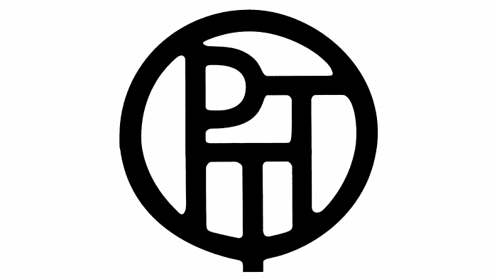
1953 – 1960
In the middle of the 20th century, designers proposed a logo in the form of a round tag to the postal service. Inside the icon are one “P” and two “T.” But this time, they are the same size, which conveys their equivalence.
1960 – 1978
The author of the new logo is the artist Guy Georget. Based on the concept, the icon depicts a rapidly flying forward bird (presumably a swallow). The body is made in an arrow with a forked tail, and the wings are trapezoidal stripes (two on each side). There is also an inscription indicating that it is the emblem of the postal and telecommunications services. The primary colors are yellow and blue.
1978 – 1984
The developers turned the bird in profile, for which they removed the second end of the tail and depicted folded wings in the upper position. This gave the logo a dynamic feel because the wings are elongated, and the body is sharper.
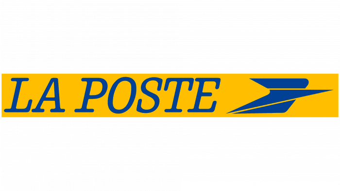
1984 – 2005
The designers have added a yellow rectangle located diagonally and the inscription “La Poste” to the existing version. The image of a flying bird was used as an icon, moved to the end of the inscription.
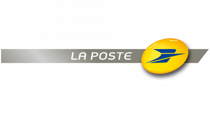
2005 – 2012
Another redesign brought some minor changes. An oval with a bird directed forward appeared on the logo. It is set against a narrow gray ribbon with the name of the postal service. On the left side, a reflection is visible, as from a bright sun.
2012 – 2018
In 2012, the need arose for a new emblem that meets modern technical requirements. Therefore, the management approved an oval yellow sign with a bluebird and subtle highlights that make it three-dimensional. Below on a white background, it says “La Poste.”
2018 – today
The current logo is almost the same as the previous version. The differences relate only to the lack of three-dimensionality, gloss, and shadows. Also, there is a distinct gradient from dark yellow to light. The font of the inscription has also been changed.
La Poste: Interesting Facts
La Poste, the national postal service of France, has been integral to French society since the 15th century. It’s not just one of the world’s oldest postal services, established in 1576 by King Henry III, but also a cornerstone of modern French life with a vast range of services.
- Historical Foundation: Starting with routes between Paris and Lyon, it originally served the royal court before expanding to the public.
- Nationwide Network: La Poste boasts a widespread network, ensuring everyone in France, including those in remote areas, can access postal services.
- Broad Services: Beyond mail, La Poste has grown into banking with La Banque Postale, parcel delivery with Colissimo, and even digital services, adapting to modern needs.
- Environmental Commitment: It’s leading in eco-friendliness, utilizing one of the world’s most extensive fleets of electric vehicles for deliveries to lower carbon emissions.
- Accessible Banking: La Banque Postale, launched in 2006, is noted for its inclusive banking, catering to individuals often overlooked by traditional banks.
- Philatelic Excellence: La Poste is celebrated for its high-quality, artistic stamps, attracting stamp collectors worldwide.
- International Operations: Via GeoPost marks a global presence in the parcel and express delivery market, operating brands like DPD and Chronopost internationally.
- Embracing Technology: La Poste is at the forefront of adopting technological advancements to improve services, from digital mail to drone delivery trials.
- Cultural Icon: Its yellow postboxes and vehicles are ubiquitous, symbolizing dependability and a long-standing tradition of public service in France.
La Poste’s journey from a royal courier service to a multifaceted modern enterprise reflects its enduring adaptability and dedication to serving the public’s evolving needs. This makes it a pillar of French society and a significant player in the global postal and logistics sector.
Font and Colors
If the emblem looked more like a monochrome monogram in the first decades, it is now a full-fledged distinctive sign with its authenticity. The main element is a bluebird, located sideways with its wings folded at the top, as if in flapping. The body is made in the form of a truncated arrow pointing to the right. The second most important detail is the yellow oval. He appeared in 2005.
The earliest was the ornate monograms in the Old English style. A variation of the Harrison Serif Pro Medium Italic typeface was then applied. Then the inscription was made in the Niemeyer Medium Italic font. The modern logo uses a version that is most reminiscent of Adrianna Extended Demibold and Days Sans Bold. The signature palette includes warm yellow and navy blue.
La Poste color codes
| Cobalt | Hex color: | #003da5 |
|---|---|---|
| RGB: | 0 61 165 | |
| CMYK: | 100 63 0 35 | |
| Pantone: | PMS 2728 C |
| Golden Fizz | Hex color: | #f2e436 |
|---|---|---|
| RGB: | 242 228 54 | |
| CMYK: | 0 6 78 5 | |
| Pantone: | PMS 604 C |
| Bright Sun | Hex color: | #eab833 |
|---|---|---|
| RGB: | 234 184 51 | |
| CMYK: | 0 21 78 8 | |
| Pantone: | PMS 142 C |
| Dim Gray | Hex color: | #706f6f |
|---|---|---|
| RGB: | 112 111 111 | |
| CMYK: | 0 1 1 56 | |
| Pantone: | PMS 424 C |

