The La Prairie logo is hardly noticeable, as well as the magical effect of microelements contained in the brand’s elite cosmetics. The emblem invites users to admire the result. And what is used for such an effect is a mystery.
La Prairie: Brand overview
| Founded: | 1978 |
| Founder: | Beiersdorf |
| Headquarters: | Switzerland |
| Website: | laprairie.com |
Meaning and History
From the first months of its existence, the La Prairie emblem was surprised with its laconicism. The developers even tried to “save” space by tightly compressing some letters. This minimalism appealed to the management because the inscription is easy to read and has its flavor, different from what competitors use. In total, there was only one logo variant in the history of the brand.
The logo contains no graphic images or symbols – it contains only verbal designations. In particular, the name of the brand is there. The inscriptions are placed in two tiers: the upper one consists of the phrase “la prairie” (brand name), the lower one consists of the word “switzerland” (country of its location). The original design of the letters makes the emblem unique: the designers have combined “la,” “pra,” and “ie.”
What is La Prairie?
La Prairie is a cosmetics line originating from the spa salons of the resort town of Montreux. It contains unique water and is designed to combat skin aging, making it an anti-aging cellular therapy brand from Switzerland. The founder is surgeon Paul Niehans, and the current owner is Beiersdorf.
Old
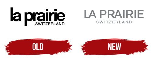
The La Prairie logo is concise, precise, and simple because it contains nothing but the name of the cosmetics company and its country of origin. Both words are used but in a different style. The first inscription is made in a bold semi-connected font in lower case with rounding. The second is typed in capital and narrow characters of an angular shape, made by straight lines. The rows are right-aligned. The glyphs are painted black, so they are visible against a white background.
New
The modern logo is unified in style: both the first and second lines are reduced to one type of design. The designers took the style of the word “Switzerland” as a basis, resulting in the lettering in both lettering styles being thin, smooth, capitalized, and without rounding. The developers moved the lower rad to the center, expanding the inter-character spacing. At the top, they left the letters “LA” and “RA” connected in pairs. Now the emblem is painted in dark gray.
La Prairie: Interesting Facts
La Prairie is a high-end skincare brand known for blending science with luxury to make popular anti-aging products. Founded in Switzerland, it combines the latest scientific advancements with luxurious elements.
- Swiss Roots: La Prairie started at the Clinique La Prairie in Montreux, Switzerland, in 1931. It is famous for its early work in wellness and longevity, including cellular therapy.
- Cellular Science Leaders: In 1978, La Prairie introduced a special Cellular Complex in all its products, aiming to refresh and support skin at a cellular level to help it naturally regenerate.
- Innovative Luxury Skincare: The brand was the first to use caviar extracts, launching the Skin Caviar line in 1987, and it is known for making skin firmer and smoother.
- Artistic Packaging: La Prairie also focuses on beautiful packaging, drawing from Swiss and other artistic traditions to make each product a design piece.
- Conservation Efforts: It contributes to global efforts to protect marine ecosystems and supports art conservation, showing a commitment to environmental and cultural preservation.
- Rare Ingredients: La Prairie uses unique ingredients like gold, platinum, and caviar extract, which are selected for their beneficial skin properties and luxurious feel.
- Specialized Skincare Lines: The brand offers different product lines, such as Platinum Rare and White Caviar, tailored to address various skin concerns and aging signs with a blend of science and luxury.
- Personalized Service: Customers can receive tailored skincare consultations and treatments at select locations, highlighting La Prairie’s focus on individual care and luxury experience.
- Award-Winning: Many La Prairie products have won beauty industry awards for innovation and effectiveness.
- Ongoing Research: The brand continues to invest in research to find new ingredients and technologies for better skin health and anti-aging effects, leading in cosmetic science.
La Prairie stands out for its mix of scientific innovation, luxurious ingredients, and artistic packaging. It offers an indulgent and effective skincare experience and remains dedicated to advancing skincare science and maintaining high standards of luxury and quality.
Font and Colors
The text is in a sleek sans serif typeface from the Sans Serif group. It is simple and geometric. The upper characters are lowercase; the lower ones are uppercase. Squares are used instead of dots above “i.” The color of the logo is monochrome – black and white.
La Prairie color codes
| Black | Hex color: | #000000 |
|---|---|---|
| RGB: | 0 0 0 | |
| CMYK: | 0 0 0 100 | |
| Pantone: | PMS Process Black C |
