The Lada logo is like a majestic fast boat floating on the automobile sea. The brand’s cars are not afraid of storms and obstacles; they confidently occupy their niche and have devoted connoisseurs. The emblem shows that the company controls the entire assembly cycle.
Lada: Brand overview
| Founded: | 1973 |
| Founder: | AvtoVAZ |
| Headquarters: | Russia |
| Website: | lada.ru |
Lada is an automotive brand from Russia founded by VAZ (now AvtoVAZ). He specializes in the production of low-cost and commercial vehicles. Its basic location is the city of Togliatti. The year of the brand’s appearance is 1973. Since 2016, it has been part of the structure of the French concern Groupe Renault. In 2021, it, together with the Romanian brand, was integrated into the Renault Lada-Dacia division.
During the period of stagnation in the post-Soviet engineering industry, the former state-owned plant decided to enlist the support of foreign companies. This helped him withstand the crisis, not waste production capacity, save face and expand the range. Although the first passenger cars AvtoVAZ produced with the technical assistance of Fiat (they came out under the Zhiguli brand), in 2008, he resorted to the help of Renault, which bought a minority stake. But in 2016, she began to fully control the enterprise’s activities, having received the rights to the Lada trademark.
Today, these vehicles are widely recognized in most markets worldwide as inexpensive, reliable vehicles with an optimal balance of price and quality. They are used in civil defense and government services in the Caribbean, Asia, Africa, and Europe. Most often used in the role of taxis and police cars.
Meaning and History
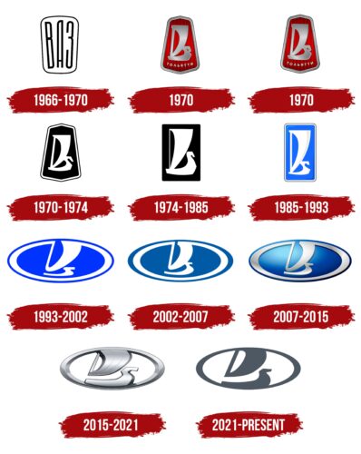
The Lada emblem has several modifications, which are associated with the image of the original Varangian ship, which denotes power, pressure, swiftness, and smoothness of the course. However, the very first sign referred to the founding plant and contained its abbreviation. The history of the logo began in the 60s of the last century.
The sign chosen for the emblem plays a very important role in the local culture. It symbolizes high speed of movement, smooth running, excellent aerodynamic characteristics, and optimal cabin capacity. Although the allegory of a water vessel does not fit well with the theme of land vehicles, they have something in common regarding transport. Therefore, the old boat remains relevant in the visual identity of Lada. In addition, its name echoes this type of boat.
1966 – 1970
Vladimir Antipin, a Russian artist, created a trial version of the emblem. It was a vertically elongated rectangle, slightly widened at the top, resembling an irregular trapezoid. Inside, there were three letters – an abbreviation for the plant’s full name of those times (Volzhskiy Avtomobil’nyi Zavod). The abbreviation VAZ (VAZ) was thin, high, rounded, and written in Cyrillic. Tellingly, at the letter “A,” the crossbar was located very low.
The appearance of two more prototypes of the modern logo dates back to this period. This is a graphic image of an ancient river and sea vessel, which forms the basis of the current name of a car brand: from the word “boat” – “lada.” Varangians, Vikings, Egyptians, and other peoples used to swim on these. The boat was oar, so it glided silently and quickly through the water. And the Russian plant was originally built on the banks of the Volga, one of the largest rivers in Russia. Hence, such a parallel arose.
On the first icon, proposed by the artist A. Dekalenkov, the boat is made in a single outline and has the shape of the Cyrillic letter “B.” The upper part is the sail; the middle part is the mast; the lower part is the ship. Then, the designer Yuriy Danilov improved his version, continuing the associative connection with the first letter of the plant’s name. He encrypted it in sails and a ship and negative space – in black background gaps. This version was later used as the official trademark mark and adorned the hood of cars. The artist also added a geometric shape in the form of a trapezoid or bell.
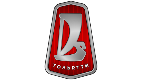
1970 (first version)
The first launch of the logo by Fiat was unsuccessful. The debut batch of emblems was defective because foreigners did not see the difference between the Russian “I” and the English “R,” mistakenly confusing them. As a result, the inscription “TOGLIATTI” under the rook was incorrect. For the rest, the developers almost did not interfere with the structure of the logo: they only finished painting it with a double white and black edging.
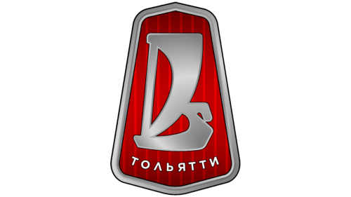
1970 (second version)
The subsequent emblem came out with a revised inscription in Cyrillic – “TOGLIATTI.” The chopped structure of the outlines of the boat has remained the same. It is rendered in short and even strokes, as in the original drawing by Yuriy Danilov.
1970 – 1974
In this version, the designers completely removed the city’s name where the car brand is located. All other elements have been retained.
1974 – 1985
The front of the rook has been widened, raised, and enlarged to match the actual size ratio. The artists depicted the mast as thin, and the sail was made less curved. In addition, they removed the trapezoidal background in the frame and replaced it with a regular rectangle, rounded the corners. The ship is still white, and the background is black.
1985 – 1993
To modernize the logo, the developers added color and volume to it. They chose blue as the main one, which most closely matches the color of the water, since the city of Togliatti, in which the production plant is concentrated, is located on the banks of the river. The logo also has a shadow in the lower right corner and a glint in the upper left. The designers extended the rectangle even more upward and outlined it with a thin edging line. They put gray strokes on the boat and sail, which gave the image a bulge.
1993 – 2002
The transition to the new millennium required a revision of the old logo concept. Designer Vladislav Pashko proposed his vision, whose version was approved. The artist removed the angular shapes and added all the streamlining elements to emphasize the high aerodynamics of the cars. As a result, a horizontal oval appeared, in which a boat with a sail resembling the English letter “V” was inscribed. The blue color was converted to the neon spectrum, and the white was left pure, without chiaroscuro.
2002 – 2007
The changes during this period were minor. The developers made the color dark blue, reduced the upper clearance between the mast and the sail, and increased the vessel’s stern, which caused it to merge with the sail.
2007 – 2015
Thanks to correctly placed highlights and shadows, the emblem has a three-dimensionality: the top and center are light, the bottom and sides are dark.
2015 – 2021
To bring the logo as close as possible to the automotive theme, designer Steve Mattin “metalized” it. To do this, he: first, he removed the blue color, the second, he used a wide range of gray. In addition, the author used the image of an old rook, adding chopped strokes to it – short and rough. He also tilted the mast slightly and extended the sail as if blown up by a tailwind. This is an allegory of wishes for success since there is a friendly phrase, “Fair wind in the sails!”. In addition, this detail gives the logo to the dynamics.
2021 – today
The Lada logo has become simple. The detailing and three-dimensionality of the vessel are a thing of the past: now, the overall outline and two-dimensionality prevail. The flat image consists of the same sailing ship as before, only it looks like a ghost, like the shadow of the previous emblem. The drawing looks like a print, with not a single smallest detail. All done in negative space inside a white oval with a gray border. The silhouette of a wind-blown sail resembles the letter “D.”
Lada: Interesting Facts
Lada, emerging from Russia, epitomizes robustness and straightforwardness. Initiated by Volzhsky Avtomobilny Zavod (VAZ), now AvtoVAZ, in the 1960s, Lada’s journey intertwined with automotive history.
- Italian-Soviet Partnership: The inception of Lada was marked by collaboration with Fiat, an Italian car maker, leading to Lada models that were adaptations of the Fiat 124 sedan, revamped for Russia’s demanding climate and roads.
- Debut Model – Lada 2101: Launched in 1970, 2101 set the foundation for Soviet automotive design, celebrated for its straightforwardness, dependability, and cost-effectiveness, becoming an emblematic figure on Russian streets.
- Worldwide Reach: Beyond its status as a hallmark of Soviet and Russian automotive identity, Ladas found markets globally, from Canada to Latin America, enjoying particular popularity in Eastern Europe and former Soviet territories.
- Lada Niva’s Off-Road Prowess: The 1977 Lada Niva (later Lada 4×4) pioneered off-road vehicle design with its unibody structure. It was praised for its durability and versatility and remains in production.
- Motorsport Achievements: Lada shattered its utilitarian image by excelling in motorsports, with the Lada VFTS making its mark in 1980s rally competitions.
- Symbol of Economic Prestige: In the Soviet era, owning a Lada was a privilege, indicative of moderate affluence and stability, given the extensive waiting periods for car ownership.
- Embracing Modernization: Lada has recently revitalized its lineup with contemporary models, aiming to assert a stronger presence in today’s competitive market.
- Alliance with Renault-Nissan: In the 2000s, Lada entered a strategic partnership with the Renault-Nissan Alliance, propelling it into a new era of design and production sophistication.
- Cultural Staple: Lada transcends its automotive role, capturing the essence of a bygone era in Russian and former Soviet cultures through its appearances in films, music, and literature.
- Venturing into Electrification: Aligning with the shift towards eco-friendly mobility, Lada has developed electric vehicles, signaling its commitment to future automotive innovations.
From its beginnings with Fiat to its symbolic presence in the realm of rugged reliability and its steps towards embracing the future, Lada’s narrative is a testament to its lasting impact on the automotive landscape.
Font and Colors
Russian specialists mainly carried out the development of the identity of the Lada car brand; therefore, many Slavic concepts in it are understandable to Russian-speaking consumers. The focus on the foreign market was paid attention only after the transition to the new millennium. Therefore, in the early versions of the logo, the image of the sailing boat resembled the Russian “B,” and in the later versions – the English “V.”
A full-fledged inscription was used in the emblem only at the dawn of its appearance – in 1970. It was a thin sans serif typeface.
The corporate palette consists of discreet colors: blue and gray in several shades. Naturally, black and white are present, but not as background, but as the main ones.
Lada color codes
| Marengo | Hex color: | #4c5763 |
|---|---|---|
| RGB: | 76 87 99 | |
| CMYK: | 23 123 0 61 | |
| Pantone: | PMS 7545 C |


