


![]() Lana Del Rey Logo PNG
Lana Del Rey Logo PNG
The elegance of the lettering and perfect proportions make the Lana Del Ray logo very harmonious, with notes of elegance and coquetry. This is quite in the singer’s spirit and aligns with her very feminine and original performance style. The red hue of the letters adds a romantic color to the sign.
Elizabeth Woolridge Grant was born on June 21, 1985, in Manhattan and grew up in Lake Placid, New York. She studied at Kent School in Connecticut and later at Fordham University in the Bronx, where she focused on philosophy and metaphysics.
In 2005, she registered the seven-track EP Rock Me Stable and moved to Manhattan to pursue music. She performed under several names, including May Jailer, Lizzy Grant, and the Phenomena. In 2006, she met Van Wilson from 5 Points Records, and in 2007, she signed a $10,000 contract.
With producer David Kahne, she released Kill Kill in October 2008. In January 2010, her debut album, Lana Del Rey, was released under a new stage name. Still, weak distribution led to its removal from sale.
After leaving 5 Points Records, managers Ben Mawson and Ed Millett helped her move to London. There she worked with Justin Parker and recorded “Video Games.” On August 19, 2011, she uploaded a self-made video to YouTube, and the song spread through blogs and listeners.
Stranger Records released the single, and in October 2011, she won a Q Award. That same month, she signed with Interscope Records and Polydor. Born to Die was released on January 31, 2012, reached No. 1 in 11 countries, and peaked at No. 2 on the Billboard 200. New York critics attacked the album, but by 2014, it had sold over 7 million copies and stayed on the Billboard 200 for more than a decade. Paradise followed in 2012, bringing her first Grammy nomination.
Later albums included Ultraviolence, Honeymoon, Lust for Life, Norman Fucking Rockwell!, Chemtrails over the Country Club, Blue Banisters, and Did You Know That There’s a Tunnel Under Ocean Blvd. In early 2024, she announced work on the country album Lasso.
Meaning and History
![]()
The celebrity does not have a special graphic logo – only her pseudonym is used to release albums and compositions. In particular, the covers of the studio collections “Lana Del Ray” (2010), “Born to Die” (2012), and “Honeymoon” (2015) are adorned with the strict inscription “Lana Del Rey.”
The typeface resembles the old-fashioned Rospi Retro, inspired by the 1933 Polish magazine Tygodnik Ilustrowany. There are similarities with the typefaces Rainbow (from Hawaiian Tropic) and Steelfish (from Ray Larabie). They are united by narrow and vertically elongated sans-serif letters.
The sixth studio album (2019’s Norman Fucking Rockwell) uses the acronym “LDR” instead of the pop star’s pseudonym. The symbols are arranged vertically, one below the other. The font resembles a comic and echoes the cartoon explosion in the upper-left corner of the cover. The letters are white with a thin red outline.
What is Lana Del Rey?
Lana Del Rey is the stage name of American singer Elizabeth Woolridge Grant, who began her career while still in college. She gained fame for her unique style, which blends elements of indie rock, pop, and electronic music. Her song lyrics focus on themes of nostalgia, loneliness, and love. The artist has released several popular albums, including “Lust for Life,” “Honeymoon,” and “Ultraviolence.”
2011 – 2012 and 2015 – 2019
![]()
On the cover of the album “Lust for Life” (2017), the singer’s pseudonym is originally stylized. “L”, “A”, “D”, “R”, “Y” have elegant curls with teardrop-shaped elements. This makes them appear to be handwritten. Another “L” (in the word “Del”), “N,” and “E” are decorated with square serifs.
The play on contrasts creates an unusual effect: the typography reflects the romantic melancholy of the music collection. It epitomizes American mass culture in the 1950s and 1960s.
Two horizontal lines complement the original italic font. One underlines the word “Del,” and the other on top connects the letters “A” in “Lana.” The logo is presented in different colors. On the covers, there was often a variant with a red inscription. Despite this, black-and-white versions have become very popular.
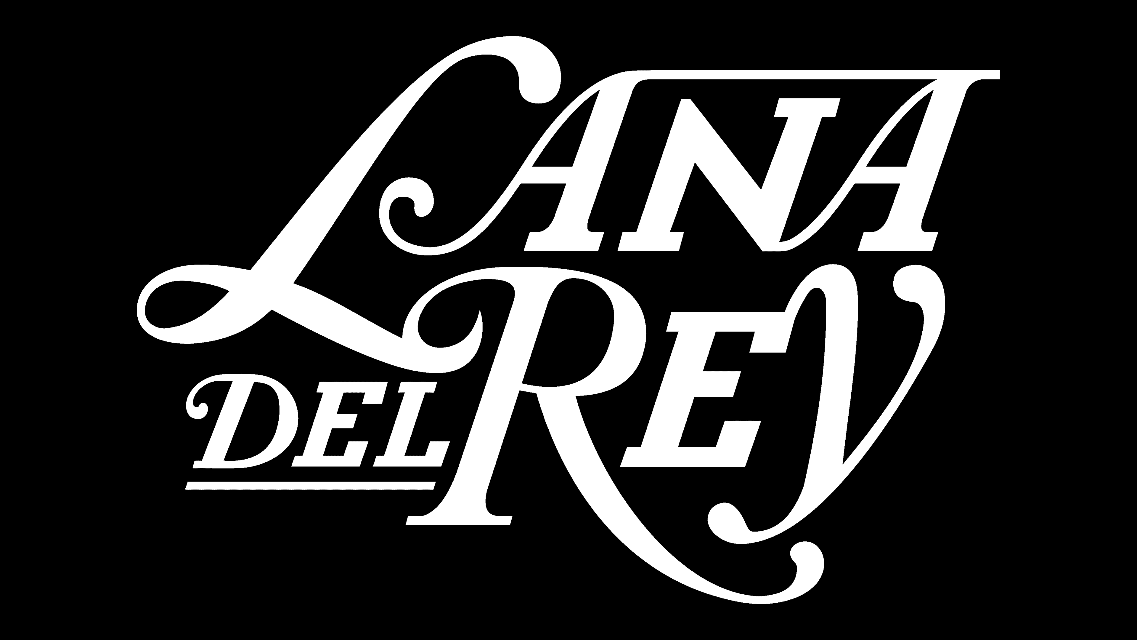
2012 – 2015
![]()
Austerity and sophistication are what characterize this personal logo in the first place. Although it has no drawing elements, the graphics can still be traced with geometric letters. The main field is occupied by the performer’s pseudonym, “Lana Del Rey.” The signs are elongated and perfectly aligned vertically. Intra-letter gaps are narrow, as is the intersymbol spacing, so it seems as if the letters are close to each other. The close arrangement of words also prompts this.
For the custom logo, the author opted for a sleek, versatile typeface with chopped letterforms. It resembles two fonts: Steelfish, designed by Ray Larabie, and Rainbow, designed by HawaiianTropic. The logo’s color scheme is also simple and universal: the classic balance of black and white. The narrow, dark letters look very stylish against a wide white background.
2019 – 2020
![]()
The sixth album is titled Norman F*cking Rockwell! decorates the image of the explosion as it appears in the comics. But in this case, instead of the word “Boom!”, the abbreviation is used, composed of the performer’s and the poetess’s initials. The exclamation mark at the end of the music collection’s name conveys a powerful impact. The explosion is rendered classically, with sharp spikes directed in different directions. The first is the red spot; the second, the yellow one, is located on it. The third element is superimposed on top of them and painted in a soft lilac hue. The letters in the inscription are contoured, with a slight thickening on the left and in the middle (in the intra-letter gap).
2020 – 2021
![]()
The following logo is minimalistic and austere. This is probably to foster a serious attitude towards the author’s poems, presented in two formats: print and audio. The identity consists of the poetess’s name and surname in italics. They are in black letters on a white background. The symbols are refined and graceful, as is the poetry they represent.
2021 – today
![]()
For the next two albums, a thicker caption has been chosen. Wide letters are complemented by thread-like beams and narrow elements of some of the legs, which form a visual contrast. The black-and-white palette is retained.
Font and Colors
There is no font in the 2019 logo because only hand-drawn elements are used there, adapted to the individual style. The lettering on the last album follows the design of the first emblem. It uses a modified version of the Muara typeface that resembles the debut logo. It is also close to Maron’s font.
![]()